Colorized iVAT Images for Labeled Data
Volume 8, Issue 4, Page No 111-121, 2023
Author’s Name: Elizabeth Dixon Hathaway1,a), Richard Joseph Hathaway2
View Affiliations
1Department of Health & Human Performance, University of Tennessee at Chattanooga, Chattanooga, 37403, United States
2Department of Mathematical Sciences, Georgia Southern University, Statesboro, 30460, United States
a)whom correspondence should be addressed. E-mail: elizabeth-hathaway@utc.edu
Adv. Sci. Technol. Eng. Syst. J. 8(4), 111-121 (2023); ![]() DOI: 10.25046/aj080413
DOI: 10.25046/aj080413
Keywords: Data visualization, Cluster heat map, iVAT image, Clustered tendency, Labeled data

Export Citations
A 2-dimensional numerical data set X = {x1,…,xn} with associated category labels {l1,…,ln} can be accurately represented in a 2-dimensional scatterplot where color is used to represent each datum’s label. The colorized scatterplot indicates the presence or absence of spatial clusters in X and any special distribution of labels among those clusters. The same approach can be used for 3-dimensional data albeit with some additional difficulty, but it cannot be used for data sets of dimensions 4 or greater. For higher dimensional data, the improved Visual Assessment of cluster Tendency (iVAT) image can be used to indicate the presence or absence of cluster structure. In this paper we propose several new types of colorized iVAT images, which like the 2-dimensional colorized scatterplot, can be used to represent both spatial cluster structure and the distribution of labels among clusters.
Received: 19 May 2023, Accepted: 19 July 2023, Published Online: 26 August 2023
1. Introduction
Let O = {o1,…,on} be a set of n objects (e.g., people, trees). Suppose we have two types of information about the objects in O: (1) a set of corresponding object data X = {x1,…,xn} Ì Âs, where for each k, datum xk gives values for s different features (e.g., height, weight) of object ok; and (2) a set of labels L = {l1,…,ln} indicating to which of several known categories each object belongs. The purpose of this paper is to introduce simple visual displays that allow us to compare the cluster structure in X with the category structure in L. Here we use the terms cluster or spatial cluster to refer to a group of close, similarly valued data points in X. Since we are dealing with visual displays, our eyes can be used to assess cluster structure. An interesting discussion of definitions of clusters from both the human and computer points of view is given in [1]. The potential uses of the new displays include: (1) checking to see if a cluster-based classification scheme (e.g., nearest centroid classification) might work well for labeling future objects; (2) providing a visual approach to feature selection for X by comparing displays using different subsets of features; (3) providing a simple visual approach for identifying clusters of interest, and (4) simply checking to see if the cluster structure of X aligns with the category structure of L.
In the case of s = 2 features we do not need a new approach as we can represent all the available information of object data X and labels L in a single, colorized scatterplot. We illustrate this below in Fig. 1 with a scatterplot of the hypothetical school data example from [2] involving 26 students (the objects) with their corresponding scaled SAT and high school GPA scores (the object data X) and their freshman math course outcomes of Pass or Fail (the labels or categories L). Note that the scatterplot reveals the clusters of the object data X along with the distribution of the labels among those clusters. Stated another way, we see that the colorized scatterplot allows us to check the alignment of the object data clusters with the label categories. Ignoring color, we can reasonably identify two spatial clusters: a lower left cluster (lower achievers) and an upper right cluster (higher achievers). Now also considering color, we see that the Fail category mostly aligns with the lower achievers while the Pass category mostly aligns with the upper achievers. We will refer to a datum xk as a minority point if it is labeled differently from most of its nearest neighbors in X, and with this term we note that there are two minority points among lower achievers and one among higher achievers. The scatterplot makes it very clear which cluster should be targeted for additional learning support, which is the group of students who achieved less in high school.
A colorized scatterplot is all that is needed for labeled 2-dimensional data, but how do we display similar visual information for labeled data with s > 2? It is certainly possible to look at many colorized scatterplots of 2-dimensional slices of X but this can give misleading or at least incomplete information about the actual situation when all s features are simultaneously considered. In 2 dimensions the simple (uncolored) scatterplot serves as the canvas to which we add color in order to display both object data and label information. What is the corresponding canvas for higher dimensional object data? The answer given here is the improved Visual Assessment of (cluster) Tendency (iVAT) image [3,4] or a similar image derived from it. In a single grayscale image iVAT is able to represent much of the cluster information for object data of any dimension, and so we choose it as a reasonable scatterplot substitute when s > 2. Color is added according to a variety of schemes given later. Presenting and testing these new Colorized iVAT (CiVAT) and related images is the purpose of this paper.

Figure 1. Green indicates Pass and Red indicates Fail.
We close this section by describing the organization of the remainder of this paper. Section 2 gives the necessary background regarding notation, terminology and iVAT images. The next section introduces several CiVAT and related approaches. Section 4 gives 10 examples using the new image-based techniques, seven of which use 2-dimensional object data. The point of using 2-dimensional examples is to provide training on the proper interpretation of the iVAT-based images by directly comparing the images with available colorized scatterplots; this direct comparison cannot be done when the object data dimension s ³ 4. The final section gives some additional discussion and questions for future research.
2. Background
Our notation for objects O = {o1,o2,…,on}, object data X = {x1,x2,…,xn} and category labels L = {l1,l2,…,ln}were given in the last section. Additionally, the number of clusters is denoted by c and the number of label categories is denoted by d. In any particular example it is not necessarily true that the clusters of X align with the categories of L or even that c = d. An alternative to object data X that is very important in the following is called relational data, which is represented using an n ´ n matrix R, whose ijth entry Rij = the relationship between objects oi and oj. With relational data, rather than describing objects directly (using the features of object data X), an object is described by saying how similar or dissimilar it is to each of the other objects. Relational data is natural in some cases such as when you try to describe the music of a particular musical band by saying how much it is like or unlike the music of other known bands.
In this paper the type of relationship described by R will always be dissimilarity between pairs of objects in O. Sometimes there may only be relational data R available and no object data X, but whenever there is object data, it is very easy to get corresponding relational data. In all of the following we will convert X to R using squared Euclidean distances:
Relational dissimilarity matrices are important to us because we can visually represent them using a single grayscale digital image, which leads us to a discussion of the original Visual Assessment of cluster Tendency (VAT) image from [6]. To represent a dissimilarity matrix R as a digital image, we interpret each matrix element Rjk as the gray level of the (j,k) pixel in the image. Sometimes we also refer to the actual pixel in row j column k of the image by Rjk. To make later colorization schemes simpler to describe we will assume that the dissimilarity matrix R has been scaled by dividing each element by the largest element of the original (unscaled) R, which means that the largest element in the new scaled R is 1 and the smallest is 0. In the representation of R as an image, the value 1 generates a white pixel and 0 generates a black one. Values in (0,1) generate various shades of gray. All images generated for this paper were done using the image display command imagesc in Matlab.
Does an image display of R in (1) give interpretable, visual information about the cluster structure in the object data X used to generate R? It turns out that the ordering of the data in X, equivalently the ordering of the rows and columns of R, is crucial to the answer to this question. The VAT procedure reorders the rows and columns of R to correspond to a reordering of the object data in X so that nearby data points are numbered consecutively (as nearly as possible). Precisely, we relabel the data according to the following scheme. The first reordered data point x(1) is taken to be a datum on the outer fringe of the data set X. Then the second (reordered) data point x(2) is chosen to be the remaining one closest (i.e., least dissimilar) to x(1). Then x(3) is chosen as the remaining point closest to any previously selected point (either x(1) or x(2)). This is continued at each step by adding the next unchosen point that is closest to the set of previously chosen ones. In practice the reordering of the data of X is done virtually through the permutation of rows and columns of R, eventually producing the VAT reordered R*, as stated later in the VAT algorithm. The VAT procedure for reordering is related to Prim’s Algorithm [7] for generating the minimal spanning tree of a graph, and this is discussed in [1].
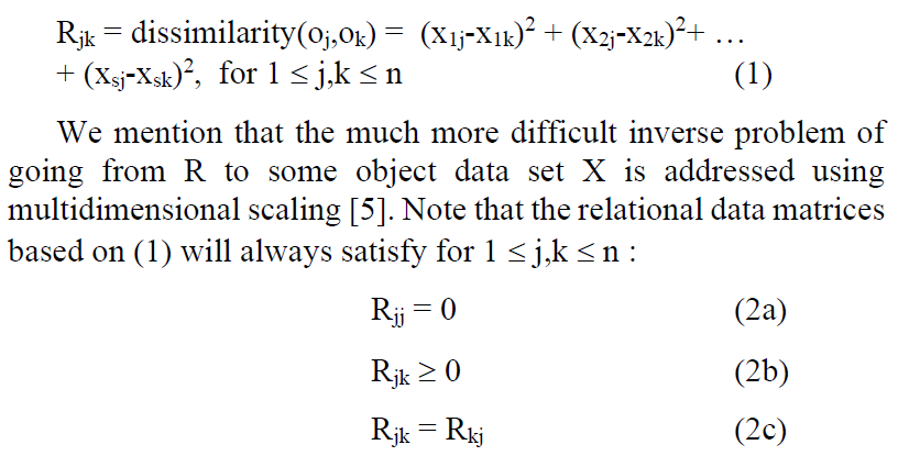
We demonstrate the importance of ordering by revisiting the school data shown in Fig. 1 using figures taken from [2]. Fig. 2 gives a scatterplot of the data in its original, random ordering, along with the image for its corresponding relational data R, calculated using (1). In the scatterplot of Fig. 2(a), the first ordered point is represented by a red square and the rest of the ordering is represented using line segments connecting consecutively ordered data.
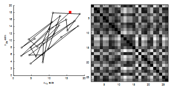
Figure 2. (a) Original X ordering starting with red square. (b) Image of R (uses the original X ordering).
Does the image in Fig. 2(b) usefully describe the cluster structure of the data? No. We cannot determine the number of clusters, the numbers of data in the clusters, the separation of the clusters, or even if there are any clusters. Now we will consider what happens if we reorder the data X (equivalently, the rows and columns of R) according to the VAT procedure. Fig. 3 gives the VAT reordered scatterplot for the data along with a display of the image corresponding to the VAT reordered R*. Notice in Fig. 3(a) that the first 13 data points are relatively close to each other as are the last 13 points. This closeness should generate darker pixels in the top left and bottom right 13 ´ 13 diagonal blocks of the image. Additionally, the relatively larger inter-cluster distances should produce lighter pixels in the other areas of the image. Fig. 3(b) confirms our expectations and gives representations of the two clusters as the two dark diagonal blocks. Appreciate that VAT produces this type of information directly from R, and there is no dependence on the actual dimensionality of the object data X.
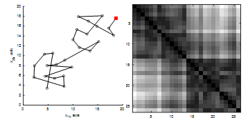
Figure 3. (a) VAT reordering starting with red square. (b) VAT image (uses the VAT reordered R*).
After seeing a few examples, it becomes easy to interpret VAT images in many cases. Blocks on the diagonal correspond to clusters. The number of clusters corresponds to the number of diagonal blocks. The numbers of objects in clusters corresponds to the sizes (i.e., the number of rows or columns of pixels) of the diagonal blocks. The degree of separation between clusters corresponds to the degree of grayscale contrast between diagonal blocks and off-diagonal block areas. When the clusters are compact and well separated, the VAT image shows a stark contrast of nearly black diagonal blocks with nearly white areas elsewhere. The VAT image in Fig. 2 is somewhat muddy in appearance because the clusters are not compact and well separated. The VAT algorithm follows.
Algorithm 1. VAT Reordering [6]
Input: R—n ´ n dissimilarity matrix
Step 1 Set J = {1, 2, …, n}, I = Æ; P(:) = (0, 0, …, 0) .
Step 2 Select (i,j) Î .
Set P(1) = i; I = {i}; and replace J ß J – {i} .
Step 3 For r = 2, …, n:
Select (i,j) Î .
Set P(r)=j; replace IßIÈ{j} and JßJ–{j}
next r.
Step 4 Obtain the VAT reordered dissimilarity matrix R* using the ordering array P as = for 1 £ i, j £ n .
It is possible to use the VAT image as the basis for colorized versions but it turns out that there is an enhanced version, known as improved VAT (iVAT), which was first proposed in [3] and is based on replacing the original dissimilarities with the set of derived minimax distances. It is useful to understand how the minimax data are defined. Think of a complete graph with vertices {v1,…vn} and interpret R as giving edge lengths (i.e., distances) between each pair of vertices; that is Rjk is the direct distance, i.e., edge length, from vj to vk. What is the minimax distance from vj to vk? Let p be any path from vj to vk and let ep be the maximum edge length (from R) used in path p. Then the minimax distance between vertices vj to vk is defined to be the minimum value of ep over all possible paths p from vj to vk, and this value is taken to be the new minimax dissimilarity (or distance) between xj and xk.
There are predictable effects resulting from the switch to minimax data. First, all points within a cluster become nearer and more equidistant to each other, and this often provides more uniformity of tone in the diagonal blocks. Second, many or all points within one cluster share a common minimax distance to points in another cluster, which also gives off-diagonal block areas a more uniform appearance. Usually there is more observable contrast between diagonal blocks and off-diagonal areas using minimax data. Lastly, it is important to note that while both Euclidean and minimax distances work great for separated hyperspherical clusters, it is true that minimax distances can better handle cases of chainlike and stringy clusters by keeping intra-cluster pairwise distances more uniformly small. Fig. 4 gives the iVAT image corresponding to the school data.
Notice the increased uniformity of both diagonal and off-diagonal blocks. Note also the high degree of contrast. The imagesc command in Matlab does a virtual rescaling of the matrix range of values to [0,1] so that every VAT or iVAT image produced by it will include black pixels on the diagonal and at least one pure white pixel off the diagonal. Comparing Fig. 4 to Fig. 3(b) we see the usual situation; iVAT images provide cleaner and clearer descriptions of cluster structure than VAT images. For this reason, we choose to use iVAT as the basis for our higher dimensional substitute for scatterplots; it will represent the cluster structure and added color will represent the label category information.
Figure 4. iVAT image (uses the VAT reordered minimax distances).
The originally proposed iVAT from [3] is done in a relatively inefficient manner. It is shown in [4] that greater efficiency (i.e., an order of magnitude of complexity) can be gained by first applying VAT to the original relational data R to get the VAT reordered R*, and then finding the minimax form of R* which we denote throughout the following by R’*. The special properties of a VAT reordered R* allow certain opportunities to gain efficiency in calculating the minimax distances. To be clear, the efficient technique in [4] produces an equivalent result to that obtained by finding the minimax version of R and then applying VAT. The efficient approach for minimax distance calculation is given next in Algorithm 2.
Algorithm 2. Efficient iVAT Calculation of Minimax Dissimilarities [4]
Input: R*—VAT reordered n ´ n dissimilarity matrix
Step 1 Initialize minimax dissimilarity matrix = [0]n´n
Step 2 For r = 2, …, n
j =
= , c = j
= max { }, c = 1, …, r-1, c ¹ j
next r
Step 3 is symmetric, thus =
To calculate an iVAT image for an original set of randomly ordered relational data R, we first apply Algorithm 1 to transform R to the VAT reordered R*, and then apply Algorithm 2 to R* to get the final iVAT matrix R’*. The display of R’* gives a nice image as in Fig. 4. A thorough and recent survey of VAT-based visualization schemes is given in [8], and discussion relating VAT to clustering methodology can be found in [1]. The VAT and iVAT images are part of a much larger set of visualization methodology known as cluster heat maps. A useful partial survey of heat maps through 2009 is found in [9]. In the next section we put color to the canvas.
3. Ordering and Colorization Schemes
In this section we introduce four schemes for adding color to the iVAT image R’*: two that use exactly the iVAT matrix R’* and two that use a label-reordered version of it. Note that the two using a label-reordered version still require application of iVAT in order to efficiently get the minimax distances which give us the clearest pictures.
We start by using an example to describe exactly what is meant by the Label Reordering (LR) of iVAT. In our example suppose that R’* is produced by iVAT and that the column and row orderings of R’* correspond to the object ordering
![]()
Also suppose that the corresponding label array for this iVAT ordering of objects is L* = [2, 1, 1, 2, 1, 2, 1, 1]. We can readily see in this example that there are 8 objects and 2 categories and can easily determine the category of each object. For example, since o4 is the fifth object in the iVAT ordering of (3) and L*(5) = 1, we know that o4 is in category 1. What exactly is the LR for this example? It is the ordering obtained by first pulling out all the category 1 objects from (3), going from left to right, and then concatenating to it the list of all category 2 objects, going from left to right. Doing this for the example gives the LR order of objects
![]()
In doing the LR reordering the objects are never actually referenced. Instead, L* is used to find the permutation that would take (3) to (4) and then the permutation is applied directly to L* and the rows and columns of R’*. Note that the LR permuted form of L* is simply [1, 1, 1, 1, 1, 2, 2, 2]. The process is continued in the obvious way if there are more than 2 categories.
So the two ordering schemes used later are iVAT and LR. Before stating the two colorization schemes we give a little background for manipulating digital images in Matlab. Suppose that R is a 2-dimensional matrix representing a monochrome image that we wish to colorize. We first need to scale R and then convert it to red, green, blue (RGB) format. This can be done in Matlab using the pair of statements R = R ./ max(max(R)) and R = cat(3,R,R,R). Execution of these two statements converts R to a 3-dimensional structure where Ri,j,1, Ri,j,2 and Ri,j,3 respectively give numerical values for the red, green and blue components of pixel (i,j). It is helpful to scale R immediately before conversion to RGB so that changes to the color components done by the colorization schemes will have consistent, predictable impact. In our implementations we use the following associations in Table 1 between category (or label) number, color and RGB values:
Table 1: Category-Color Associations
| Category Number | Name of Associated Color | [R,G,B] Values |
| 1 | red | [1,0,0] |
| 2 | green | [0,1,0] |
| 3 | blue | [0,0,1] |
| 4 | cyan | [1,1,0] |
| 5 | magenta | [1,0,1] |
| 6 | yellow | [0,1,1] |
| 7 or more | black | [0,0,0] |
This color scheme is implemented and referenced in the algorithms using the label color matrix C given by
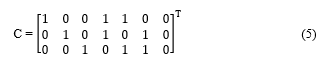
Sometimes we will refer to Rij as the matrix or structure entry and sometimes as the corresponding pixel. Also, the notation “:” should be understand (as in Matlab) to indicate free range of that parameter. In other words, C(2,:) refers to row 2 of C. As an example of using C, the color for category 3 has [R,G,B] values C(3, 🙂 = [0, 0, 1] which is blue. More colors can easily be included by adding rows to C. The choice of C in (5) suffices for us as we do not have examples with more than 7 different label categories.
We now describe the two colorization schemes. The first type of colorized image is said to be Diagonally Colorized (DC), which when paired with the two ordering schemes gives the two images DCiVAT and DCLR. Here each diagonal pixel, is assigned the label color of its corresponding object. For an example, let R** denote the result of scaling and then converting to RGB format either the iVAT matrix R’* or the LR version of it. If the third row (and column) of the matrix R** corresponds to an object that is in category 2, then the (3,3) pixel is made (pure) green by assigning the RGB values of C(3,:) = [0, 1, 0] to . This is a simple approach that gives clear information if the number of data is very small, but a single diagonal pixel may be very difficult or impossible to see if the number of data is large. For large data sets, we include the option of coloring B additional bands of elements to the immediate right and underneath the diagonal pixels; in the previous example that would mean to not just colorize but to also change RGB color values of , , …, and , , …, to all match . This thickened diagonal band will be visible for images of any size, as long as the number of additional bands B is approximately equal to n/50 or larger. Examples in the next section will give the reader a feel for how many additional bands are needed. Algorithm 3 which gives the first pair of our colorized images, DCiVAT and DCLR, is given next.
Algorithm 3. Diagonal Colorization: DCiVAT and DCLR
Input: R—n ´ n dissimilarity matrix
L—1 ´ n array where L(j) = category label of oj
T—string giving order type to use: iVAT or LR
B—scalar in {0,1,2,…,~n/25} denoting the number of additional color bands
C—c ´ 3 matrix giving label color RGB values
Step 1 Apply Algorithm 1 (VAT) to R to get R* and 1 ´ n
permutation array P
Step 2 Obtain the reordered label array L* using the permutation
array P by L*(j) = L*(P(j)) for 1 £ j £ n .
Step 3 Apply Algorithm 2 (iVAT) to R* to get R’*
Step 4 If T = iVAT, then do not alter R’*
If T = LR, then overwrite R’* by its LR version and L* by its LR version
Step 5 Scale R’* to have all elements in [0,1] and convert the scaled matrix R’* to RGB color format structure R**
Step 6 For r = 1, …, n
Change RGB color values of diagonal pixel to C(L*(r), 🙂
next r
Step 7 If B > 0, Change RGB color values of B pixels to right and below to match the new color of the diagonal pixel.
For r = 1,…,n
Change RGB color values of , , …, and , , …, to all match C(L*(r), 🙂
next r
The second type of colorized image is said to be Block Colorized (BC), which when paired with the two ordering schemes gives BCiVAT and BCLR. In the block-colorization approach we color a pixel whenever it is intracategory, i.e., the row and column objects corresponding to that pixel share the same category. This procedure will colorize many pixels compared to the diagonal-colorization approach and if care is not taken then cluster information depicted by various shading patterns could be destroyed by overly intense off-diagonal colorization. Rather than make complete changes to the effected pixels, we redefine them as the average of the old RGB values and the new category RGB ones; i.e., we change the RGB color values of intra-category pixels to equal the average of (old) and C(L*(r), :). This has an analogous effect to using stain and not paint on a piece of wood; we get the advantage of color but can still see the grain underneath the color. Algorithm 4 is given next which gives the last two of our colorized images, BCiVAT and BCLR.
Algorithm 4. Block Colorization: BCiVAT and BCLR
Input: R—n ´ n dissimilarity matrix
L—1 ´ n array where L(j) = category label of oj
T—string giving order type to use: iVAT or LR
C—c ´ 3 matrix giving label color RGB values
Step 1 Apply Algorithm 1 (VAT) to R to get R* and 1 ´ n
permutation array P
Step 2 Obtain the reordered label array L* using the permutation
array P by L*(j) = L(P(j)) for 1 £ j £ n .
Step 3 Apply Algorithm 2 (iVAT) to R* to get R’*
Step 4 If T = iVAT, then do not alter R’*
If T = LR, then overwrite R’* by its LR version and L* by its LR version
Step 5 Scale R’* to have all elements in [0,1] and convert the scaled matrix R’* to RGB color format structure R**
Step 6 Change RGB color values of intra-category pixels
For all (r,t) Î {1,…,n} ´ {1,…,n} with L*(r) = L*(t)
Change the RGB color values of to equal
the average of (old) and C(L*(r), 🙂
In the next section we report on various experiments involving the four approaches. Which type of colorization is better, DC or BC? Which type of ordering is better, iVAT or LR? Does any combination of colorization and ordering produce a useful higher dimensional analogue to the 2-dimensional colorized scatterplot?
4. Experiments
In the first part of this section, we give all four new images for each in a set of seven 2-dimensional examples. The 2-dimensional examples allow us to compare the images directly to colorized scatterplots, and this will help us achieve two goals: (1) develop some skill in properly interpreting the new colorized images, and (2) determine if some of the new colorized approaches work better than others. Note that there is always color consistency between scatterplots and colorized images; i.e., scatterplot points of a certain color correspond to image pixels of the same color.
Example 1. Hypothetical School Data from Section 1.
Fig. 5 repeats the colorized scatterplot for the School Data along with its four corresponding new images. Note that DCiVAT in Fig. 5(b) most clearly represents the situation of the single minority point in the green cluster and the two minority points in the red cluster. BCiVAT in 5(d) gives the same information but the colorized strips outside of the main diagonal blocks are a little distracting, at least initially. The DCLR and BCLR images in Fig. 5(c) and 5(e), respectively, disrupt the main diagonal block structure of the iVAT image by reordering according to category, but these images still convey the information of the scatterplot. Note how the off-diagonal-block patches of gray are essential for interpretation; for example, the vertical off-diagonal gray bars in Fig. 5(e) indicate that the last two green points are near (or in) the red cluster. No extra diagonal bands are needed (i.e., B = 0) for DCiVAT and DCLR because of the small sample size n = 26. With each example, notice which type of image most transparently and naturally conveys the essential cluster and category information in the scatterplot.
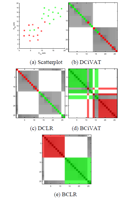
Figure 5. Colorized scatterplot and four images; sample size n = 26; extra diagonal bands B = 0 for DCiVAT and DCLR.
Example 2. Data with Perfect Alignment between Spatial Clusters and Label Categories.
Fig. 6 gives the scatterplot and corresponding images. This example covers the ideal case where the clusters are well separated and perfectly aligned with the label categories. In this simple case each approach perfectly captures the essential information in the scatterplot. Each image shows the presence of 3 well-separated clusters, each filled with points of a single label category. Diagonal blocks, each of single color with light off-block areas, imply alignment between clusters and categories is total. Relative block sizes indicate the red cluster has about 3 times as many points as the blue and green clusters. The iVAT-produced minimax distances allow the stringy clusters to be handled just as naturally as the cloud clusters. The diagonals of DCiVAT and DCLR are slightly thickened for the sample size n = 53 using B = 1 extra bands of pixel coloration.
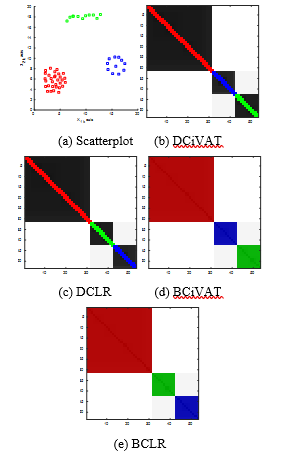
Figure 6. Colorized scatterplot and four images; sample size n = 53; extra diagonal bands B = 1 for DCiVAT and DCLR.
Example 3. Data with No Alignment between Spatial Clusters and Label Categories.
Fig. 7 gives the scatterplot and corresponding images. The scatterplot in Fig. 7(a) shows 3 well-separated spatial clusters having virtually no alignment between clusters and label categories. Once again, the DCiVAT image gives all the information in a clear fashion. It shows there are three spatial clusters and that each cluster has a mixture of points from each of the three label categories. The BCiVAT image is similarly informative but the colorful off-diagonal pixels are somewhat distracting. Note that the reordering of DCLR and BCLR has seriously disguised the spatial cluster information, and to reconstruct it you have to notice that the red objects appear in 3 small clusters, as do each of the green and blue objects. This could all be explained by having 3 mixed clusters as in the scatterplot but having to do this type of reconstruction is awkward at best.
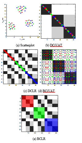
Figure 7: Colorized scatterplot and four images; sample size n = 52; extra diagonal bands B = 1 for DCiVAT and DCLR.
Example 4. Data with No Spatial Clusters.
Fig. 8 gives the scatterplot and corresponding images. In this example we have a data set with virtually no cluster structure. In each of the images, a uniform gray tint and an absence of dark diagonal blocks indicate a lack of spatial clusters. The scatterplot contains additional information, though. There is some segregation of red and green points, while the blue and cyan ones are mixed together. Do any of the images in Fig. 8 represent this? The DCLR and BCLR do not give the color organization information in an easily interpreted form. No doubt the ghost diagonals in the bottom right-hand quarter of the DCLR and BCLR images contain some of this information but it is difficult to interpret. On the other hand, the iVAT ordering in DCiVAT and BCiVAT shows extensive intermingling of blue and cyan, along with some segregated groups of red and green. It is not a perfect representation of the scatterplot but it is consistent with what is shown there and it is instantly interpretable. Lastly, note the larger sample size n = 122 gives a need for B = 3 extra bands to widen the colorized diagonals in DCiVAT and DCLR.
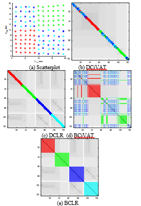
Figure 8. Colorized scatterplot and four images; sample size n = 122; extra diagonal bands B = 3 for DCiVAT and DCLR.
Example 5. Data with More Spatial Clusters than Label Categories.
Fig. 9 gives the scatterplot and corresponding images. This example is quite easy for all four approaches. The scatterplot shows 5 well-separated clusters: 1 red cluster, 2 blue clusters and 2 green clusters. This information is indicated most clearly by DCiVAT and DCLR. The BCiVAT and BCLR images are also consistent with the scatterplot and easily understood, but slightly more awkward because of the lighter blue and green off-diagonal blocks. Notice that the blue diagonal blocks in DCiVAT are not adjacent while the green ones are, and this shows that adjacency of blocks does not necessarily imply nearness of corresponding spatial clusters.
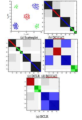
Figure 9. Colorized scatterplot and four images; sample size n = 75; extra diagonal bands B = 1 for DCiVAT and DCLR.
Example 6. Data with Touching Spatial Clusters #1.
Fig. 10 gives the scatterplot and corresponding images. Several of the previous examples have dealt with extreme cases but we include one here with a more likely property: the existence of spatial clusters that are not well separated. The scatterplot in Fig. 10(a) shows a data set with a red, green and (mostly) blue cluster. The green and blue clusters are touching and could arguably be considered a single cluster. Notice what the images indicate for this example. At first glance, DCLR and BCLR seem to do a good job, indicating the presence of 3 clusters, each cluster populated by points of a single label category. The results for DCiVAT and BCiVAT are essentially the same but with the additional information that a couple of the green points may be invasive to the blue cluster. In each image the large dark block containing the blue and green areas indicate that those two clusters are very near each other and could arguably be considered a single cluster.

Figure 10. Colorized scatterplot and four images; sample size n = 104; extra diagonal bands B = 2 for DCiVAT and DCLR.
Example 7. Data with Touching Spatial Clusters #2.
Fig. 11 gives the scatterplot and corresponding images. First note the spatial similarity of this and the previous example that is evident in a comparison of the Fig. 10(a) and Fig. 11(a) scatterplots. The real difference is all about the labeling of the points in the touching clusters. Notice how the DCiVAT and BCiVAT images in Fig. 11 perfectly represent the situation; there is a distant cluster of red points and a single cluster of points with commingled green and blue labels. On the other hand, DCLR and BCLR represent this and the data from Example 6 in an essentially identical manner, and we view this as a serious fault of the label reordering schemes.
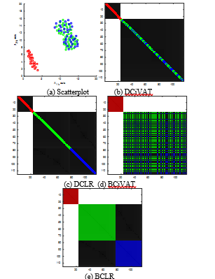
Figure 11. Colorized scatterplot and four images; sample size n = 115; extra diagonal bands B = 2 for DCiVAT and DCLR.
In the second group of examples we will apply all four approaches to higher-dimensional data sets taken from the UCI Machine Learning Repository at https://archive.ics.uci.edu/ml/index.php. The data sets used for the experiments below can be found by searching there for ‘iris’, ‘divorce’ and ‘seeds’. For each data set we only give the four new images since no scatterplot is possible.
Example 8. Iris Data [10].
Fig. 12 gives the corresponding images. This data is considered to be real-valued continuous. Fisher’s Iris Data [10] has probably been used more often in demonstrating clustering and classification schemes than any other data set. In this example we use the “bezdekIris.data” version of the data set from UCI. It consists of 150 4-variate object data describing the Setosa (red labels), Versicolor (green labels) and Virginica (blue labels) subspecies of iris. The data set contains 50 observations for each of the 3 subspecies, with each observation giving a measurement of sepal length, sepal width, petal length and petal width. Various colorized scatterplots of 2-dimensional slices of the Iris Data are available in the literature (e.g., page 82 of [1]) and the images in Fig. 12 are consistent with what is known about it. The Setosa (red) cluster is well separated from the other two overlapping clusters. Note that the DCiVAT and BCiVAT images indicate the possible intrusion of the Virginica cluster by Versicolor data.
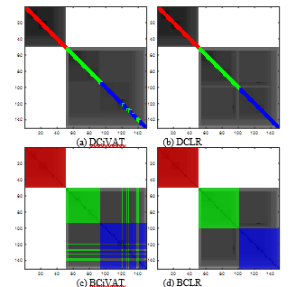
Figure 12. Four images for 4-variate Iris Data; sample size n = 150; extra diagonal bands B = 3 for DCiVAT and DCLR
Example 9. Divorce Data [11].
Fig. 13 gives the corresponding images. This data is considered to be integer valued and is from [11]. It consists of 170 54-variate data from 84 divorced (red label) and 86 married (green label) couples. Each person interviewed gave answers of the form 0 (never), 1 (seldom), 2 (average), 3 (frequently), 4 (always) to each of 54 questions such as “I feel right in our discussions” and “I wouldn’t hesitate to tell her about my wife’s inadequacy”. All images indicate fairly separated clusters that are well aligned with the categories. There may be a bit of a trail of red transition points leading from the core of the red cluster over to the green cluster. The DCiVAT and BCiVAT images also indicate possible red intrusion into the green cluster. Appreciate that we have done something analogous to a colorized scatterplot even though we have 54-dimensional data!
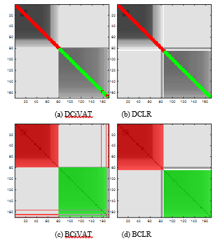
Figure 13. Four images for Divorce Data; sample size n = 170; extra diagonal bands B = 4 for DCiVAT and DCLR.
Example 10. Seeds Data [12].
Fig. 14 gives the corresponding images for our final example. The real-valued, continuous Seeds Data is from [12] and consists of 210 7-variate observations of 3 varieties of wheat: Kama (red label), Rosa (green label), and Canadian (blue label). The data is divided equally among the 3 categories. Each datum consists of measurements of 7 geometric parameters of wheat kernels: area, perimeter, compactness, length, width, asymmetry coefficient and length of kernel groove. All of these measurements are obtained using a high-quality imaging of the kernel done by a soft X-ray technique. The DCiVAT and BCiVAT images indicate the presence of poorly separated clusters. There appears to be a green labeled cluster and a large red-blue one. The red-blue one has a red core part, a blue core part, and a mixed part. The DCLR and BCLR images may at first seem to indicate 3 cleanly aligned spatial clusters but the dark off-diagonal block is a reminder that there is considerable red and blue intermingling. This example is probably typical of many; it provides an imperfect but useful glimpse of some of the information that we seek.
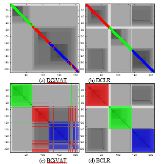
Figure 14. Four images for Seeds Data; sample size n = 210; extra diagonal bands B = 5 for DCiVAT and DCLR.
5. Discussion
In this paper we presented four colorized images that simultaneously display cluster and category information for labeled object data sets of any dimension. These four approaches are obtained by combining a colorizing scheme (Diagonalized or Block) with an ordering scheme (iVAT or LR). Having tested all approaches on the diverse set of examples in Section 4, we can now assess DCiVAT, DCLR, BCiVAT and BCLR. We believe that the superior method among the four is DCiVAT. In every 2-dimensional experiment it produced an accurate reflection of the corresponding scatterplot in a way that is most easily understood. We will say more about DCiVAT after we give specific criticisms of the other three approaches.
The label reordered approaches DCLR and BCLR may only give good results in the simplest possible case, when there are well-separated clusters with (nearly) perfect alignment between clusters and label categories. This situation is demonstrated in Example 2 where all colorization schemes did equally well. We found no situation where LR ordering works better than iVAT ordering and some where it absolutely fails, such as that seen by comparing Examples 6 and 7; in those examples DCLR and BCLR gave nearly identical results for two very different situations. In other examples LR ordering preserves, but scrambles, the cluster information so that visual interpretation of the images is [ complicated; Example 3 gives a clear case of such cluster obfuscation. To summarize, LR is never better, sometimes flat wrong and at other times unnecessarily awkward. Additionally, the process of first doing iVAT and then undoing that ordering to get LR adds computational overhead above that of DCiVAT and BCiVAT.
In comparing DCiVAT to BCiVAT we know the ordering is the same and so it is only about the relative merits of the two different colorization schemes. Preference between these is admittedly subjective. There are cases where a BCiVAT image is very clear in its depiction of the data set, as in Example 7, and other cases where there is enough off-diagonal action to be distracting, as in Examples 3 and 5. It is possible that adjustments to BCiVAT that lighten the off-diagonal part of the image might very well improve its readability, but will it then produce something clearer than DCiVAT? We do not think so. Our conclusion is that BCiVAT is good, but DCiVAT is also good and never produces visually awkward results. DCiVAT is also the most straightforward of the four schemes to describe or program. Simply do iVAT and then colorize the diagonal pixel to match the category labels. Adding extra bands of colorization is easily done in the routine by adding one double loop. While our Matlab routines were written to allow the user to specify the number of additional colorization bands B, this choice could be automated in the DCiVAT program by using something like B = floor(n/25). Python users can get the core VAT and iVAT routines written by Ismaïl Lachheb at https://pypi.org/project/pyclustertend/ .
This paper is concluded with a few ideas about possible future research involving DCiVAT or related colorization schemes. The first opportunity may be to colorize other VAT-type approaches. Many VAT type procedures have been devised since the original paper [6], and [8] gives a thorough survey of most of them with a total of 184 references. For example, there are various big data variants of VAT beginning with [13] and continuing through more recent work as in [14]. There are VAT-based procedures for rectangular (i.e., not square) relational data matrices [15,16] and even streaming data [17]. Are there opportunities in this vast set of methodology to add useful colorization, for depicting either label information or something else? Color is effectively used in [18] to draw attention to parts of 3-dimensional scatterplots. Are there more opportunities to usefully colorize? Might a block colorization scheme be more natural than diagonal colorization in some cases, such as for rectangular data matrices?
Another opportunity may be to refine our ability to interpret iVAT and colorized iVAT images. Did the examples in Section 4 teach us everything about DCiVAT interpretation or would a more extensive and systematic study yield more? Is it possible to use a colorized iVAT image to visually display the performance of a classifier, where correctly classified objects can be visually differentiated from incorrectly classified ones? Is it possible to tweak BCiVAT in a way that lowers its off-diagonal level of distraction? We should think more creatively about adding colorization to further increase the usefulness of VAT approaches.
Conflict of Interest
The authors declare no conflict of interest.
- J.C. Bezdek, Elementary Cluster Analysis: Four Basic Methods that (Usually) Work. Gistrup, Denmark: River Publishers, (2022).
- E.D. Hathaway, R. Hathaway, Diagonally colorized iVAT images for labeled data, submitted to the IEEE International Conference on Data Mining, Orlando, FL, USA, (2022), doi: 10.1109/ICDMW58026.2022.00043.
- L. Wang, T. Nguyen, J. Bezdek, C. Leckie, K. Ramamohanarao, iVAT and aVAT: enhanced visual analysis for cluster tendency assessment, in: M.J. Zaki, J.X. Yu, B. Ravindran, V. Pudi (Eds.), Advances in Knowledge Discovery and Data Mining. PAKDD 2010. Lecture Notes in Computer Science, 6118. Springer, Berlin-Heidelberg, (2010) 16-27, doi: https://doi.org/10.1007/978-3-642-13657-3_5.
- T.C. Havens, J.C. Bezdek, An efficient formulation of the improved visual assessment of cluster tendency (iVAT) algorithm, IEEE TKDE. 23 (2011) 568-584, doi: 10.1109/TKDE.2011.33.
- I. Borg, P.J.F. Groenen, Modern Multidimensional Scaling: Theory and Applications, 2nd Edition. Springer, New York, (2005).
- J.C. Bezdek, R.J. Hathaway, VAT: A tool for visual assessment of (cluster) tendency, Proc. IJCNN, IEEE Press. (2002) 2225-2230, doi: 10.1109/IJCNN.2002.1007487.
- R.C. Prim, Shortest connection networks and some generalizations, Bell System Technical Journal. 36(1959) 1389-1401, doi: 10.1002/j.1538-7305.1957.tb01515.x.
- D. Kumar, J.C. Bezdek, Visual approaches for exploratory data anlysis: A survey of the visual assessment of clustering tendency (VAT) family of algorithms, IEEE SMC Magazine. 6(2020) 10-48, doi: 10.1109/MSMC.2019.2961163.
- L. Wilkinson, M. Friendly, Michael, The history of the cluster heat map, The American Statistician. 63(2009) 179-184, doi: https://doi.org/10.1198/tas.2009.0033.
- R.A. Fisher, The use of multiple measurements in taxonomic problems, Annals of Genetics. 7(1935) 179-188, doi: https://doi.org/10.1111/j.1469-1809.1936.tb02137.x.
- M. Yöntem, K. Adem, T. İlhan, S. Kılıçarslan, Divorce prediction using correlation-based feature selection and artificial neural networks, Nevşehir Hacı Bektaş Veli University SBE Dergisi, 9(1) (2019), 259-273, Retrieved from https://dergipark.org.tr/en/pub/nevsosbilen/issue/46568/549416.
- M. Charytanowicz, J. Niewczas, P. Kulczycki, P.A. Kowalski, S. Lukasik, S. Zak, A complete gradient clustering algorithm for features analysis of X-ray images, Information Technologies in Biomedicine, Ewa Pietka, Jacek Kawa (eds.), Springer-Verlag, Berlin-Heidelberg, (2010), 15-24, doi: https://doi.org/10.1007/978-3-642-13105-9_2.
- J.M. Huband, J.C. Bezdek, R.J. Hathaway, bigVAT: Visual assessment of cluster tendency for large data sets, Pattern Recognition. 38 (2005), 1875-1886, doi: https://doi.org/10.1016/j.patcog.2005.03.018.
- L.H. Trang, P. Van Ngoan, N. Van Duc, A sample-based algorithm for visual assessment of cluster tendency (VAT) with large datasets, Future Data and Security Engineering (Lecture Notes in Computer Science, 11251) J. Kung, R. Wagner, N. Thoai, M. Takizawa (eds.), Springer-Verlag, Cham, Switzerland (2018), 145-157, doi: https://doi.org/10.1007/978-3-030-03192-3_11.
- J.C. Bezdek, R.J. Hathaway, J.M. Huband, Visual assessment of clustering tendency for rectangular dissimilarity matrices, IEEE Trans. Fuzzy Syst. 15 (2007), 890-903, doi: 10.1109/TFUZZ.2006.889956.
- T.C. Havens, J.C. Bezdek, A new formulation of the coVAT algorithm for visual assessment of clustering tendency in rectangular data, Int. J. of Intelligent Systems. 27(2012), 590-612, doi: https://doi.org/10.1002/int.21539.
- D. Kumar, J.C. Bezdek, S. Rajasegarar, M. Palaniswami, Adaptive cluster tendency visualization and anomaly detection for streaming data, ACM Trans. On Knowledge Discovery from Data. 11(2016), 1-40, doi: https://doi.org/10.1145/2997656.
- I.J. Sledge, J.M. Keller, Growing neural gas for temporal clustering, Proc. Int. Conf. Pattern Recognition. (2008), 1-4, doi: 10.1109/ICPR.2008.4761768.
Citations by Dimensions
Citations by PlumX
Google Scholar
Crossref Citations
No. of Downloads Per Month
No. of Downloads Per Country