
The Designing of Institute’s Educational Mascots for Brand Identity
Volume 5, Issue 6, Page No 1759-1777, 2020
Author’s Name: Nop Kongdeea), Suparada Prapawong, Manissaward Jintapitak
View Affiliations
Department of Animation and Visual Effects, College of Arts, Media and technology, Chiang Mai University, Chiang Mai, 50200, Thailand
a)Author to whom correspondence should be addressed. E-mail: nopmerzy@gmail.com
Adv. Sci. Technol. Eng. Syst. J. 5(6), 1759-1777 (2020); ![]() DOI: 10.25046/aj0506210
DOI: 10.25046/aj0506210
Keywords: Character Design, Mascot Design, Toy and Souvenir, Representative, Graphic Identity, Advertising, 3D Printing, Institute Marketing, Thai Cultural, Thai Character Design, University Advertising, Graphic Design, Symbol analysis, Concept Arts, Arts and Design

Export Citations
The purpose of this study is to show how to design the character used as the symbol or Mascot of the educational institution and how to apply the design results into advertising and Brand identity design such as printing art, poster, digital media, toy, and souvenir. In this study, the ideas of mascot design have been leaded to present a contemporary design under the conceptual framework from local culture, organizational culture, theories of society, arts and design through the analysis and synthesis of the organization, which is CAMT from Chiang Mai University, as the model of this study. CAMT has 7 bachelor’s degree majors, namely Animation and Visual effects (ANI), Software Engineering (SE), Digital Film (DF). Modern Management and Information Technology (MMIT), Digital Game (DG), Digital Industry Integration (DII) and Knowledge Innovation Management (KIM). These Mascot design group were applied into Art product such as poster, Line sticker and end up with Toy product as a final stage, it was using digital 3D printing for action figure product in prototype level. This study including Toy creating concept designing and how the outcome product affected to Mascot identity, institution brand and the target groups of study which are widely from generation X to Z, mostly age range 18-23 years old. As a result, it founded that this Mascot package advertising becomes the distinctive character creating the new image of CAMT and the enhanced of Toy design product that raise CAMT remembered as a contemporary and digital organization in Chiang Mai University. Accordingly, it produced the impact results to receivers in many dimensions involving trend, creative behaviors such as Fan Art design, Doujinshi, or Caricature, Cosplay, Arts, and craft also Subculture from the public user.
Received: 05 November 2020, Accepted: 21 December 2020, Published Online: 30 December 2020
1. Introduction
This paper is an extension of work originally presented in 2020 Joint International Conference on Digital Arts, Media and Technology with ECTI Northern Section Conference on Electrical, Electronics, Computer and Telecommunications Engineering [1]. In the lights of arts and designing, a mascot1 is an effective public relation, promotion and marketing means of building brand images. A mascot is an extension of a logo in order to create the deeper dimension of image by building graphic identities or brand identities, it bears the responsibility of lifting the spirits of the group as well [2] which is highly popular nowadays. The building of a brand can rely on different techniques. However, most of the time, it involves the design of products such as shirts, hats or even collectibles that are memorable and tangible.
As for this project, it concerns the creation of new mascots based on the rebranding of College of Arts, Media, and Technology (CAMT2) Organization, Chiang Mai University,
Thailand. This college offers courses that are relating to Digital Contents in fields of Sciences and Arts focusing on innovation and digital technology. This project involves the designing of the new mascots for CAMT that correspond to the vision of the organization that emphasizes on digital innovation and advancement. Thus, the direction for the designing of the mascots/characters focuses on modernity and concurrence with the vision of CAMT and images of Chiang Mai University while building new images that focus on the dimension if arts and designing of Chiang Mai province simultaneously. Thus, it is apparent that the scope for the design corresponds to culture, images and perspectives that are overlapping on one another in various dimensions. Nevertheless, a new and meaningful image, which is the core outcome of this project, depends on the designing method, analysis and definition.
Marketing and promotional extensions an important element that leads to the memorization of brand identities. To achieve this requires images to consist of multi-dimensional perspectives that do not go beyond the conceptual framework, such as the design of envelope, letterhead, graphics on shirts and even graphic posters in the forms of digital media and digital image communication (stickers of Line application), as well as the design of toys and souvenirs, which are included as parts of the creation in this project. It is expected that the designed mascots will lead to the added value to the brand and the wide publication of promotional media and images in unique manners.
2. Literature Review of Mascot and Brand
In [3], it is stated that brand identity is how a company is being identified. The consistency of this brand identity is formed by its features like culture, vision, personality, positioning, presentations, relationships and other meaning beliefs followed by the entity. In term of commerce, brand identity is required to create costumers’ awareness and remembrance in order to get access and chosen from consumers. However, there are many methods of brand identity expression which mascot is one of the potential paths.
It is quoted that the origin of the word “Mascot” is derived from “Mascara” or mask in the etymological dictionary [4], Corominas (1980, 1985) collected the first identifiable written use of the word “Mascota” or mascot in the year 1233. The word “Mascot” comes from the provincial language “Mascoto” which means magical things or amulets. Afterwards, it has been abbreviated to be “Masco” which roughly means which that relates to supernatural [5]. This is the linguistic and meaning background of the word “Mascot” which leads to the perception that “Mascot” is the representative of mask and magic.
“Mascot” would be a real person or animal or a character (or a group) used continuously and in different poses and attitudes to represent, advertise or promote a product, a brand, a company or institution, an event or a specific cause [6]. Therefore, mascot could be made of and could be representation of things for gaining awareness and recall and also could make the product alive and cause positive attitude for consumers.
“Mascot is being heralded as the magic bullet in the contemporary marcomms armoury [7]. Visual representation of a brand by using brand mascots is a technique which has been applied by organizations for many years. As the visual ‘ambassador’ of a brand, the mascot’s goal is to strengthen the brand identity. The visual properties which are translated by these mascots can cause the distinctiveness of a brand [8]. It could be concluded that mascot is one of the most powerful tools for communication of brand’s identity as we could see many famous brands with their identities’ representation by mascots for instance: Michelin Man by Michelin, Mr. Peanut by Planters, The Laughing Cow by The Laughing Cow, Mickey Mouse by The Walt Disney Company, Jolly Green Giant by B&G Foods, etc. Therefore, it has assured that mascot is appropriate with intimate image with consumers setting organizations [9]. Another reaffirmation is that Mascot usage in Thailand tends to be usage for public relations mainly in events [10]. It has been mentioned that 60% of tourists in Shiga Province, Japan has been increased by the Hikonyan mascot. All this information insist that mascot is a very important instrument for communication, especially for brand identity representation.
3. Analysis of the Symbol
“Meaning” is defined that while everything has its meaning, meanwhile, everything does not have a chance to form its meaning by itself. Human is the entire meanings former which is not under human nature in an individual context to create meaning for things. It takes at least two or more humans to perform to make it meaningful where perception of meaning of things is based on experiences from the five senses. Since the past, interpretation and meaning transmission have been hidden in many visual languages [11]. Symbol is one of the hidden visual languages which is significantly influence interpretation and perception of human for a long time.
In general, mascot is a mean to create brand identity, and has the objective to enable people to remember an organization through a unique character in addition to logo design because a mascot is created within the similar framework of art concepts, such as the use of colors, shapes and forms. A mascot is one of the channels representing semiotics which denote sign and symbol that has been produced and sent or transmitted to indicate how the meaning of representation was formed, including its understanding of a thing or a process of giving such meaning. Semiology was a tool that could make individuals understand the formation of meaning and its application [12]. Semiotic theory is an “Interpretive” theory that can be applied to most aspects of everyday life although most people would not realise it.
However, a character has the complicated story, as well as emotions, characteristics, identities, style and overall image through the characteristics of the character. Meanwhile, logo design has the limitation; but to create a mascot requires creator to consider the campaigns that the mascot is used for and how to make people remember the mascot. In addition, mascot power can build harmony and unity in an organization such as the use of a mascot of sport teams to promote the organization and tourism of the local area. For instance, the use of the raccoon mascot of American football team of Tennessee, USA. Raccoon is a local animal of Tennessee State; thus, it is used as the mascot to express cultural identity. Therefore, mascot creation is a mean to present organizational culture and images based on the concept of artistic marketing or ‘Graphic Identity, which is a branch of marketing strategy. In the education and academic society, it is known that in Thailand, animals are used for representing, which is relating to the contemporary society, and has endless development in accordance with the ever-changing trend in the global society. As for Chiang Mai University, the representing symbol is an elephant. However, the University has no exact or clear mascot. However, based on the definition of the symbol, it can be said that the keyword that is significant for the creation of core identity of Chiang Mai University is a violet elephant, which has been used for a long period of time although there has never been any exact or official mascot. Therefore, it can be said that a symbol needs people to drive it and time for cultural absorption until it is memorized and defined eventually.
In this case study, College of Arts, Media and Technology (CAMT) is an organization of the university. Thus, the culture of the university dominates the identity of this organization. Consequently, this organization has 2 logos of 2 different types. The first logo is the core logo of the university that is jointly used by all faculties, with the name changed in accordance with each faculty, and the defined logo that is especially designed for the organization (as shown in Figure.1) in order to express the definition of the organization that is contemporary and specific through the use of art compositions and designing.

Figure 1: Logos of College of Arts, Media and Technology (CAMT):
Core Logo and Defined Logo
The aforementioned logos reflect different definitions. The core logo of the university is composed of the symbolic animal and violet color as the focal points of the local, which create identities of the university. Meanwhile, the shapes and forms of components in the logo clearly reflect the Thai style. Meanwhile, the defined logo of CAMT is completely different from the former because it reflects the modernity of the organization. The definition of CAMT is the emphasis on inventions through digital contents. This definition concurs with the courses that this organization opens; hence, the logo is designed to be in a modern form that is minimized, without any implication or symbol of Thai culture used at all. However, the status as being Thai has been defined in the name that is another defined image. In other words, the status as being Thai or Lanna Thai has already been inserted in the contexts of the organization already. However, images or representing symbol that are shown have the aim to reflect the status as a contemporary organization. In addition, the use of color of the organization (faculty) reflects the status as a luxurious and international organization. This logo has been developed from the previous logo that was defined 10 years ago (as shown in Figure 2).
Figure 2: Previous logo of College of Arts, Media and Technology (CAMT)
It is apparent that the contexts of CAMT have changed and the logo has been minimized with the different aim and in a different manner. Originally, the concept of the logo was to make people memorize the alphabets, but the current logo emphasizes on making people memorize an image with contexts. The letter ‘Can has the form like a beehive or geometric form, which concurs with the previous definition. Nevertheless, the contexts of CAMT are flowing and changing along with the changes in different eras and the expansion of scientific and art concepts that still create the complexity of the organization.
Since symbols are changed in accordance with societal ideas and trends that serve as driving forces, mascot designing has been changed accordingly. Originally, there had been 3 mascots to represent the Department of Animation and Games, the Department of Software Engineering and the Department of Modern Management (MMIT) because there were 3 departments back then, which were divided into 6 branches in the bachelor level, as mentioned before. Thus, an interesting question is whether the contemporary design of mascot to reinforce the images of an organization should be for the timeline of 10 years in advance, together with the analysis on the nature and ideas of university students nowadays and in the future (Generations Y-Z) in the scope of organizations of university students or not. However, the implication of CAMT from previous mascot still has core definitions that include freshness, curiosity, contemporaneity and ethicality of students still remain in the symbol. Therefore, it is necessary to use the previous mascot as the basis for the analysis and development for designing a new mascot.
3.1. Previous Mascot
Originally, the previous mascots of CAMT had been designed with the focus on the education and the teaching and learning that was clearly separated by departments. Thus, the designed characters were students in the uniform that precisely reflect the characteristics of the 3 departments, namely, Animation and Game, Modern Management and Software Engineering in the bachelor level (as shown in Figure 3).
Analyzed in the aspect of arts, the 3 previous characters were designed to have color theme which was like an old logo that reflects moods through facial expressions of a board character3, the characteristics of which are reflected through facial expression and shape and form of the eyes. As for the proportion, each of the characters have the proportion of a kid, with a big head, big hands and a small body. This style of design is called Super Deformation (SD)4, which is the deformation of a human body into a downsized body like a deformed body of a small kid. The advantage of this style is that the designed characters are trendy in accordance with the drawing style of Japanese graphic novel that is widely popular. Consequently, the characters are eye-catching and easy to remember.
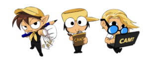
Figure 3: The previous Mascots of College of Arts, Media and Technology (CAMT)
Nevertheless, the mascots with the old definitions and policies have been used for more than 10 years since the establishment of the organization. With new policies and directions, there has been the need for extension and development of these characters so that they are contemporary while reflecting the identities of CAMT and CMU simultaneously.
3.2. Data Identification
College of Arts, Media and Technology has the educational approach that focuses on complexity which includes both sciences and arts, taught in a faculty that has learning method that is changed in accordance with eras, with the emphasis on innovation and digital technology as key principles. Therefore, the analysis and definition of the identities of the university are not fixed because the concepts and directions change annually in accordance with eras and trends. However, some keywords of the organization still remain. For instance, an organization that emphasizes on agriculture and technology may use lines and colors in organic art form in order to enable people to understand the definitions immediately. Alternatively, the Faculty of Political Science and Public Administration uses a scale and a lion as symbols that are related to Thai beliefs and symbolic definition which are combined together to form identities of the organization. As for CAMT, the symbol is designed to reflect the identities CAMT. However, such identities are under the domination of the identities of Chiang Mai University. Thus, there is the combination between identities of CAMT and identities of CMU, only for the identities from the social definition and graphic identities.
Chiang Mai University is an old complex university that provides courses of several subjects including medicine, sciences and arts in several branches, and extends and develops new curricula that fit modern era. From the view of the society, Chiang Mai University is a key University in the northern region of Thailand. At present, the university has the policy that focuses on digital technology and graduates of new generation with the competencies for diverse jobs, ethicality and promptness to the international level. However, such driving also leads to the change in the view of identities. In other words, this leads to the status as a contemporary university that accepts more foreign students, with the emphasis on linguistic aspect and tour system for foreigners in the university, or even the expansion of territory and branches in the northern region of Thailand, and the use of digital systems in the university, which turn the university Smart University, such as vehicle tracking system, game application for introducing places, class attendance (check-in) system with QR code and online method. Therefore, it is apparent that the current definition of the university is concurrent with the policy of CAMT because they are overlapping with each other and go in the same direction.
In addition, the definitions in the two aforementioned parts are also dominated by Lanna Thai status. It can be said that the Thai status and identities in terms of culture, thinking and traditions have control over the overall identity that cannot go out of this frame of social concept or definition. Consequently, the unique identity is created from the combination of several aspects such as media, people, policies, trends and politics, all of which are combined together. Therefore, the identity from the combination of the aforementioned aspects is a basis and component for designing a mascot with a clear scope that is different from a character that is a mascot of a private organization that has a broader scope. Nevertheless, this is no disadvantage. Rather, it enables the creation and designing of a character become clearer. However, there are several factors that are relevant, especially the concepts of the artist and the society which are key factors that lead to the building of the Character Style that are influenced by histories and the society as well.
3.3. Cultural Appropriation and Domination
Cultural Appropriation5 is an approach concerning arts and society and is a key factor for the creation of art works. Therefore, it has both direct and indirect influences on the designing of mascots and characters based on experiences and societal perceptions of the artists or designers, as well as social trends, approaches referred to in a particular era and the implantation of ideas. For example, in this case, it is the creation of characters in the style of manga, which is a result from the great influences that Japanese manga works explored in Thailand to current. As for the designing, the thinking system of the artists focuses on applied art or extended arts, with the adherence to the origin. Therefore, the new identity reflects the combination among manga, original Thai arts and each artist’s ideas. Not only does Thai status in arts and designing refer to lines and drawing but it also means identities, actions and stories that are added to a particular character. Thus, a character can be deemed to have identities that are based on Thai culture although it has culturally mutated or developed, which is called the ‘mixed blood’ or ‘mongrel’. Nevertheless, based on the approach of Culture Appropriation, the aforementioned phenomenon may be deemed a wrongdoing like plagiarism or copying of styles from any other culture in order to build and claim as our culture. Thus, the definitions of culture in various approaches are unclear. On the contrary, identity that is especially from the development of the aforementioned basic approach is accepted by people in the society and eventually becomes a symbol. Thus, the borrowing of culture that is caused from the domination over thinking occurs all the time, with the society acting like the judge and artists acting as presenters [13]. However, goals, objectives and approaches that newly occur have more significant implication. Hence, as for mascot designing at present, artists design their works to reflect the influences from mangas because of the aforementioned factors. It is not surprising that a newly designed character will look like a manga character. In addition, the key overlapping definitions, combined with styles, can create specific identity that serves as representation6 of that society or organization as well. Therefore, cultural burrowing can occur all the time as a normal event in the society and in the field of designing.
3.4. Character Population and Demand
First of all, the target audiences for the mascot designing in this project are students in the age range of 15 – 25 years (Generation x) at present. From the survey, it is discovered that the characters that are popular are in the style of Manga7 and have features of a kid (Manga Cute Characters). The advantage of this approach is the popularity of the style among the target audiences and audiences in other age ranges because cute characters do not mean manga style only; rather, it also means western characters such as Bug Bunny (W. Brothers, 1940). This character is used in western cartoon. It should be noted that this character is not originally created to serve as a symbol or logo but for producing animations for children audience. However, since the popularity of this character rises by dint of the expansion of media, Bug Bunny has become a symbol of western cartoon. Furthermore, Mickey Mouse (W. Disney, 1928) and Elza (C. Buck, 2013) have
made Disney’s cartoon characters memorable and great. In addition, may other characters from movies have also been popular and a societal factor. Examples of such characters are super hero group from Marvel Comics (1939), which have created trends that affect behaviors and thinking. Apart from memorable identities and looks, other attributes of these characters such as characteristics and thinking of the characters can generate new trends and thinking of people in the society. They can also trigger the building of social groups in accordance with personal preferences, which is concurrent with the concept of freedom of thinking nowadays. Looking back to Asian society that has manga characters as the foundations for thinking, one can say that manga characters were originally created to disseminate Japanese culture and thinking. However, with the popularity, manga characters have expanded to Thailand and become imprinted into many Thai artists during their childhood. Consequently, such artists design their works in the directions that they have been imprinted and in accordance with the popularity that evolves in each era.
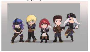
Figure 4: The Experimental Designs of Mascots:
DG – SE – MMIT – Dii – ANI draft 1
The mascots designed in this project belong to an educational organization. Thus, the outfits should be a uniform that reflects Thai culture in the improvised style and politeness in the society, mixed with the identities that the university wants to present, namely, digital technology, modernity and future world, with the basics of the identities from the identities of the university. In this case, violet, which is the color of the university, is used as a component of the design. Thus, in this designing experiment, culture domination and character population play prominent roles. As a result, there is a clear direction for the possible design.
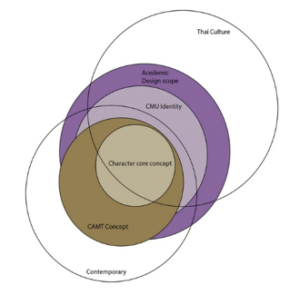
Figure 5: CAMT Mascot Design Scope, the overlapping area of contents analysis to finding of core concept design.
Concerning the concept for designing the characters to represent the educational institute in this case, or CMU (as shown in Figure5), it is apparent that the scopes of the concepts are overlapping. Thai culture has partly taken part in the determination of the concepts of the characters because CAMT also has concepts in the international level. It cannot adhere to only Thai culture. Rather, foreign cultures have also partly played roles. At the same time, certain concepts that are the scopes of an educational organization, such as uniform, knowledge pursuit (curiosity), intelligence and friendliness. Such concepts belong to CMU and CAMT itself. The scopes of CMU have covered all the characters. At the same time, concepts of CAMT are slightly different from CMU because its identities are different from those of other faculties and are harmonious. In addition, such identities include contemporaneity that regards the directions of creation with all overlapping conceptual frameworks and scopes that cover the concepts of characters. Thus, it is apparent that the contemporary status and the Thai status are mixed together in the even ratio, with the concepts of characters as the cores for the designing and creation. In addition, feedback from audiences and users of the mascots is also taken into account. The most important aspect is the outcomes from the designing, which are regarded as the priority purpose.
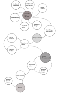
Figure 6: Design frameworks that specific for this project that require the audiences create an idea together with the artists.
4. Methodology
As for this study, the framework of the designing process consists of 4 phases that are 4 key steps, as follows. 1) Pre-production is the step that includes data research and analysis and determination for definitions and scope of the outputs and directions for designing, and study on the experiments by other artists. 2) Production is the step of the development of the designs that build images and patterns of the characters in ways that concur with principles of arts and designing and the concepts of contemporary design. Thus, this step incorporates experiments and creation of images in different dimensions. 3) Post-production is the step that includes the creation of media to present the outcomes from mascot designing, printed media to display in the building of CAMT, and promotional media including Line sticker and action figures. 4) Development and Conclusion is the step in which data are stored and products that have been released are refined in special occasions in order to add values to the brand in the consistent manner. In addition, new products are launched and new experiments in more diverse styles are conducted in accordance with social behaviors in each particular era.
In addition to product development, each of the aforementioned steps also includes the experiments that are based on the feedback from experts and some audience. The target audiences are divided into different age ranges, from people of generation Y or high school and university students to working adults. The designs of the mascots in this project must be neutral as possible whilst satisfaction and recognition should be supported by and concurrent with opinions and critics in social media as well.
5. Character Concept Identifying
The design definitions of each characters, Animation and Visual effects (ANI), Software Engineering (SE), Digital Film (DF). Modern Management and Information Technology (MMIT), Digital Game (DG), Industry Integration (DII) and Knowledge Innovation Management (KIM). The main concepts are contemporary and trendy including clothes and attitudes. The characters have their own distinctive characteristics, but work as a team. The same as CAMT concept that each major are related each other. The visions are combining which the words Honest, Dis cipline and Sharing (HOD)8 which comes from the core values of CAMT (CMU CEO)9 defining the current identity of CAMT. These definition and keywords are applied into Mascot mind and characteristic as a concept identity.
The definition of the Mascot of Animation and Visual Effect (ANI) is that this character has a high level of artistic features with individual thinking in digital technology-related arts. Therefore, the key instruments for creating the works in this project is the tablet pen painting plate, with the emphasis on creativity that allows the character to have high flexibility in terms of its appearances, which mean the character will not strictly adhere to any principle or rule.
As for the Mascot of Software Engineering (SE), this character is defined to be a scientific person who emphasizes on complex and systematic thinking with ability to create new software and has literacy in special languages or digital ones (programming). Hence, this character relies mainly on left side brain (IQ) and truth.
As for the Mascot of Modern Management and Information Technology (MMIT), this character is defined as a person with leadership, innovativeness, capability of managing team members and planning, and ability to think and analyze, and intuition for forecasting things in the society through digital tools. This character is thus classified to have administrative skills and instant confidence for sound judgment.
In addition, the Mascot of Digital Game (DG) is defined separately from Software Engineering, but the emphasis is put on the creation of digital games. Thus, this character is both artistic and scientific and have more commitment than others. At present, there is a competition called E-sport. Hence, this character incorporates competitiveness, innovativeness and creativity.
Meanwhile, the Mascot of Digital Industry Integration (DII) is defined as a character who is based on facts and truth in the society, with the characteristics that are changing in accordance with the social trend. This character can learn from the issues in the digital industry; and thus, has diverse characteristic and ideas that are consistently changed. This character has diverse knowledge and ability to gather all knowledge in order to create new knowledge that is concise and easy to use.
The Mascot of Digital Film (DF) is defined as a character with creativity like the ANI Mascot, but this character focuses on the creation of cinematographic media, with combination between reality and imagination, and confidence. In addition, this character has capabilities and uniqueness in the field of entertainment arts because it has most prominent look of all members in the team.
This character can be a director and an actor; thus, this character has as high confidence as MMIT Mascot, but in terms of entertainment only.
The definition of the Mascot Knowledge Innovation Management (KIM) is that it is the character that is regarded as the source of knowledge for the team because this subject is in Master Degree and Doctoral Degree levels only. The character is the eldest and most experienced of the team, with the characteristics to provide suggestions and advice to others in order to create new things from available information. Therefore, this character is prudent and does not show the emotion clearly. The special capability of this character is to analyze and file a great amount of information.
From the definitions of the characters, each character can be clearly and individually identified with values and policies of CAMT. Consequently, each character has specific definitions that are concurrent with the image and look of the character and different from another character depending on the subject. This is the concept for the designs of all the characters that has been combined with contemporaneity.
5.1. First Look of Design
After the data management is complete, in the Production Step, there will be the experiments of the art works by creating the mascots starting from forms, along with color designing, all of which are based on the definitions of the characters. In the image, it is apparent that gadgets that are related to each subject are added. For example, the ANI will hold a tablet and is floating all the time in order to show the implication of imagination and freedom in terms of arts. The experiments are still based in the feedback from the experts, which will be followed by the refinement of the designs because the designed characters are still not artfully perfect and are too complicated for the memorability.
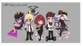
Figure 7: CAMT early mascot part 2 design from artist A with digital gadget design e.g. tablet, gaming keyboard or smart phone.
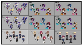
Figure 8: CAMT early Mascot design color alternative experiment
The using of color and shape, the trendy costume is also the key component by using the concept of Science fiction (Sci-Fi). The concept is that the costume design should indicate the futurism and the digital technology infused with CMU attributes and Lanna culture for representing the overall CAMT identity. In this process, there are experiments of color composition in various patterns (as shown in Figure7) as the attempts to clarify the identities of the mascot e.g. using red to portray danger and using blue to portray serenity.
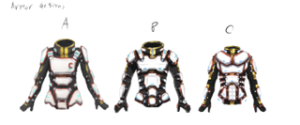
Figure 9: Early Digital CAMT Costume Design, Armor design
Concerning the designing of costumes of characters (as shown in Figure 9), initially, it is apparent that the look of the costume is too hard, which reduces the gentleness of the characters. In addition, the stories of characters are not agreeable. Thus, it is necessary that fabric materials are used as much as possible in order to create the costume that can be used in real life. Furthermore, the proportion of the characters is changed from SD (Superhero Scale) in order to present charisma, confidence and implication of leadership, as well as the results from the analysis of the popular characters. As for this case, the characters from animation and game media are used. It is also apparent that characters from Ragnarok Online[1]0 Game have been highly popular for the past 20 years.
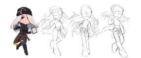
Figure 10: The example of ANI character transformation, SD re-scale design process.
Apart from rescaling, it is also vital to focus on the gestures of characters so that the identities and habits of each character will be presented more clearly. To do this, it is necessary to design the sketches in order to promote the mascots simultaneously by analyzing the characteristics of each character. For example, the Mascot of Digital Game (DG) (as shown in Figure 11) is reserved, loves playing games, and is not talkative. However, this character is keen on computer use and programming. This character is obsessed with some specific matters only. Such characteristics and habits are from the analysis of people of generation X who have complexity in thinking, individualism and introversion in high levels. However, with the light of the identities of CAMT people, this character also has optimism, which adds cheerfulness to this character until new identities are built. As a result, this character has gestures that show consistent movement and high responsiveness because most gamers have responsiveness rate that is faster than that of non-gamers. This is because of the main activities of the character.
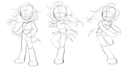
Figure 11: The alternative of Character posing Design of CAMT DG Mascot
Unlike DG Mascot, Digital Industry Integration (DII) Mascot (as shown in Figure 12) is confident and capable of getting along with others easily. As a new character because the branch has been established this year, the character is designed to be still and prudent, with systematic thinking for management and confidence, but not in a great level as the confidence of MMIT and DF characters. In other words, this character can talk to, meet with and learn from other people all the time as reflected through the habit of the character whereby the character wears Bluetooth all the time with the promptness to discuss matters with people. At the same time, the character has still and stable gestures, with less movements than that of DG character.
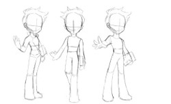
Figure 12: The alternative of Character posing design of CAMT DII Mascot: Confident Gestures.
Therefore, the creation of new postures that is carried out simultaneously with the rescaling is a significant step for adding personalities to each character. For instance, SE (Software Engineering) character (as shown in Figure 13) the uniqueness of which is the Smart Digital Arm. This character is the smartest one of the team, with expertise in language literacy and knowledge of programming. Hence, the gestures of this character represent confidence and uniqueness of the character. Initially, the postures emphasize on the Smart Digital Arm that is the unique feature of the character. Furthermore, the postures make the character look like a superhero but the child-like SD proportion make the character not much different from others in the team.
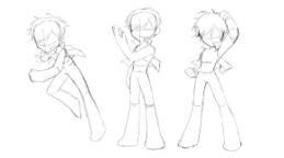
Figure 13: The alternative of Character posing design of CAMT SE Mascot
5.2. Detailing and Identifying
After designing the posing of characters, the next step is detailing and finishing the costumes by adding lines and details from the postures of the mascots. In this step, it is possible to create the graphics that can be actually used. In other words, there is the production of concept art which will be promoted in the step of publicity, which will shorten the period of time for media production. Nevertheless, there is a limitation that comes from a combination of organization synthesis. Besides, another limitation is that the costumes including hairs and faces have to be different and be infused with the gimmick11 and the symbol. These are used to enhance the understanding of the receivers, e.g. Using of Digital suit look mixed Traditional Thai culture on fabric form and texture with which can be seen in the details of the character, MMIT (as shown in Figure 14).
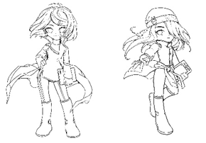
Figure 14: Detailing and Re-posing of design art concept, MMIT and ANI Characters
After the drawing process, more details are added to the characters. Each character is presented on different sides (in Character Sheet), together with expressions (in Expression Sheet) with details of gadget of each character in order to extend the story and details of the character in the future. In this step, the key action is to determine colors used for creating graphic identity without any deviation. The color system used is RGB that is concurrent with the color of the organization.
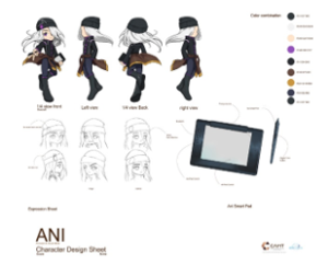
Figure 15: Character design Sheet of CAMT ANI (Animation and Visual Effects) Mascot
From Figure 15, the ANI (Animation and visual effects) character is based on the personalities of the students of this branch and the body of knowledge from the analysis, the results from which reveal that the character is highly individual, especially in terms of art, or computer art, reserved, and outgoing, not for speaking but for presentation of arts and opinions. Therefore, the character is designed to have long silver hair, which reflects the obsession of independence. Thus, the character can fly, which is like the characteristics that is flexible, highly independent and sometimes introversive. The character carries a digital tablet as the important gadget that is used for drawing all the time. The eyes of the character are in violet color, which is a gimmick because violet is the color of CMU, which is inserted in the concept of the character. Meanwhile, the costume of the character is in the same direction as CAMT suit, with color tone limited to brown color and the character seems to be floating all the time.
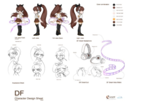
Figure 16: Character Sheet of CAMT DF (Digital Film) Mascot
The DF (Digital film) character is the combination of digital art and communication arts relating to entertainment art, especially cinematography. Therefore, the character has individualism as the ANI character and confidence to present self-identities because of capabilities and knowledge of acting and producing for films. Hence, this character is girly but confident, good looking and taking care of herself all the time, in terms of personalities and beauty. This is the only character of the team that is related to front stage. The accessory that represents this character is the Hologram Film Ribbon that is a traditional film roll. It symbolizes that although the character is in digital era, she still has knowledge of cinematography history. In addition, this symbol is easy to understand for propel in general, based on basic perception. In other words, when people see the symbol, they can immediately define the character. This character wears a miniskirt, but the miniskirt is also in the form of the contemporary uniform of the university, with the senses of fashion and sex appeal added. At the same time, the colors used are still related to the color of the organization, or brown in different shades.
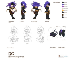
Figure 17: Character Sheet of CAMT DG (Digital GAME) Mascot
DG (Digital Game) character is not much different from ANI one in terms of art statement with high levels of confidence and introversion. The differences are the love to competition and the capability of programming, which make this character inferior to ANI one in terms of arts. However, this character has complex thinking relating knowledge of digital interactive. This character is also inspired by e-sports that turn some game players to game producers. Hence, the character is highly obsessed and self-oriented. The key tool of this character is a traditional joystick that is linked to Oculus [2]. This tool is the key gimmick that presents a symbol that can hasten people’s understanding on the concepts of the character. Meanwhile, the costume of the character has colors that are concurrent with the color of the organization. The costume is also designed to be agreeable to e-sport game team suit.
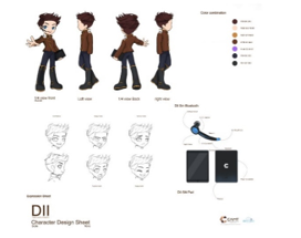
Figure 18: Character Sheet of CAMT DII (Digital Industry Integration) Mascot
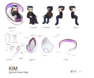
Figure 19: Character Sheet of CAMT KIM
(Knowledge Innovation Management) Mascot
DII (Digital Industry Integration) character is a male character and the only character of the team is has high confidence and skills of speaking and presentation, as well as concern with personality, which is reflected through the face and hairstyle that look polite and slick. The body of knowledge in this branch is related to the building of bodies of knowledge that can be implemented to contemporary industries in order to always catch up with current trends. Therefore, the character is confident and highly capable of communicating with others. The personal gadgets of this character are a smart Bluetooth and a notepad that the character carries all the time. This can manifest the implication of speaking and analytical skills, high are the key skills in this character. The costume of the character is adapted from suit jacket that makes the character looks more agile and active than other characters in the team.
KIM (Knowledge Innovation Management) character is the eldest character of the team. This character works at the back of the stager as the consultant of the team. This character collect and file all bodies of knowledge in every subject in the world. Thus, he is designed to have some gray hair as highlight, which is a tangible symbol to represent an aged person. Another unique point of this character is that he sits all the time, with the characteristics of a leadership who does not disclose himself or is the person secretly working at the back to ensure the success of the team. The significant skills of this character include the dissemination of knowledge, and the provision of advice in the fields of academy. The key gadget is the smart throne that is a tool to show and to store data like a hard disk. In addition, this gadget allows the character to communicate with others all the time. It is deemed as one of the most versatile digital gadgets because it can be used for creating, storing, and communicating. This throne is designed to have unique symbolic uniqueness of this character because it has violet color that is the thematic color of Chiang Mai University.
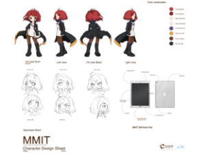
Figure 20: Character Sheet of CAMT MMIT
(Modern Management and Information Technology) Mascot
As for MMIT (Modern Management and Information Technology) Mascot, this character is the leader of the team. She is capable of managing things quickly and efficiently. This character is also the key planner of the group and is also as capable of communication as DII character but has a greater level of leadership. Therefore, the character is designed to have the facial expression that reflects her confidence, with gestures that show high agility and delicacy, which are presented through the costume that consists of the cloak that waving all the time. The character has red hair which reflects boldness and confidence at the same time. Also, MMIT character has the key gadget of this character is the Smart Light Notebook that can store a lot of data but less than that of KIM character. However, the gadget of this character allows the character to have agility like a note pad does. Nevertheless, the concept of this character is inspired by the overall personality of the graduates of this branch, and the body of knowledge that has recently been developed.
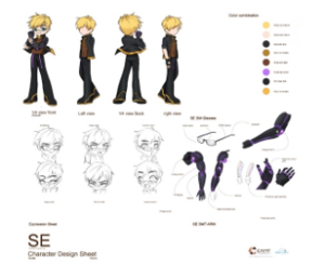
Figure 21: Character sheet of CAMT SE (Software Engineering) Mascot
Meanwhile, SE (Software Engineering) Mascot is deemed as the smartest character of the team, and has the knowledge of programming, production and language. This is the only character of the team that has mixed blood (a Thai – American person). The weakness of this character is the skills of arts. Even though being the smartest one, this character has to rely on ideas of ANI character as well. Therefore, SE character and ANI character are the closest friends of each other. The key tool of this is the Smart Digital Arms with AI at the finger tips, which allows the quick creation of programming works. This Smart Digital Arm was built by SE character himself, with color of CMU reflected through the violet light emitted from the tool. This gimmick has implication that can be widely understood with general perception in vision of color and arts.

Figure 22: Character Size Comparison when the character assemble as a team group.
6. Graphic for Advertising Product
The use of mascots for promoting an educational organization has more limitations than the use for a private organization in several aspects, including ethical images, definitions of education and organizational culture, all of which have to be taken into accounts and lead to the consideration of the types of media used. All media types, both physical and digital ones, are related to target groups and images of the organization. For instance, it may be deemed that the medium that is the symbol for memorization is a keychain souvenir because a general function of a keychain is to be a memorable symbol of an event or a place. However, at present, some functions may be added, such as to add a USB port flash drive to the keychain for multifunctional purpose. Likewise, designing the graphics that have mascots as the core element, it is necessary to present the images and tones that make the organization look like a lively and attractive place for every student like the students’ second home that has modernity, and contemporaneity. In addition, the definitions of the term ‘welcome’ are reflected through the facial expressions of the characters. All the aforementioned concepts generate keywords that will be applied to all products under the principle of graphic identity in combination with the principle of graphic design in order to blend perception into arts perfectly without the need to sacrifice the identities of the organization. The building of such images needs the release of images in phases with the goals to allow audiences to send feedback and to enable all audience to perceive a little bit of new images of the organization at a time, starting from the display of the characters in the forms of posters in social media in special occasions such as New Year’s Day, or in an event that has become a hot topic in the current society, such as the COVID-19 circumstance in 2020.
6.1. Poster Design
The designing idea for the Poster is not the use of conventional printed media only. rather, it includes the change of the head of the Facebook page of the organization, public announcements and question what the designed characters are representing. The chosen release day is the day for the celebration of 11th Anniversary of the University. This may have impacts on people in and outside of the University. In addition, this scheme al so makes students feel attached to the subjects they are majoring.

Figure 23: The Example of Character Poster Design
In 2020, there had been the outbreak of COVID-19 disease that caused Chiang Mai to be locked down for a certain period of time. At that moment, the professions that were worrisome were doctors and nurses who played key roles in taking care of patients, with the close encounter to the incurable disease. Therefore, the team designed a poster which was used in an online campaign to show the characters in the outfits of doctors and nurses in order to show the feelings of care and appreciation to doctors and nurses who worked hard. This design expressed the message that enabled people seeing the poster aware of the concern by the University with the situation, through the characters in the well-blended manner whilst expressing the perspectives that the organization had towards the country.
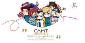
Figure 24: A Digital Poster using of Mascot on COVID-19 period in Thailand that also promoting a brand identity and policy at the same time.
Concerning the use of the poster design to deliver a message, at present the technique that has been found most effective currently is the creation of graphics that can be shown online. However, it is merely a one-way communication technique that can create awareness. Meanwhile, the use of mascots of the University to deliver messages to audience is a good way that reduces tension in certain situations along with presenting the images of the organization in new dimensions. Especially, in case of an educational organization, the delivered messages will be more reliable and accepted. All the aforementioned principles are related to social structure.
6.2. Line Sticker Design
To design characters to be used in social media communication is included in the marketing plan for building a brand in the modern era. This technique is to use characters that express emotions in the conversation to promote the key issue. In this case, the chosen media is Line1[3] chat with is a popular mean of communication of people nowadays and is widely used in Thailand. Therefore, the team has created the mascots of CAMT to show emotions, appearances and symbols of human beings. This enables the users to choose the suitable characters that they like to complement their communications. Thus, designs of the gestures of the characters are related to currently popular messages such as ‘congratulations’, ‘work hard’ or ‘thank you’, all of which are still within the frameworks for designing the mascot of the organization without communicating messages that are too in-depth, allowing people of various age ranges, from high school students to middle-aged people, to use the designed characters and signs. In addition, the designed appearances and the used colors make users feel positive because the characters do not look too serious, which makes them fit the current trend.
The use of these character in digital communication (Line application in this case) has boosted the awareness of identity in deep and cognition because of each character has a differences personality for example, when they use MMIT emotion it can feel the leadership personality somehow from the face and body language, and that can show the identity of organization while using these symbols. The gender of the characters is also affected the user via using image or sticker chat, it makes the user more attractive on chat, same as using new patterns of language in teenager, [14] and these characters become representative of user emotion and personality at the same time. There are 2 versions Line stickers that are designed. Each version is designed to have a concept that is different from each other. The first version is for expressing common emotions such as ‘thank you’ and ‘good’ in ‘good day’. At the same time, stickers in the other version are designed to be more specific with the works of the organization or professions, with new concepts and modern words, including slangs added, in order to make the designed characters become contemporary in the aspects of appearances, images and notions. In addition, facial expressions of the designed characters can look hilarious as well.
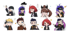
Figure 25: The example of Line Sticker CAMT mascot version 1-2 that already in the market.
Apart from designing the digital symbols that are for general purposes, in the beginning of 2020, there has been the outbreak of COVID-19 disease; hence, the research team has designed Line stickers in Thai language in order to use the designed mascots to promote and reinforce certain messages to the society. The mascots in this special version wear the outfits of doctors and nurses to show care and concerns with people in the society, which will spread positive vibe. Therefore, it is apparent that that the designed characters can be used for conveying diverse meanings and can be transformed into different styles whilst carrying the identities of the organization and their own identities at the same time, e.g., the KIM character, who is the source of knowledge or the team leader, wears a doctor uniform and has gray hair whilst other characters wears uniforms of PAs and nurses. At the same time, each character still shows his/her personal characteristics. For instance, the DF character, even though wearing a nurse uniform, shows cute and lively personalities as well. And that it makes people smile even in bad situation, this is a power of Mascot.
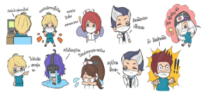
Figure 26: The examples of Line Sticker CAMT mascot COVID-19 version
6.3. Architectural Decoration
The plan for the presentation of identities of the organisation is to increase the number of the woks consistently. One of the significant symbols is the L-shape building with glass wall at the main entrance. One thing that is indispensable is the decoration of the building, which will create the atmosphere and emphasize on the identities of the organization. The team designs big posters showing the designed characters to be displayed on the glass wall of the entrance in order to present new images of the organization and to renovate the building because the building is heated by the sunlight from the northern side. Pasted on the glass wall, the stickers will serve as blinds instead of curtains. The effects that happen are that the appearances of the building are completely changed because the colors and looks of the designed characters make the building of the organization look more exciting, active and delightful. The outcomes from this work lead to the discovery that to use bright and lively looks of the characters makes people visiting the building feel lively. These effects are like the ambience of Akihabara area in Japan, where some buildings are decorated with manga characters. Even though such manga characters are for advertising purposes, they make people in the space feel lively. Therefore, the decoration of the building, together with the design of landscape to have the building encompassed with a green garden, will also make students feel fresh and lively. At the same time, the decoration of the building builds unity in the organization. Also, the building of CAMT is the only building in Chiang Mai University, or even in Chiang Mai Province, that is decorated with images of contemporary characters in order to create the positive perception perfectly.
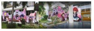
Figure 27: The use of Mascot for decoration, College of Arts Media and Technology, CMU.
7. Toy and Souvenir Product
As for the designing of characters, one of the indispensable elements is the creation of 3D models in order that the images and appearances of the designed characters will be more concrete. This concept of the creation of 3D models has led to the idea to create souvenirs to reinforce the identities of the organization through digital symbols and digital way of life. At present, many people, with artists and designers included, prefer to collect toys in the types of action figure, statue, Figma[4]. Therefore, the team has an idea to create souvenirs that are 3D models of the designed mascot characters with the framework to present the images of the organization along with the creation of aestheticism from small toys. The creation process starts with the creation of the characters in a computer before using a resin 3D printer which has the greater resolution than aplastic (PLA) 3D printer. The concept of this work is also based on some marketing principles concerning the presentation of images and symbols of the organization simultaneously.
7.1. Concept Design
This project is the creation of the set statue contained with 7 characters of CAMT in the sizes and scale were in accordance with the standard of Nendoroid[5], with the heights ranking between 5-15 cm, in the forms of SD characters [15]. Nendoroid is defined as a popular brand of small plastic figure replicas of manga and anime characters [16]. This is not too big statue but not too small based on population toys in the market. Mostly, for toys collector in worldwide so it become a standard size, scale and proportions. As a comparison of Nendoroid in the market place, there are the same scale and can replace the face and emotion but it lacks of group assembler product and light up system. This is an idea to create a difference type of Nendoroid figure. In this case, the works are created as statue figures, in order to set the gestures and looks to be presented that go in the same direction. The scopes of the design are as follows.
- Each of the 7 models has a base that is a part of the logo of the organization. Each collector must collect all the 7 models in order to get a complete logo.
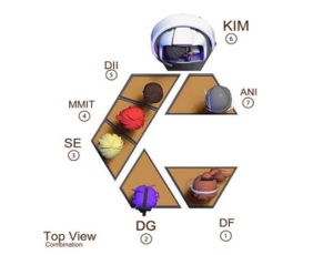
Figure 27: A Top view of 7 pieces of mascot combined
into a CAMT logo
- The base is supported by a plate which is included in the model of KIM character, which is the team leader.
- The base of each model consists of the lighting system that related to the main plate, called LED light up base, which makes the display look more dimensional.
- The models are displayed in the stepped manner, with DF and DG characters sitting on the lowest steps whilst other characters are standing on the upper more steps. Thus, all characters will be seen from all angles without blocking one another.
Some characters, such as ANI, are floating all the time. Thus, the model of such a character consists of a metal pole that makes the model look floating. In the future, the pole many be created with transparent material such as clear acrylic so that it will look more realistic. All the aforementioned ideas are complemented with the marketing design in order to make collectors desire to collect all the models in the set-in order to have a complete logo of the organization. In addition, the set of the models can serve as a lamp. As for toy designing, the most important elements are sizes and perspectives of the work in 3D view. Therefore, sizes are first set in the program of 3D image creation. The framework that is especially dedicated to this work is designed.
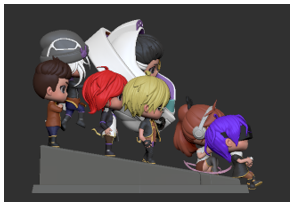
Figure 28: A Side view show the levels of the model steps
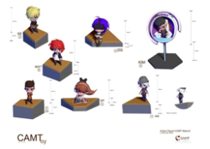
Figure 29: The separated details of each character
7.2. Methodology
The production of the toys can be divided into 3 main steps, namely, Pre-production, Production and Post-production, with the details of activities as follows.
- Pre-production is the step in which the initial design of each character and the concept for the assembly of the toys (Toy Mechanic Combination) are drafted. Also, details concerning used materials, postures, communication of the meanings and perspective are tested in the 3D space. In addition, the proportion and function for lighting systems can be adjusted in the step of the sketching in the 3D space. Furthermore, there is also the research for information of toys of the types of Statue and Nendoroid. If the size is bigger that 15 cm, the model set will need a great space, but a purpose of this model set is to be placed in any place such as at the space over the console of a car or a computer desk, which has no great space. Therefore, each model is designed to be 5-10 cm in accordance with the scale of each character.
- Production is the step that directly involves with the creation of the model set. This step starts with the creation of 3D model prototypes and the number of polygon is not taken into account. Thus, the design can have high quality subdivision, which will not affect the software for the printing. In this step, the focus is on the parts with joints that will be seriously taken into account because of the significant effects on the printing out. The consideration is also put on the designing of the colors for each character. Finally, the lighting system is added to the printed out model.
- Post-production is the step that still incorporates adjustment but the adjustment is more like the finishing of the details of each work in order to create the mold that will be used for mass production. This step also includes the taking of photographs to present the works and to get feedback which is used as statistical data of marketing demand. This step also includes activities in the production step if there is any suggestion from
audience or expert. Most of the attained suggestions concern the use of mixed materials and the colors of the product.
From all the 3 steps as mentioned before, it is apparent that there are 2 keys activities in the production, which are the creation of products in 3D space and the printing out which require many experiments and adjustments.
7.3. Creation of 3D Model for 3D Printing
This activity of the creation of the model is the experiment to determine the perspective and composition whereby all the models can be seen. From Figure 30, it is apparent that the SE character model is swapped with the DG character model in the final product. This is because SE model is in the standing posture whilst DG model is in the sitting posture. Hence, DG model is placed in the central area instead of SE model.
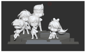
Figure 30: The First Draft 3D model in 3D Software.
This step also includes an important activity, which is the designing of separable parts such as faces, hair styles and bodies in order to let each model look seamless as possible. For instance, an SE model consists of 3 separable parts, namely, hair, head and body, which are easy for the assembly and the addition of details.
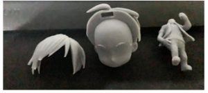
Figure 31: The test 3D model printing using resin separated 3 pieces.
Each model has to be printed out in the test 3D model printing in order to check some details that may be eliminated. From the experiment, it is discovered that resin is very fragile especially in the parts of hair and small pieces in the model. Therefore, in this case, glasses are made of transparent plastic instead of resin.
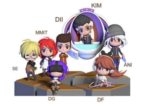
Figure 32: The Combination of the Mascot set in 3D vision.
After the test 3D printing of SE models, it has to make sure that when the character combine together, it in the right position and proportion. We use symmetrical in a feeling of mass and space, as you can see that KIM is blended to the right but on the left, there are 3 character standing on the step to make the composition look actually balance. The based system also designed in this step, in order to move on to printing a prototype step.
7.4. Printing a Product
This step involves the production of the models that have passed the test printing in 3D space already. All the pieces are put together, and the bases to support the works are also designed. The designing of the base to support each model is an important action in peeling the mold off the work. After the mold is peeled off, the work has to be scrubbed in order that the surface is smooth. In addition, a UV LED lamp is used for making the resin material hard and have smooth surface as expected. Instead of the lamp, sunlight can be used as well. Resin printing is different from PLA because it can show more details. In this case, a UV LED lamp is used for creating the prototypes, by using UV light to cause curing reaction on resin which makes resin hard.
After each model is printed out, the base is printed out in the shape that can be assembled with others on the plate in the shape of the logo of the organization as designed in the first step. As shown in Figure 33, put together on the plate, the bases of the models do not fit well with one another. Therefore, the pieces of works have to be scrubbed with sand paper before the coloring process. Another problem is that the metal pole for holding the model is too high, disabling the model to stand by itself. In this step, there will be slight adjustment to the base. In the following step, the installation of lighting system will be focused on.
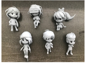
Figure 32: The Printed Resin Prototypes of Some Characters
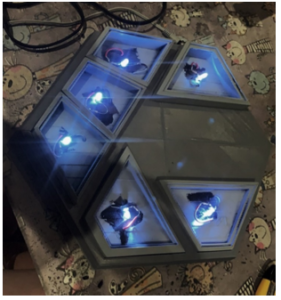
Figure 33: The testing of LED light up system
As for the installation of lighting system, the switch is placed at the back of the plate to allow the connection with the adaptor for the light-up display. All the works in all the aforementioned steps have been described in posts on social media in order to attract feedback from message receivers. The attained feedback is satisfying to a certain degree but the light is too sharp and too bright. Therefore, the material of the base that cover the light bulb is changed to translucent one in white color in order to accumulate the light that hit the object. The opacity level of the material is 60 percent to deficit the light.
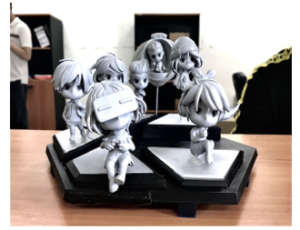 Figure 34: The Printed Prototypes Put Together on Plate in the Shape of the Logo of the Organization
7.5. Product Development
Based on suggestions and feedback from the experts and the audiences, the bases are modified to be in light gray color and the positions are changed, with KIM model pushed back of the plate. In case where a collector does not want to display all the models together, each model can be displayed separately. In addition, the KIM model is modified to show less seams because this model is the biggest and heaviest of all.
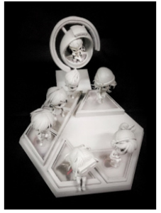
Figure 34: A prototype of the assembled product: picture for commercial released in October, 2020, on social media
After the product development leads to the satisfying outcomes, photographs of products are taken and shown on social media in order to get feedback in the Post-Production step. The results show that the satisfaction level is greater than 80 percent, but there are still requests for colored products, which are still in the course of experiment on different materials and colors.
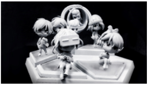
Figure 35: A prototype of the combination product and this picture is for commercial released in October, 2020 on social media.
7.6. Prototype
This final step involves the presentation of prototype products on social media. The presented prototype products are monotonously in the grayish white color. The products are presented in black and white color tone so that audiences can see the forms of all models, the lighting system of the base of each model and effects on the products. This style of presentation is popular among toy producers to present their works in a way to enable audiences to use additional imagination from experiences in primary perception and concept prior to the colored version.
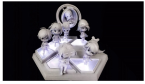
Figure 36: A prototype of the combination product with LED light up test, released in October 2020 on social media.
In certain cases, consumers or audiences may want to see the prototypes in gray color, which can be optional. However, some audiences may p want to see just the colored version in order to consider the features of the products. Nevertheless, this style of prototype presentation will make audience consistently follow-up the updates of the products and give feedback. Afterwards, there is the primary virtual coloring so that audiences can imagine on the final products.
7.7. Product Publicity for Feedback
After the prototypes of the works are created, the next step is to create digital visualized images of the colored works to be presented to the audiences for their feedback. The colored works are presented with the concept of the overall product set in order to show clear identities of the designed mascots, which is the extension of the mascot designing.
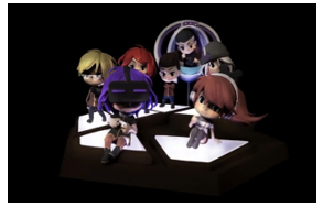
Figure 37: A prototype in color version from digital visualization published for feedback
The issue relating to the works in this set is that they are just prototypes. This means the works can be modified in many other steps. There have been critics on material that the used material should be the mixed one that is composed of silicone because nowadays, silicone has been added as a component of materials to be used for creating works in the type of toy or statue in order to create the moods and dimensions of the surface that look more realistic. The extension of the product aims at the same goal, which is to extend the brand of the educational organization that is a choice for the promotion to make the brand sustainable.
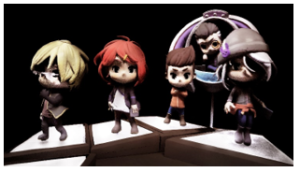
Figure 38: A close-up shot of products of colored version
8. Results
As for the creation of elements of brand identity of the educational organization with various digital design-oriented media, namely, digital image, digital communication icon (sticker massage), poster, building decoration and toy (collectible) products, different feedback and opinions concerning different issues have been given by audiences and the experts.
In this project, many new characters (mascots) have been designed to have features different from original ones designed by artists/students. This means the characters in this project are re-versioned to have contemporaneity as other artists/students deem preferable. Theoretically, this style of drawing is called ‘Dojinshi’ [17] in Japanese language, which means the artists who are fond of certain characters to certain degrees re-create such characters in their own styles. Also, this style is called ‘fan-art’.
The aforementioned fan-art phenomenon can be seen as the expression of feedback in the concrete and tangible manner.
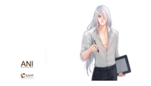
Figure 39: Transformation of style of a character (ANI) into teen look can attract more favorable feedback.
Nevertheless, the designing of mascots for educational organizations still faces with certain limitations to designing, on the bases of target groups, organizational culture, spatial culture, and ethicality, which, all together, form the main scopes of the designing. Consequently, the designing cannot go beyond such scopes. This incident reflects the key difference between free comics and education comics because the designing has still had to embrace all the concept keywords. As a result, positive feedback and satisfaction are attained because more than 60% of the audiences (students and staff) deem that the designed mascots (characters) are related to themselves. Even though the uniform is designed to be more contemporary, the used symbolic colors of the organization, i.e., violet and brown, are implication that are hidden in the compositions of the designing and are comprehensible among target audiences.
The unique brand at CMU is a marketing concept for the creation in this project. The creation of the mascots that look contemporary and the extensive designing of other products in order to add values to the brand have led to the uniqueness of the University which results from this creation because the University is the only educational organization that applies platform and media usage in industrial level through the digital processing method in order to create versatile and tangible works. The ultimate result is qualitative and positive feedback that reflects a high level of satisfaction.
To create toy product is a key idea that enhances the strength of the brand of the organization because it reflects the versatile knowledge and skills acquire from learning. The concept of the University is to be a governmental university that is under regulations and conceptual frameworks but has been developed in the digital new normal era that follows the post-modern era. The designed products are tangible and create aestheticism while letting audiences absorb brand identities. This idea leads to a new direction of artwork creation that can be extended to industrial production. Furthermore, this experiment has received positive feedback from audiences in social media, which can be implied that it has market demand in a good level.
In techniques of creating these toys set, the using of digital methodology in ordinary which are follow step 1) 3D creating 2) Printing 3) Mass product creating is the same, but the idea of adding more option into the product such as light up figure or combination of set is the core of concept campaign if comparing with others Nendoroid in the marketplace and it keep develop and added more function into the product. However, the use of Toy product in brand identity is a good idea of memorizing by touching, playing, and watching especially in institute’s educational organization.
9. Conclusions and Discussion
From feedbacks from 3 groups of audiences, namely, CMU students, officer, staff and people in general, it is apparent that there are certain ideas that can be extensively applied to Institute’s education brand designing and identity creation, with the main goal being to create tangible uniqueness for the organization through digital platform and digital media, in the form of products that people in the digital contemporary era can comprehend well an touched. Most of organization need a symbol present their identity. Logo is a good example, but it is lack of life and emotional in deep then that the idea of creating the Mascot was born. In this study, the scope idea does not include Digital Animation Film or game or any advance media, but it is the next step in advance once the brand is growing up and popular at certain level in social. Therefore, this study emphasize on to a new way of using Mascot design to enchanced and added value of the University brand in complicated cultural. It need many research of people mind, comments, feedback, population statices and demands, as well as analysis on behaviors of visitors who visited to the University and current students, which contributed to the creation of the new brand identity platform and the improvement of art identity in a future mindset. Key findings from the results analysis and presentation of the artwork product testing are as follows.
First, the designing of mascots for an education institute requires the connection among different dimensions of organizational culture, from the personal level that relies on the in-depth analysis on attitudes and specific personalities, the level of organizational image of the University, the level of provincial culture and the level of the country, under the conceptual framework that has limitations of dressing, ethicality, and purposes and policies of the organization. This is a contemporary study and creation project that creates new identities of the organization, which are reflected through characteristics of mascots (characters) that can be extensively designed as other products, based on the approaches of marketing strategies and advertising, all of which are systematically and sophisticatedly inter-related to one another. In addition, the trend of design is a factor for the creation. The results from the analysis point out that all the symbols designed in this project will be changed again in next ten years in order to sustain the values of the brand.
Secondly, the key factor for character designing is the target groups that are potential customers in term of marketing. Thus, it is significant to focus on students in order to study on trends and art population. From the study, it is discovered that 80 percent of the samples are interested in the styles of comic characters in animations and games rather than general photographs whilst 20 percent of the samples are interested in fashion in portrait style. It is also discovered that the cosplay and Korean pop (K-POP) fashion styles are most influential. Hence, the characters are designed in accordance with the aforementioned demands and trends, in combination with the spirits of digital era in order that they will have the ultimate looks that fit the trends while reflecting the organizational culture simultaneously.
Thirdly, the process of the creation of characters for an educational organization has conceptual framework that has more limitations than organizations of other types, including ethics, morals, and local culture. As for this case, it is Chiang Mai University which is a symbol of the city. Hence, it is necessary to create specific concept from analysis and synthesis. The aspect that must not be overlooked is the combination between organizational culture and local culture that is composed of ideas of people from local communities. Therefore, the outcomes are based on contemporary ideas that are more powerful than conservative perspective alone.
The fourth point of the findings is that toy product is a significant factor that affects imaginations for the audiences, people and provide beyond personal experience as we know that toys can make you imagine and more [18]. With this power, it is a powerful instrument for running promotional and marketing activities to promote brand identities perfectly. In general, people in this modern era, especially teenagers of generation Y people and younger people of following generations prefer to collect such products or any other products that features comic characters. From the analysis on the data of the market of Japan which known as the comic city as a culture, it is discovered that comic characters are used for presenting the tourism, and there have been new characters created until this style of art has become an element of culture since the post-modern era until the Bro-postmodern era when this art style is combined with the elements of the digital era. All the aforementioned cultural features have been absorbed by Thai youths. Consequently, modern artists can create manga-like art works, which can be regularly seen at present. From the analysis, it can be seen that this art style has also incorporated the features of traditional Chinese arts, especially the Chinese brush line drawing that has been developed to be digital line drawing that enables the creation of art works with new styles and contents. Eventually, the art works have been used as the bases for producing tangible mass products that, in turn, increase the popularity of the characters on which they are based. As for this project, the aforementioned product is the designed toy that also serves as a tool for measuring marketing outcomes, and effects in terms of art and culture simultaneously.
The final point from this study is that a perfect brand identity package should consist of tangible and intangible media that are contemporary, which will increase the values of brand and enable the brand to have versatility in terms of social statuses and positions so that the brand can effectively communicate with people in the current era. The findings from the analyses on consumer behaviors, products, trends, and positive ideas that have led to aesthetic perception which involve the awareness of artful beauty from sight and other senses. Hence, the design package for this study has incorporated digital art, and physical art and craft, which can reinforce the images of the organization in recognition and memories of audience in the easily comprehensible and quick manner, in addition to the use of ordinary graphic image or the logo of the organization.
These mascot design set and graphic brand identity project has been used in officially in Chiang Mai university, Thailand and its keep inspired to the people who visited CAMT as a school of new arts, media and technology at all the time.
[1]0 Ragnarok online is MMORPG game developed by Gravity interactive Company in Korea. The contents are based on manhwa Ragnarok by Lee Myung-jin. The game is the one of the most popular in the world and character design population.
1[2] Oculus is a VR game gadget from American technology company that used for visual reality in game specific support hardware and software in digital game.
13 Line is a new communication application managed by a Japan company called Line Corporation. This application allows people to make free calls and free messaging. Invented by Naver Corporation Korea, it is the most popular
1[4] Figma Toy is a series of Japan toys invented by Max factory and distributed by Good Smile Company. The product focuses on highly articulated hand-sized figure of popular anime figure.
1[5] Nendoroid is a series of plastic figures created by Japanese Good smile company in 2006. It becomes popular due to cute appearance. The figure has a function of articulation in appropriate scale for collectors.
- N. Kongdee, S. Prapawong and J. Manissaward, “The Designing of Institute’s Educational Mascots,” in 2020 Joint International Conference on Digital Arts, Media and Technology with ECTI Northern Section Conference on Electrical, Electronics, Computer and Telecommunications Engineering (ECTI DAMT & NCON), 287-291, 2020, doi: 10.1109/ECTIDAMTNCON48261.2020.9090707.
- L.L. Adams , “The Mascot Researcher: Identity, Power, and Knowledge in Fieldwork,” Journal of Contemporary Ethnography, 28(4), 331-363, 1999.
- S. Mindray, A. Manolica, T. Roman, “Building Brands Identity,” Procedia Economics and Finance, 20, 393-403, 2015, doi: 10.1016/s2212-5671(15)00088-X.
- P. Medrano-Bigas, The Forgotten Years of Bibendum. Michelin’s American Period in Milltown: Design, Illustration and Advertising by Pioneer Tire Companies (1900-1930), Ph.D Thesis, University of Barcelona, 2015: English translation, 2018.
- W. Nunthaporn, Graphic Design for Campaign of No Sweet for Thai Youths. M.A. Thesis, Chulalongkorn University, 2010.
- P. Medrano-Bigas, The Forgotten Years of Bibendum. Michelin’s American Period in Milltown: Design, Illustration and Advertising by Pioneer Tire Companies (1900-1930), Ph.D Thesis, University of Barcelona, 2015: English translation, 2018.
- S. Brown, S.P. McCabe, Brand Mascots: And Other Marketing Animals, Routledge, 2014.
- V. Daniel, Does your mascot match your brand’s personality?, M.S. Thesis, University of Twente, 2014.
- W. Nunthaporn, Graphic Design for Campaign of No Sweet for Thai Youths. M.A. Thesis, Chulalongkorn University, 2010.
- P. Prueangphong, Mascot Design for Cultural Events of Chiang Mai, M.F.A. Thesis, Chulalongkorn University, 2014
- N. Tongprasert, Meaning Design, Urgent Tag Co.,Ltd., 2016.
- W. Chiemvisudhi, “The sign and idenity signification through the officil Olympic game emblem,” Veridian E-Journal, Silpakorn University, 10(1), 2011-2092, 2017.
- C. Bacchilega, Postmodern Fairy Tales: Gender and Narrative Strategies, Philadelphia: University of Pennsylvania Press, 1997.
- S. Kapidzic, S.C. Herring, “Gender, Communication, and Self-Presentation in Teen Chatrooms Revisited: Have Patterns Changed?,” Journal of Computer-Mediated Communication, 17(1), 53-54, 2011.
- S. Seibundo, My First doll: Clothing Patterns Creating in Nendoroid Doll Size, Seibundo Shinkosha, 2019.
- Y. Sone, Japanese Robot Culture: Performance, Imagination, and Modernity. Palgrave Macmillan, 2017.
- S. Seibundo, My First doll: Clothing Patterns Creating in Nendoroid Doll Size, Seibundo Shinkosha, 2019.
- S. Akiko, “Emerging 2.5-dimensional Culture: Character-oriented Cultural Practices and Community of Preferences as a New Fandom in Japan and Beyond,” Journal Article Mechademia: Second Arc, 12(2), 124-125, 2020.