Activerest: Design of A Graphical Interface for the Remote use of Continuous and Holistic Care Providers
Volume 5, Issue 2, Page No 635–645, 2020
Adv. Sci. Technol. Eng. Syst. J. 5(2), 635–645 (2020);
 DOI: 10.25046/aj050279
Keywords: Pressure ulcers, Mobile application, Digital technologies, Healthcare mobile solution, Android
One of the most prevalent physical limitations of both aging and accidents is immobility. Being bedridden requires great care to avoid the formation of pressure ulcers. Thus, the ‘ActiveRest’ project aimed to develop a textile mattress guard that will contribute to the prevention of pressure ulcers. This textile mattress guard integrates a monitoring system, based on a network of sensors (pressure, temperature, humidity), coupled with an intelligent non-invasive actuation system. The major innovation is that the actuation system only acts around high pressure loci, effectively relieving pressure in those critical areas. This system can operate autonomously and continuously adjusts its response to the data obtained by the real-time pressure sensor network. In addition, the system encompasses a mobile application that communicates in real-time with the mattress guard, and that enables caregivers to monitor the condition of a patient (and even receive an alert whenever their direct action is required). In the scope of ActiveRest, this paper describes the work pertaining to the digital technology component of the system, namely the graphic design and the development of the App necessary to convey the data to the caregiver. In this case, the main focus was the design of a graphic user interface, simple and customized towards distinct target audiences, which will facilitate the caregiver’s work and interaction with the pressure ulcer prevention system.
1. Introduction
In recent decades there has been a growth in average life expectancy in developed countries, according to a study published in The Lancet magazine, in 2020 for the first time in history there will be more people aged 65 years or more than aged 5 years or less [1].
In Portugal, in 1970 a person aged 65 could live on average more 13.5 years. In 2017, this number has risen to 19.5 years [2]. However, in 2013, the years considered healthy after 65 years of age had an average of 9.2 years.
Despite the increase in average life expectancy, aging still causes several types of limitations to the human body, it begins at 25 years and after the age of 60 accelerates its process which causes more physical and cognitive difficulties to the individual. In addition to aging, emerging diseases are also a factor that increases these limitations [3].
Immobility is one of the examples of physical limitations caused by aging and more prone diseases among the elderly. In addition to numerous complications, one of the factors aggravated by it is the emergence of pressure ulcers (PU) which, according to the European Pressure Ulcer Advisory Panel (EPUAP), are defined as “a localized lesion of the underlying skin or tissue, usually over a bony prominence as a result of pressure or a combination of bone and torsional forces. ” [4]. In most cases, the emergence occurs when the patient is bedridden and has little or no mobility, which requires him or her to be accompanied by a health professional or family member to move to prevent PU.
Faced with this problem and given the seriousness of the emergence of a pressure ulcer for the patient and caregiver, as well as the economic burden on the national health services (NHS), there is a need to implement preventive measures. as well as timely therapeutic means to face the risk of pressure ulcers development.
So, the ActiveRest project, to which this paper is part, proposes a solution that can act on time to prevent this type of skin injury, while providing immediate relief from pressure on the user. This solution is composed of two components that complement each other, although they can act independently. One of these components is a textile guard that incorporates a sensing system composed of pressure, temperature and humidity sensors, three risk factors for the development of PUs, together with an autonomous localized pressure relief system, which is based on an actuation mechanism. noninvasive, light and compact. The other component, which represents one of the innovative features of the proposed solution and which makes it stand out from the existing solutions in the market, constituting the central focus of this work, is the design of a digital graphic interface through which the user can interact with the product. safeguard, namely, access and manage the data derived from its performance.
Thus, this work aims to develop a Mobile Application (app), which will communicate with the guard via wireless, and which will enable the caregiver to check the patient’s condition at any time. In this case, it is intended to implement two versions of the app that are suitable for patient monitoring in more technical or familiar environments (hospital / institutional or home environment). Thus, a home version was designed for use by family members and caregivers in the home environment. And another version designed for the institutional / hospital environment for use by doctors, nurses and other professionals/caregivers who have direct contact with patients, this version may be used in institutions such as nursing homes, retirement homes, rehabilitation centers / continuous care/palliative care, as well as in hospitals and other units that receive this category of patients.
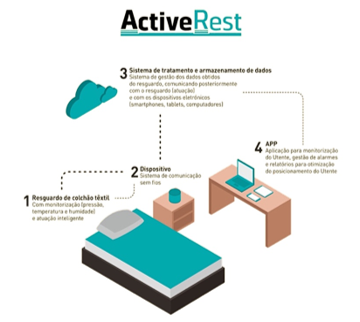
Figure 1 presents an infographic perspective of the underlying approach taken by the ActiveRest project.
The solution presented in this project, in addition to designing an application that is capable of displaying data from communication with the bedridden, also has a set of other features that complement the patient’s treatment and give the application another level of protection. So, based on what has been said, the research carried out and presented in this article aimed to improve the development of a mobile application in order to design a more versatile and efficient solution that enables better results of the mobile application in the use of textile protection by the digital component.
2. Digital Transformation of Health in Portugal
Digital transformation is increasingly present in health and, in this sense, “several systems have been developed, implemented and updated to improve the quality of the information in healthcare provision and management, increase efficiency and technologically upgrade existing systems. , allowing for an improvement in public services provided to citizens […]” [5].
In Portugal, the eHealth Summit event has been held in recent years where the main advances in the Health area are debated. Besides, several implementations of the concept have been observed in the country, an example is the Paperless Receipt (PR) which, according to the NHS, consists of the following: “With PR, the user may provide his doctor with an email and mobile number to receive prescribing information. At the time of consultation, he will be able to receive the treatment guide in paper form, or choose to receive it via email, and also access and consult it in the Citizen Area” [6]. In August 2018, the PR represented 97.02% compared to the traditional ones [7]. This figure reflects the effectiveness of the implementation of the system which, besides reducing costs and contributing to environmental preservation, has greater safety and control of the prescription of the medicine.
Henrique Martins, President of the Ministry of Health’s Shared Services (HSS), states that “[…] we cannot continue to program and create digital solutions, assuming that people are sitting in front of a fixed terminal. People move. Healthy people do not go to the NHS much, nor do they want or seek health care… It is health that has to go after them and preferably in their pockets and everywhere. Therefore, all mobile digital transformation requires a paradigm shift in programming, creation, and the relationship of digital tools.” [8, p. 9]. In Portugal was created MySNS Carteira, an app that allows the user to consult his health information present in the National Register of User (NRU), through his own mobile phone. In May 2018 this was the most popular app in Portugal in the Health & Fitness category of the GooglePlay and AppleStore stores [9, 10].
MySNS Carteira is an example of mHealth – Mobile Health that “refers to the practice of medical and public health supported by mobile devices such as mobile phones, tablets, personal digital assistants (PDA) and wireless infrastructure. […] mHealth covers all applications of telecommunications and multimedia technologies for providing health information.” [11].
In the Portuguese context, mobile applications are the most used medium in mHealth, with surveillance, monitoring and information exchange being the most used features in the development of these apps [12].
Through several initiatives, such as those mentioned above, Portugal distinguishes itself at the forefront of Digital Health Transformation with prominence among the member countries of the European Union [5]. Despite this achievement, SPMS President Henrique Martins has listed eight essential conditions for the country to continue with this advance: (1) Social and political motivation and support; (2) eSkills of health professionals and digital literacy of citizens; (3) Technical skills of technical staff in the State and in companies; (4) Strengthening the action of digital transformation agents; (5) Robust infrastructure, fast networks, and appropriate hardware; (6) Digital pillars and experience; (7) Mobile-to-start principle; (8) All2All thinking; CyberSecurity as a Service; TeleHealth as a principle rather than as a supplement [8].
Under these conditions, it is possible to observe that both health professionals and other citizens are fundamental elements for TDS in Portugal to continue to happen gradually. Through the support, receptivity, and use of technological systems, it will be possible to create a means of collaboration for this advance. And for these technologies to be successful before the public, the intervention of professionals specialized in technological and digital areas, such as programmers and designers, is required.
3. Mobile Health Applications
Since its inception, the use of mobile applications has spread. The massification of mobile devices coupled with the expansion of easy access to the internet, justify the growing increase in their use. Other factors that contributed to this growth are the ability to be developed for various types of needs, and the mobility characteristic of mobile devices. The number of app store downloads is growing rapidly every year. In 2017 the number of downloads was 178.1 billion, the forecast is that this number will increase to 258.2 billion in 2022 [13].
Wireless technologies combined with mHealth enable healthcare to be increasingly connected. In the digital health market, mHealth has been the fastest growing technology since 2015 [14]. The diversity of mHealths present in online stores is extensive, being one of the fastest-growing categories. According to a statistical analysis by Statista, the Health & Fitness group is AppStore’s eighth most popular group.
Through the use of wearable equipment (electronic devices that capture and send information and can be used as clothing accessories, such as a bracelet or watch) apps are developed for various uses and mainly for monitoring, storage and data exchange. FitBit is a company that manufactures a wearable technology-based wristband that collects fitness data from the wearer and uploads it to their smartphone storage. According to one study, the use of the bracelet proves to be effective in weight loss [15]. In addition, other research indicates that data collection by the device is accurate and reliable [16]. In 2016, the same company was in the top 50 on the list of the 500 fastest growing companies worldwide [17]. Just like the FitBit bracelet, there are many other solutions in this context, which have a good reception by the public.
Mobile applications have changed the global health scenario in both work and personal care. There is a wide variety of applications focused on this area, and the trend is its gradual increase, especially with the introduction of new devices that, together with smartphones, allow the development of increasingly accurate and new mHealths. functionalities. On the other hand, because it involves a delicate subject such as health, it is necessary that these applications have supervision by a regulatory body, especially those that indicate diagnosis, since the apps are not 100% safe, always requiring the review of a professional. Cybersecurity is also an important issue, namely in protecting the user’s personal data.
Based on the objectives of the ActiveRest project, a mobile application was developed which, through data collection and exchange with the textile guard, enables better patient monitoring and, consequently, the prevention of pressure ulcers. Although there are already apps on the market that focus on the same theme of this research, they do not meet the needs of the equipment in question, for two main reasons: first because it is a device that has been developed since its inception, featuring certain particularities and functionalities that set it apart from other equipment; and second for distancing itself from apps with unattractive aesthetics to the user, being one of the main goals the development of an app with an appealing aesthetics for different segments of the app users.
4. Research Contribution
Pressure ulcers are classified by the NHS in the National Network of Integrated Continued Care group (RNCCI) which “has as its main objectives the provision of continuous and integrated health care and social support to people who, regardless of age, are in a situation of dependence and loss of autonomy” [18, p. 109]. Detailed information on health statistics and the burden of pressure ulcers on the economy has been provided by OCDE [19].
The DGS indicates that about 95% of pressure ulcers are preventable, as long as their degree of risk is identified in advance, so one of the factors that help prevent this problem is proper patient monitoring. One of the many problems that arise from the emergence of pressure ulcers is the increased length of stay of the patient causing the NHS greater financial burden.
The development of a mobile application that allows the caregiver to check the patient’s condition at any time could improve the prevention of pressure ulcers in order to optimize patient monitoring through the guarding sensing system which will send data about your performance for the app. With the ease of mobility of mobile devices, healthcare professionals, through the use of guard and mobile applications, will have greater control over the risk of developing pressure ulcers in patients using this type of equipment.
Through the use of the app, the workload of professionals responsible for providing the necessary care to these patients tends to decrease, since the system works autonomously, alerting the caregiver whenever there is a need for repositioning. as well as which or which body regions are under pressure. The decrease in the appearance of pressure ulcers, in addition to bringing more quality of life to the patient and their caregiver, will also present to the NHS a decrease in the expenses resulting from this health problem.
5. State of Art
For this analysis, we used mobile applications and device interfaces that integrate objects that act physically in the prevention/treatment of ulcers, such as mattresses with pressure sensors. The examples below correspond to existing applications/interface models that are designed to assist patients and their caregivers in the prevention and treatment of pressure ulcers, and also serve as an informative tool for this type of skin wound.
Applications and software analyzed: A) VA Pressure Ulcer Resource mobile application, B) XSENSOR – FORESITE PT software, C) uControl app and D) Lifelens.
The VA Pressure Ulcer Resource application developed for pressure ulcer and injury prevention is intended for US war veterans and their caregivers. Features such as history; sticky notes; notes; pressure and time monitoring graphs; alerts for the user to move around; a shortcut to get urgent care, as well as knowing where the nearest hospital is. These features allow the user to act proactively, through history and reminders, preventing the appearance of pressure ulcers. Alerts allow mobile users or caregivers to act at certain times, helping the patient to move so that there are no very long periods of body immobility [20].
The XSENSOR – FORESITE PT created ForeSite PT, which is a body pressure monitoring system using a mattress cover and a touch screen monitor with software that analyzes and stores data. Real-time display of a body map of the pressure being exerted allows the user to act on body movement only when necessary. Graphs with the duration of the current position and the occurrence of repositioning allow the system to be used by different users, a common occurrence in hospitals. The timer indicates the time intervals to be reset and is positioned prominently on the interface because it is a key feature of the system, allowing the user greater control over patient movements [21].
Unitron is a multinational company with high experience in hearing solutions. As a member of the Sonova Group, Unitron develops high-performance hearing solutions that enable natural listening to sounds and speech. In addition to hearing aids, Unitron offers its users three applications: Remote Plus, uControl and Start Here. These applications allow the user to get the most out of the device by adjusting the volume and balance of the hearing aids. Constant assessment of user satisfaction is also allowed, as is communication between users. This application is developed for the senior public and differs from the vast majority found in this market by presenting an attractive and intuitive design, managing through graphic minimalism to effectively transmit messages to the UI [22].
Pressure Ulcer Prevention is a mobile application developed by the University of Southern California School of Medicine for patients with pressure ulcers to use as a follow-up, information and research about the disease, thus allowing the sharing of information with doctors or caregivers for better identification of causes and subsequent prevention. The application allows the user to photograph and annotate some parts of his body – specifically the areas most sensitive to the appearance of pressure ulcers – for monitoring. With this data, the app creates graphs showing the history of the monitored part. It also allows the user to create alerts to remind them to reposition themselves to avoid constant pressure on a certain area of the body. It has a didactic component where it tells the patient recommendations to reduce the risk of ulcers. And just like the previous mobile app, it even includes a shortcut for the user to make emergency calls [23].
Vista Medical is a company that develops technologies in the field of sensors and pressure mapping. This brand has developed the BodiTrack system that consists of a kind of sensor blanket and a USB cable for the integration of devices such as tablets and computers to access the product software.
This software allows the user to view the history of pressure exerted at a given time; visualization of areas with higher pressure; indicates the risk factor of each body part according to sensing; allows you to time the repositioning time; indicates the maximum pressure exerted during a selected period; ability to create alarms and real-time pressure mapping [24].
Lifelens is a Windows Phone 7 application that diagnoses malaria with 94% accuracy, which contrasts with 40% of conventional methods [25]. This app significantly reduces the costs of testing and traveling teams for testing, as it only requires the user to photograph blood already combined with special malaria dye, then a specific algorithm indicates if the patient is infected. Results can be sent via the Internet, along with GPS coordinates, thus enabling faster interventions in disease outbreaks.
According to this analysis, it was possible to identify some functions that were the basis for the ActiveRest app project, namely: the real-time visualization of the pressure exerted by the body. This feature quickly and effectively provides you with information relevant to pressure ulcer prevention along with history, reminders, notes, pressure and time monitoring graphs.
The most relevant features for the study of the creation of the ActiveRest app were: the real-time visualization of the pressure exerted by the body to the local and general software. pressure ulcer prevention; pressure and repositioning history for better analysis of patient behavior; pressure and time monitoring reminders, diaries, and graphs for optimizing information catalysis.
An important detail found in the analyzed applications (table 1) was the presence of an emergency button that allows the user to quickly contact another person. However, it was observed that despite having an interesting concept, shortcuts in applications are confusing and with various actions to make the contact, causing the functionality to lose its main purpose. In ActiveRest we analyzed a more effective way to make this contact, allowing the user to perform the task with the fewest possible actions.
In the analysis of solutions for the prevention and treatment of pressure ulcers, it can be observed that the interfaces need a specific development, as well as the attention regarding UX because it is a product to be used by two audiences of different age groups. One of the challenges of this project was the development of interfaces that meet the needs of both segments.
Table 1: Comparative table of applications and software functionalities.
| APP -SOFTWARE |
|
||||
| FUNCTIONALITY | VA PRESSURE ULCER RESOURCE | PRESSURE ULCER PREVENTION | XSENSOR FORESITE PT | VISTA MEDICAL BODITRACK | UNITRON |
| Body Pressure Map | |||||
| Body Humidity Map | |||||
| Historic | |||||
| Sticky notes | |||||
| Daily | |||||
| Monitoring | |||||
| Data Graph | |||||
| Move Alert | |||||
| Emergency button | |||||
| UP’s Information | |||||
| Stopwatch |
6. Mobile Application Development
Extensive analytical work on the literature on the types of mobile applications and graphic software interfaces in the area of pressure ulcer prevention devices / systems has culminated in an app proposal and its specifications have been defined. In this way, it was possible to define the necessary steps for the development of the app, among which the characterization of the people; the information architecture; wireframes and wireflows; the visual identity; prototyping; and the mobile application to the current development of textile protection.
6.1. Personas
Persona 1 – Bruno, 30, male nurse responsible for providing care and monitoring bedridden patients. He works in a large hospital and looks after a sector with 25 bedridden patients, some of whom have pressure sores and the remaining developmental risks. It uses the ActiveRest app along with the textile guard to monitor patients more effectively, enabling them to make better and more accurate patient surveillance and, when necessary, to take appropriate preventive measures early. It also uses the app to record and manage patient information, including repositioning history, humidity, pressure, temperature, and view notes and reminders.
Persona 2 – Joana, 42, journalist, responsible for accompanying her bedridden mother at home. Joana works at home but sometimes needs to be absent. Use the app and guard to know when to reposition her mother as well as to receive alerts when an abnormal or hazardous situation is detected, including critical pressure spikes and/or excessive temperature and humidity levels.
Persona 3 – Maria, 67, retired, has reduced mobility, so she spends many hours in bed. In addition to lack of mobility and sensitivity, which requires help to move and change her position, she also has memory problems, having some difficulty remembering to take the medicines. That said, Maria uses the app as a resource in her care, taking advantage of the app’s alarmistic ability to reposition herself, as well as medication reminders, among other features that help her in her daily life and that provide her with preventive measures against her condition. She also uses the diary feature and reminder setting to create notes that may be important to present to the attending physician. She also makes use of the emergency call function as she has an imminent risk of myocardial infarction.
6.2. UX UI for audiences of different age
A aplicação móvel será utilizada por públicos de diferentes idades, sendo a idade inicial os 25 anos. O público jovem/adulto geralmente possui melhor literacia digital em comparação ao público idoso (65+). Por este motivo, foi necessária uma investigação a respeito do desenvolvimento de interfaces digitais para públicos com diferentes níveis de literacia digital.
The worldwide increase in the number of older people in an increasingly digital society requires that digital technology solutions were increasingly adapted to this public. The aging of the human body, even if currently possible, is one of the main obstacles in the use of digital media, due to the gradual loss of motor and mental abilities. However, the lack of use of appropriate solutions for this class of users in the development of digital interfaces is also one of the major factors for the frustration and withdrawal of the use of these technologies.
Data indicate that the usability of websites decreases 0.8% per year between the ages of 25 to 60 years, the reason is the increased time to complete each task on the page, and difficulties in interacting with the interface. This percentage tends to increase after age 60, a 75-year-old is 74% slower to use websites than a conventional 35-year-old. This is due to the consequences of human aging that contribute to it, among them it is possible to mention: the decrease of cognitive resources; of visual ability; the ability to memorize; of perception; and motor skills [3].
Nielsen says that designing only for the young audience may result in the elderly giving up the interface. In contrast, when designing for the elderly the chances of the interface being used by both audiences are significantly higher because the basis of the research will be for the development of an easily accessible interface for people with reduced mental and motor skills, so the interface can answer also to the young public that usually has these capacities in better condition, However, good practices for aesthetic design must be present in the project, as it is an important the attractive component for young audiences. Thus, the adaptability of the mobile application is an important resource to be used for both audiences to achieve greater success in using the app.
According to an analysis of several studies, it was possible to find different recommendations to be followed so that the interaction of senior users with digital interfaces is of the least possible frustration. These recommendations are based on human behaviour in a digital environment as they age, and the issues of decreased vision, motor coordination, and reduced memory capacity are the main factors for their development.
These recommendations, although based on the development of interfaces for the elderly, are largely similar to those indicated in the design for the adult audience. About the 10 Interface Design Usability Heuristics developed by Nielsen, the author states that: “The 10 Principles of Interface Design Usability are called heuristics because they are general rules rather than specific usability guidelines” [4].
With this research, it was possible to compile the analysed studies on the recommendations for interface design for seniors and then created a table where it is possible to briefly find these guidelines (Table 2). This table aims to facilitate and speed up the design of interfaces for seniors, so that following the suggestions in it is likely that the final product has a better solution for the user.
These recommendations have been used in the implementation of both versions of the app, so that both classes of users can use both versions of the app without causing them frustration or major handling difficulties.
6.3. Information Architecture
Information Architecture (AI) is a term created by designer Richard Saul Wurman. In his book “Information Architects” he states that the information architect is the “individual who organizes patterns inherent in data, transforming the complex into something clear” and who “creates the structure or map of certain information to enable others to create their path toward knowledge.” It further states that “AI is the emerging profession of the 21st century, whose scope is shaped by current needs, focused on clarity, human understanding and the science of information organization.” [26]
Table 2: Recommendations for the design of digital interfaces for the elder
| NAVIGATION | TEXT | COLOR | GRAPHISM |
| Home page customization option; | Font size should not be less than 14pt; | Color contrast: 4.5: 1 or 3: 1, depending on font size; | Visual noise reduction; |
| Allow the user to enlarge the screen; | Use non-serif and non-condensed typography whenever possible; | Option to change the colors of the application, and the other version of the theme should have colors with more contrast; | The application icon must be easily recognizable; |
| Always inform the user of the current page; | 80 characters per line in text; | Try to use familiar and user-recognizable symbols; | |
| Minimum possible actions to perform tasks; | Avoid the use of justified text; | Actions when identified by colors should also, whenever possible, make use of text or symbols; | Buttons with clear language and distinct from the other features of the app and avoid having too small dimensions, with the recommended minimum size 9mm high or wide; |
| Avoid drastic changes to the application interface when updates occur; | Use few font styles as well as different types; | Avoid using colors such as blue and green on the same screen, as the elderly have difficulty distinguishing them in screens; | |
| Whenever there is an error-prone and irreversible action, ask the user for task verification and confirmation; | Create option to increase or decrease mobile application font size; | ||
| The most important features should be visible on the first page avoiding the need for many interactions to find them; | Make use of clear and simple language that does not force the user to make too much memorial effort to identify an action; | In the background of texts avoid high contrast and opt for a pastel color so that there is no interference in reading due to the screen light; | |
| Make navigation as predictable as possible, as well as consistent with using the same features across all app pages; | Avoid the use of unnecessary words, where possible use a word to describe a function, always simply and clearly; | ||
| Whenever possible, insert top and bottom navigation bars should be uniform throughout the app navigation and should have frequently used page access buttons such as Home; | Make clear the hierarchy of information, clearly and clearly exposing the titles, and the information, according to its degree of importance, should be highlighted or evidenced; |
In the case of a mobile application, the information architecture brings together the concepts that will be present in the project and logically segments the information that will give rise to the features to be inserted in the app. This step makes the development of functions more objective and understandable. It is possible to observe in Figure 2, the information architecture for the app that is intended to be developed within the ActiveRest project, through a demo with the main specifications of the app, taking into account the different scenarios of use of the guard.
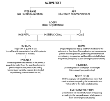 Figure 2: Information Architecture.
6.4. Wireframe and Wireflow
The term wireframe derives from the term waterfall which is defined as a model where the structure process is schematic and sequential, being drawn from top to bottom. This model was described by Winston W. Royce in 1970. With the development of digital editing software, such as Adobe Photoshop, more flexible [27]. According to Brown “Wireframes are” crude “illustrations that show, to a greater or lesser extent, the content of each screen. They are called wireframes because they are usually rendered with simple lines, not very elaborate designs. They illustrate, among other things, what kind of information will be most important on each screen” [28].
From the developed wireframes, it was possible to create the wireflow, that is, the flowchart that will act through the drawn screens. This step made it possible to identify the effectiveness of fluidity in navigating the related functions.
6.5. Visual identity and design guidelines
Regarding this project, the visual identity was developed to act in the mobile application and derived from the logo previously developed for it, and the main components derived from the logo used for the deployment of identity in the app were the colors and minimalist language.
According to the Interaction Design Foundation, design guidelines can be defined as: “sets of recommendations for good design practice. They are intended to provide clear instructions for designers and developers on how to adopt specific principles such as intuition, learning ability, efficiency, and consistency. Rather than dictating conventions, design guidelines provide helpful advice on how to achieve a design principle that can be platform-specific or cross-platform.” (Interaction Design Foundation, 2017). This definition can be understood as a set of good practices to be adopted in the development of design projects. It is not mandatory to use them, but only advisable, to improve the harmony of language for the use [29].
In the user interface field, Google and Apple are the largest guidelines developers, this is because they have the two largest mobile operating systems, respectively, Android and iOS. According to IDC consultant, the two best-selling smartphone brands in Portugal in 2017 were Huawei and Samsung, both using the Android operating system. Nevertheless, a study by Marktest in November 2017 indicated that the sites audited by the Android group had a 30.8% access percentage, representing leadership over other systems [30]. Thus, the most used operating system in Portugal is Android, which is why the app was developed according to the guidelines established by Google for the design of mobile applications.
Google created Material Design, defining it as “a visual language that synthesizes the classic principles of good design with technological and scientific innovation.” Thus, this concept can be understood as a set of guidelines that can be used for software development, directed mainly to the Android operating system. On the material.io website, the company offers several packages designed, based on scientific studies, in the concept of guidelines for the user interface. Also defined by UI Kits, this type of content is not required but has a high impact on mobile application development.
In summary, some of the advantages of using these UI Kits are that they are developed based on studies that seek the most satisfactory user possible interface and time optimization. First, on the part of the designer who can use this time in other components of the app design, and secondly on the part of the user, who can create a higher rate of application receptivity, as many components are known by him.
It is also possible to observe in these UI Kits the presence of several recommendations for elderly interface design as well as Nielsen’s heuristics. Some examples as simple and straightforward language; visual noise reduction; use of non-serif typography; minimalist design; consistency and predictability in navigation; use of standards among others are inserted in the development of this material. Thus, the use of Google’s UI Kit for ActiveRest application development was then defined as it had the interface developed for the Android operating system and these guidelines already fit the recommendations for designing applications for seniors as well as the use of parameters to be used for the adult audience. The images below demonstrate the design of some application screens using Google’s UIKit.
6.6. ActiveRest App
After analyzing all the research carried out within all the necessary components for the development of a mobile application that responds to the adult and elderly public in the same digital environment, the application was designed. For its development, the recommendations for interface design for the elderly as well as Nielsen’s heuristics were used:
- Color and Icons: The predominant color (# 00AAAD) used is the same as the project For better contrast, black and gray were used, as well as the use of white spaces to prevent visual noise, choosing the minimalist language. The settings can be changed the app theme to a higher contrast mode as well as change the font size. In Figure 3 can be seen the color option used and the option to change the font size. The icons are meant to be easily recognizable, thin lines were avoided, not to disturb the user’s perception.
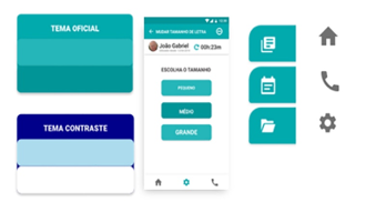 Figure 3: App Colors | Option to change font size | App icons.
- Home and Repositioning Time: on the homepage are the shortcuts to the most important functionalities of the application (see Figure 4), as well as the emphasis of the body pressure map and repositioning time that is present in most of the pages of the app for better control of the user.
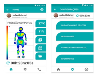 Figure 4: HOME-Domestic | SETTINGS-Hospital / Institutional screen (in the upper right corner is the timer).
- Emergency Button: was developed so that the user performs the minimum of actions to complete the task. We used windows to confirm the fulfilment of emergency requests to avoid unnecessary requests. These windows are positioned closer to the bottom of the interface so that the user can finalize the task with the least possible actions (see Figure 5).
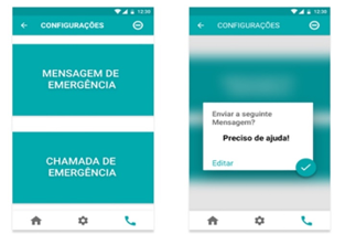 Figure 5: EMERGENCY BUTTON screen and Home confirmation popUp.
- HOME version and HOSPITAL / INSTITUTIONAL version: The two versions of the app are similar in several respects, differing only in the following, the login mode that in the home version is done through the user and password credentials, and in the hospital / institutional version is done through the access PIN, the latter being the most common mode in hospital software; Emergency Button functionality is present only in the home version because it is not useful in a hospital / institutional setting.
6.7. Prototype
The prototypes can be tested in the following links:
- DOMESTIC: https://marvelapp.com/ed2cbie
- HOSPITAL (Institutional): https://marvelapp.com/4id38ji7.
7. Wireless Communication System
The Bluetooth Low Energy (BLE) communication protocol was selected to enable a simple and standard way to establish between the mattress guard the developed mobile App. For each mattress guard, there will be a local electronic system (comprised of a printed circuit board with a processor, storage unit, and a BLE module), which will manage the power supply of the different electric components and obtain a signal input from them (namely, the sensors and actuators embedded on the mattress guard).
Control of the sensors and actuators is achieved through a microcontroller, which also stores the sensor information in the local storage unit. When the App establishes a connection with the mattress guard, by pairing the mobile device with the BLE module in the local mattress guard controller, data will start being transferred by Bluetooth and become available to the user. Conversely, whenever high pressure loci are detected above the defined threshold, the device will enable one or several of the actuators (according to a protocol developed within the ActiveRest project) in order to eliminate that pressure peak.
Figure 6 shows a schematic of the communication model between the mattress guard and its control and management electronic system, as well as the digital unit to where the data are sent by Bluetooth, becoming accessible to the user.
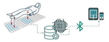 Figure 6: Scheme of the data communication model.
8. Android App Implementation
In order to validate the graphic model of the developed App, a prototype version was created, integrating the core features that can be tested by users and that are vital to the underlying purpose. These include the wireless communication between App and the mattress guard, and are essentially dependent on the hardware that acquires the signal and stores it for further processing. This App was developed using Android Studio version 3.1. It was compiled and further tested using a mobile phone running Android 7.0, and featuring current standard hardware, including the required Bluetooth communications module.
The App initializes with the project logo. After the start-up screen, the user is presented with the first interactive screen, that displays data received from the mattress guard. This main screen intends to provide almost all relevant information the user requires for the purpose of monitoring the bedridden patient, and includes a graphical representation of the pressure mapping. In order to communicate with the mattress guard, the App employs the low energy Bluetooth protocol, using a pre-defined MAC address (configurable by the user), thus receiving data from the external on a regular time interval. The pressure data is processed into a color scale, which highlights specific pressure loci. The employed color scale goes from white (which stands for locations with pressure below a minimum setting, and which are not relevant), passing through a blue gradient (relatively low, but relevant pressure, usually implying the presence of a body), up to the highest pressure values, in red gradient (implying the pressure in that location has exceeded the threshold pressure for potential formation of ulcers). For every sensor present in the mattress guard, the value provided to the App is mapped onto this color scale and rendered in the two-dimensional grid that represents the physical device (see Figure 7.a). It was possible to use a simple and regular two-dimensional grid because all the sensors are spaced equally in the developed mattress guard, but this could be easily adjusted to any other physical configuration of the sensors.
Whenever the local pressure value exceeds the user-defined threshold (for which the project conducted a literature review and collected information from medical staff), it will induce an alarm, which can then trigger both (or either) a communication to a caregiver by text messaging, and a local notification / pop-up (with an audible trigger). Also, in order to allow analysis of the history of previous high pressure loci alerts, whenever the value exceeds the threshold it is stored in a list, which can then be accessed through a specific App page. This second App page, with the history of critical values, is shown in Figure 7.b. Note that in this view only the highlighted pressure loci are usually represented, but the user can quickly adjust the mapping threshold, for example to see how the overall pressure map evolved between alarm intervals. The pressure information is stored in a simple text file which later can be extracted from the device and transmitted to a caregiver or a physician.
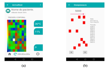 Figure 7: Android App screenshots: (a) the main page where the data from the pressure mapping, and the temperature and humidity values are shown, as well as the repositioning timer, and (b) the page with the history of critical pressures that exceed the established threshold.
Last, the developed App includes a timer that send a notification to the caregiver after the specified interval. This is very useful for the regular repositioning of the patient which is a routine activity that needs to be performed on bedridden patients. The mattress guard does not intent to replace the standard repositioning protocols, but to complement them by identifying whenever a more urgent action is required, and thus, the timer was a feature request by all the professionals that were inquired during the early specification stage.
9. Usability tests
The usability test is one of the most important phases of the project, it is through it that the user will contact the product and will bring the designer answers regarding the usability and effectiveness of the developed interface. Loranger states that the main benefit is identifying design efficiency as well as the actual needs of users [31].
Nielsen states that five participants are the ideal number for taking a test and that, for best results, they should be short-lived and made up of simple tasks [32]. Usability testing can be developed early in the project, except when the product is for senior audiences. In this case, the prototype to be tested must be of high fidelity, because, due to the aging of cognitive abilities, this audience has a lower degree of abstraction and imaginary component [26, 27].
Loranger highlights nine important criteria to consider when preparing a usability test [33, 34]. They are: (1) Define the purpose of the test; (2) Define the format and scenario of the test (lab or field / moderate or unmoderated / face-to-face or remote); (3) Number of users; (4) Ensure that participants are suitable for the intended test; (5) Create tasks corresponding to the purpose of the study; (6) Perform a test run; (7) Collect metrics; (8) Create a script for the test; (9) Conduct the team test consisting of a moderator (who conducts the test) and an observer (who observes and takes notes).
During the test, it is essential to pay attention to the mode of communication with the participant so that the influence on the final action is as small as possible. Nielsen states that the Thinking Aloud method is the most important tool in a usability testusabilidade [35], asking the participant to say what he is thinking while performing the task is an important resource for assessing how the user interprets the interface. Interventions are discouraged when the participant is performing a task, questions should be unbiased to avoid naming interface elements and where possible answer the participant’s questions with other questions and these should be exempt leading him to the conclusion by himself [24],[28]-[31].
After the completion of the test it will be through the analysis of the collected data that the success rates of each tested functionality will be found and, if necessary, redesigned to better fulfill the interface objective.
In the present project the usability tests were performed only with the interface developed to work in an institutional / hospital environment, were directed to three groups of participants, the first group was of eight nurses, the second two doctors, and the third five direct action assistants. It was decided to test the prototype in high fidelity in order to facilitate the participants’ interaction with the product. A guide was developed for the documentation of the test, which contained a detailed description of each task to be requested for the participant, as well as areas for annotation of the responses and their behavior. An app qualitative assessment questionnaire was also created for each test participant to complete at the end.
For data analysis, the profession and age range of each user was taken into account. The results indicated that the 31-40 age group had a higher success rate in using the interface. In terms of profession, nurses and physicians were the ones that represented the highest success rate. It is noteworthy that according to the questionnaire performed at the end of each test, these two classes were those that showed the greatest interest in mobile application adherence. It was identified that the questionnaire will not be the most appropriate tool to be used in usability tests, due to the fact that it presents different results from those collected in the monitoring guide, that is, the user’s opinion did not always coincide with their own rate. of success in accomplishing each task. Results are shown in Figures 8 and 9.
With an 85% success rate, it was concluded that the HOSPITAL/ INSTITUTIONAL interface achieves the proposed objective. However, for better use of the app it is best to have the two features with a lower success rate (change timer and exit the application) be changed as these are key functions in using the app.
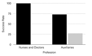 Figure 8: Profession Success Rate Chart; black: success rate; grey: failure rate. The graph comes from usability tests.
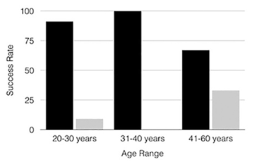 Figure 9: Age Success Rate Chart; black: success rate; grey failure rate. The graph comes from usability tests.
10. Conclusion
Pressure ulcers is a serious problem that significantly affects a patient’s quality of life. This problem occurs mostly in the elderly, with a high loss of physical health. Whether for economic or welfare issues, solutions focused on health care for the elderly are important preventive measures for the well-being of a society in which the average life expectancy of people tends to increase.
ActiveRest emerges as a solution focused on the prevention of UPs, through a textile shelter and a mobile support application. This project aims to offer patients (and their caregivers) a relevant contribution to their quality of life.
The present work had as main objective the development of the digital interface to work together with the ‘ActiveRest’ textile mattress guard. For the study it was necessary to examine the current panorama of digital technological investment in health with emphasis on the Portuguese market. In this way, it was possible to identify the current reality of health institutions as well as the existing solutions in the market to respond to this problem. The analysis of the behavior of the target public (adult and senior) was fundamental to understand what the real functionalities that these users need. It was also essential to analyze the solutions already on the market, these were selected according to similar functionalities that would be present in the ActiveRest project.
The application resulting from the investigation of this project, adapted with two versions to be used in a hospital environment and another in a home environment, even with the objective of working together with textile protection, is able to independently present support for prevention pressure ulcers. For example, the application’s timer functionality provides the user with better control and optimization of time and, if there is a possible failure in blocking the application, it will continue to work. Features like Diary, Help Button and Reminders also do not require the backup feature. For a better use of the application, it will always be necessary to use textile protection, however, these components demonstrate that the mobile application remains operational and functional, even without using it.
11. Acknowledgements
Sandra Ventura (Texteis Penedo), Graça Bonifácio (CITEVE), José Casquilho (ComfortKeepers), Joana Fonseca (CENTI), Joana Almeida (CENTI), Miguel Ribeiro (CENTI), Pedro Pereira (CENTI), and Ricardo Carvalho (CENTI), for their contributions to the ActiveRest project. This research was supported by FEDER funds through the COMPETE 2020 Programme under project ActiveRest (project 18011 of the 33/SI/2015 call).
- R. Suzman, J. R. Beard, T. Boerma, and S. Chatterji, ‘Health in an ageing world – What do we know?’, The Lancet, vol. 385, no. 9967. Lancet Publishing Group, pp. 484–486, 07-Feb-2015.
- E. instituto nacional de PORDATA, ‘Esperança de vida aos 65 anos: total e por sexo (base: triénio a partir de 2001)’, PORDATA, 2014. .
- J. Nielsen, ‘Middle-Aged Users’ Declining Web Performance’, 2008.
- National Pressure Ulcer Advisory Panel et al., Prevenção e Tratamento de Úlceras por Pressão: Guia de Consulta Rápida, vol. 2, no. 1. 2014.
- H. Martins, ‘Transformação digital e inovação na saúde em debate no “Portugal eHealth Summit”’, PÚBLICO, 19-Mar-2018.
- Serviço Nacional de Saúde, ‘Receita Sem Papel – SPMS’, 2018. [Online]. Available: http://spms.min-saude.pt/product/receita-sem-papel/. [Accessed: 09-Sep-2018].
- SNS, ‘Receita Sem Papel – Monitorização’. [Online]. Available: https://www.sns.gov.pt/monitorizacao-do-sns/receita-sem-papel/. [Accessed: 09-Sep-2018].
- H. Martins, ‘SNS digital e as condições da transformação digital na saúde’, 2018.
- A Enfermagem e as Leis, ‘MySNS Carteira: Aplicação móvel do SNS lidera na categoria de saúde e fitness | A Enfermagem e as Leis’, 2018. [Online]. Available: http://www.aenfermagemeasleis.pt/2018/05/09/mysns-carteira-aplicacao-movel-do-sns-lidera-na-categoria-de-saude-e-fitness/. [Accessed: 09-Sep-2018].
- G. Lins, ‘MySNS Carteira (SPMS) | Guga Lins UX/UI Designer’. [Online]. Available: https://www.gugalins.com/mysns-carteira/. [Accessed: 10-Dec-2019].
- Innovatemedtec, ‘mhealth – what is mhealth?’, 2018. [Online]. Available: https://innovatemedtec.com/digital-health/mhealth. [Accessed: 09-Sep-2018].
- C. Duque, J. Mamede, and L. Morgado, ‘Iniciativas de mHealth em Portugal mHealth initiatives in Portugal’, 2017.
- Statista, ‘Annual number of mobile app downloads worldwide 2022 | Statistic’, 2018.
- Statista, ‘Global digital health CAGR by major segment 2015-2020 | Statistic’, 2018. [Online]. Available: https://www.statista.com/statistics/387875/forecast-cagr-of-worldwide-digital-health-market-by-segment/. [Accessed: 13-Sep-2018].
- J. M. Jakicic et al., ‘Effect of Wearable Technology Combined With a Lifestyle Intervention on Long-term Weight Loss’, JAMA, vol. 316, no. 11, p. 1161, Sep. 2016.
- K. M. Diaz et al., ‘Fitbit®: An accurate and reliable device for wireless physical activity tracking.’, Int. J. Cardiol., vol. 185, pp. 138–40, Apr. 2015.
- Deloitte, ‘2016 Technology Fast 500 TM Ranking Recognizing growth’, 2016.
- Ministério da Saúde, ‘Relatório anual acesso a cuidados de saúde nos estabelecimentos do sns e entidades convencionadas’, 2018.
- OECD, Health at a Glance 2017. OECD, 2017.
- U.S. Department of Veterans Affairs, ‘Resource App’, no. March, 2017.
- XSENSOR, ‘XSENSOR Technology – Accurate Pressure Imaging Sensors’. [Online]. Available: https://xsensor.com/. [Accessed: 10-Dec-2019].
- uControl, ‘uControl’. [Online]. Available: https://www.unitron.com/content/unitron/pt/pt_PT/professional/hearing-solutions/accessories/hearing-instrument-accessories/ucontrol.html. [Accessed: 10-Dec-2019].
- Pressure Ulcer Prevention (PUP) |, ‘Pressure Ulcer Prevention (PUP) |’. [Online]. Available: https://medicinegov.org/pressure-ulcer-prevention-pup/. [Accessed: 10-Dec-2019].
- BodiTrak, ‘BodiTrak – Wireless Bed Pressure Mapping System’. [Online]. Available: https://www.boditrak.com/products/medical/bed-system.php. [Accessed: 10-Dec-2019].
- Internetmedicine, ‘The Lifelens Project: Smartphone App Diagnoses Malaria from Drop of Blood | InternetMedicine.com’, 2014. [Online]. Available: http://internetmedicine.com/2014/04/26/malaria1/. [Accessed: 13-Sep-2018].
- J. Nielsen, ‘10 Usability Heuristics for User Interface Design’, Nielsen Norman Group, 1995. [Online]. Available: https://www.nngroup.com/articles/ten-usability-heuristics. [Accessed: 12-Dec-2019].
- R. S. Wurman, P. Bradford, and G. P. Corp, Information Architects. Graphis, 1997.
- Timetoast, ‘History of wireframing Timeline’, History of wireframing Timeline, 2018. [Online]. Available: https://www.timetoast.com/timelines/23833. [Accessed: 28-Aug-2018].
- G. L. Strunck, Como criar identidades visuais para marcas de sucesso., 4a. Rio de Janeiro, 2007.
- Interaction Design Foundation, ‘What are Design Guidelines? | Interaction Design Foundation’, 2017. [Online]. Available: https://www.interaction-design.org/literature/topics/design-guidelines. [Accessed: 06-Sep-2018].
- H. Loranger, ‘Usability Test, Even When You Know the Answer’, 2018. [Online]. Available: https://www.nngroup.com/articles/test-when-you-know-answer/?lm=why-you-only-need-to-test-with-5-users&pt=article. [Accessed: 01-Dec-2019].
- J. Nielsen, ‘Why You Only Need to Test with 5 Users’, Nielsen Norman Gr., 2000.
- A. Dickinson, J. Arnott, S. Prior, and A. Dickinson, ‘Methods for human-computer interaction research with older people’, Behav. Inf. Technol. is, vol. 26, no. 4, pp. 343–352.
- H. Loranger, ‘Checklist for Planning Usability Studies’, 2016. [Online]. Available: https://www.nngroup.com/articles/usability-test-checklist/?lm=users-real-data&pt=article. [Accessed: 01-Dec-2019].
- J. Nielsen, ‘Thinking Aloud: The #1 Usability Tool’, 2012. [Online]. Available: https://www.nngroup.com/articles/thinking-aloud-the-1-usability-tool/. [Accessed: 01-Dec-2019].
- Fatima-Zahra Elbouni, Aziza EL Ouaazizi, "Birds Images Prediction with Watson Visual Recognition Services from IBM-Cloud and Conventional Neural Network", Advances in Science, Technology and Engineering Systems Journal, vol. 7, no. 6, pp. 181–188, 2022. doi: 10.25046/aj070619
- Mohammad Shadeed, Layth Abu Arram, Majdi Owda, "Forensic Analysis of “WhatsApp” Artifacts in Android without Root", Advances in Science, Technology and Engineering Systems Journal, vol. 7, no. 2, pp. 127–132, 2022. doi: 10.25046/aj070212
- Piwai Chikasha, Kemlall Ramdass, Ndivhuwo Ndou, Rendani Maladzhi, Kgabo Mokgohloa, "Industrial Engineers of the Future – A Concept for a Profession that is Evolving", Advances in Science, Technology and Engineering Systems Journal, vol. 6, no. 4, pp. 72–79, 2021. doi: 10.25046/aj060409
- Angelina, Weliati, Edwin Christian Jonatan Wardoyo, Sugiarto Hartono, "Mobile Application Design for Student Learning", Advances in Science, Technology and Engineering Systems Journal, vol. 6, no. 1, pp. 776–782, 2021. doi: 10.25046/aj060186
- Chinedu Wilfred Okonkwo, Magda Huisman, Estelle Taylor, "A Framework for Adoption and Diffusion of Mobile Applications in Africa", Advances in Science, Technology and Engineering Systems Journal, vol. 5, no. 6, pp. 1577–1592, 2020. doi: 10.25046/aj0506189
- Tarek Frikha, Hedi Choura, Najmeddine Abdennour, Oussama Ghorbel, Mohamed Abid, "ESP2: Embedded Smart Parking Prototype", Advances in Science, Technology and Engineering Systems Journal, vol. 5, no. 6, pp. 1569–1576, 2020. doi: 10.25046/aj0506188
- Alexi Delgado, Enrique Lee Huamaní, Alfredo Chiara-Sotomayor, Florencio Roman-Casahuamán, "Design of a Mobile Application for the School Enrollment Process in Order to Prevent Covid-19", Advances in Science, Technology and Engineering Systems Journal, vol. 5, no. 6, pp. 1042–1046, 2020. doi: 10.25046/aj0506126
- Nghia Duong-Trung, Nga Quynh Thi Tang, Xuan Son Ha, "Interpretation of Machine Learning Models for Medical Diagnosis", Advances in Science, Technology and Engineering Systems Journal, vol. 5, no. 5, pp. 469–477, 2020. doi: 10.25046/aj050558
- Gulam, Afan Galih Salman, Bayu Kanigoro, "Learning Tool for Kids on Android Platform", Advances in Science, Technology and Engineering Systems Journal, vol. 5, no. 5, pp. 212–216, 2020. doi: 10.25046/aj050526
- Sarun Duangsuwan, Chakree Teekapakvisit, Myo Myint Maw, "Development of Soil Moisture Monitoring by using IoT and UAV-SC for Smart Farming Application", Advances in Science, Technology and Engineering Systems Journal, vol. 5, no. 4, pp. 381–387, 2020. doi: 10.25046/aj050444
- Alexi Delgado, Enrique Lee Huamaní, Elizabeth Jenny Cortez-De La Peña, "A Mobile Application Design to Prevent Criminal Acts in Lima, Peru", Advances in Science, Technology and Engineering Systems Journal, vol. 5, no. 4, pp. 40–46, 2020. doi: 10.25046/aj050406
- Zuhri Syarifudin, Suharjito, "Mobile Based for Basic English Learning Assessment with Augmented Reality", Advances in Science, Technology and Engineering Systems Journal, vol. 5, no. 2, pp. 774–780, 2020. doi: 10.25046/aj050297
- Rajesh Kannan Megalingam, Santosh Tantravahi, Hemanth Sai Surya Kumar Tammana, Nagasai Thokala, Hari Sudarshan Rahul Puram, Naveen Samudrala, "ROS Based Multimode Control of Wheeled Robot", Advances in Science, Technology and Engineering Systems Journal, vol. 5, no. 2, pp. 688–696, 2020. doi: 10.25046/aj050285
- Alvina Aulia, Yogi Udjaja, Irma Kartika Wairooy, Adithia Panji Hutama, Dinar Khansa Shabira, Sabilal Muhtadin, "Android Application to Detect Cat Disease Using an Expert System", Advances in Science, Technology and Engineering Systems Journal, vol. 4, no. 5, pp. 158–162, 2019. doi: 10.25046/aj040521
- Iryna Zhuravska, Dmytro Lernatovych, Oleksandr Burenko, "Detection the Places of the Heat Energy Leak on the Underground Thermal Pipelines Using the Computer System", Advances in Science, Technology and Engineering Systems Journal, vol. 4, no. 3, pp. 01–09, 2019. doi: 10.25046/aj040301
- João Manuel Leitão Pires Caldeira, Vasco Nuno da Gama de Jesus Soares, Pedro Miguel de Figueiredo Dinis Oliveira Gaspar, Joel José Puga Coelho Rodrigues, Ricardo Manuel Valentim Fontes, José Luís Lopes Silva, "iSensA – A System for Collecting and Integrating Sensor Data", Advances in Science, Technology and Engineering Systems Journal, vol. 3, no. 6, pp. 213–221, 2018. doi: 10.25046/aj030628
- Tareq Khan, "A Wi-Fi based Architecture of a Smart Home Controlled by Smartphone and Wall Display IoT Device", Advances in Science, Technology and Engineering Systems Journal, vol. 3, no. 6, pp. 180–184, 2018. doi: 10.25046/aj030623
- Procheta Nag, Saikat Mondal, Arun More, "A Holistic User Centric Acute Myocardial Infarction Prediction System With Model Evaluation Using Data Mining Techniques", Advances in Science, Technology and Engineering Systems Journal, vol. 3, no. 6, pp. 56–66, 2018. doi: 10.25046/aj030605
- Zijadin Krasniqi, Adriana Gjonaj, "The impact of Big Data on the Android Mobile Platform for Natural Disaster Situations", Advances in Science, Technology and Engineering Systems Journal, vol. 3, no. 2, pp. 206–210, 2018. doi: 10.25046/aj030224
- Tsz Hei Yeung, Chi Kit Ng, Vincent Ng, "A Smart Mobile Application for Assisting Parents in Anti-Drug Support", Advances in Science, Technology and Engineering Systems Journal, vol. 3, no. 1, pp. 434–442, 2018. doi: 10.25046/aj030153
- M. Raihan, Saikat Mondal, Pritam Khan Boni, Arun More, Md. Omar Faruqe Sagor, "Smartphone Based Heart Attack Risk Prediction System with Statistical Analysis and Data Mining Approaches", Advances in Science, Technology and Engineering Systems Journal, vol. 2, no. 3, pp. 1815–1822, 2017. doi: 10.25046/aj0203221
