The Usability Evaluation of Academic Progress Information System (SIsKA-NG)

Adv. Sci. Technol. Eng. Syst. J. 5(2), 460–468 (2020);
 DOI: 10.25046/aj050259
Limited functionalities of the Academic Progress Information System (SIsKA) has direct consequences on the quality of thesis management service at the authors’ magister study program of the authors’ university. This research focused on the significant improvement from the previous User Experience Questionnaire (UEQ) result of SIsKA. That significant improvement was based on the recommendations from the previous Heuristic Evaluation (HE) and two additional usability evaluation methods. All of those improvements have been applied to the new Academic Progress Information System that was called SIsKA Next Generation (SIsKA-NG). Overall, there are three usability evaluation methods were used in this research, namely the Performance Measurement (PM), the Retrospective Think Aloud (RTA), and the UEQ. The PM through the effectiveness analysis and the efficiency analysis each provided 11 and 16 recommendations, while The RTA provided 39 recommendations. The UEQ provided the assessment on SIsKA-NG with level excellent on aspect of attractiveness, efficiency, dependability, stimulation, and novelty; and with level good on aspect of perspicuity. It was considered as a significant improvement of the UEQ result of SIsKA-NG compared to the previous UEQ result of SIsKA because of the better assessment on four aspects with level excellent on SIsKA-NG, namely attractiveness, efficiency, dependability, and novelty. Same assessments are on two aspects, namely perspicuity and stimulation. SIsKA-NG still need to be improved based on the aspect of perspicuity, additional recommendations from the conducted Focus Group Discussion, and procedural White Box testing for code evaluation.
1. Introduction
This paper conformed to the scope of the journal in Computer software and applications (A6) of Engineering & Technology topic. It addressed a particular complex system related to the thesis management information system. This paper is an extension of the work originally presented as a best paper in The 3rd Third International Conference on Informatics and Computing (ICIC) [1]. This paper focused on the significant improvement from the previous User Experience Questionnaire (UEQ) result of SIsKA. That significant improvement was based on the recommendations from the previous Heuristic Evaluation (HE) [1] and two additional usability evaluation methods conducted in this research, namely the Performance Measurement (PM) and the Retrospective Think Aloud (RTA). All of those improvements have been applied to the new Academic Progress Information System that was called SIsKA Next Generation (SIsKA-NG). SIsKA itself is Indonesian abbreviation of “Sistem Informasi Kemajuan Akademik”.
SIsKA that has been used at the authors’ magister study program (refer to ” the authors’ study program ” on the next discussion) of the authors’ university has been able at certain level to manage the academic progress of the postgraduate student (refer to “the student” on the next discussion) related to their thesis research [1][2]. The future works of that previous research are on improving the UEQ result and following up the user interface improvement recommendations based on the HE using expert respondents.
This research focused on that future works and following up the recommendations from two additional usability evaluation methods, namely the PM and the RTA. The usability evaluation by involving the user respondents has an advantage on information about how the users use the system as well as problems faced directly by them [3]. There are three categories of usability evaluation methods, namely inspection, testing, and inquiry [4]. This research used both of testing and inquiry for observing the users and their response to get the improvement recommendations.
This paper is organized into several sections, i.e.: Section 1 (Introduction) describes the problem background related to the improvement of SIsKA based on its previous UEQ result [1]; Section 2 (Literature Survey) describes the related works in area of usability testing methods; Section 3 (Research Method) contains the research stages for all of SIsKA improvements applied to SIsKA-NG; Section 4 (SIsKA-NG) provides several aspects related to its initial design and implementation; Section 5 (Result and Discussion) covers SIsKA-NG usability evaluation; and finally, Section 6 (Conclusion and Future Work) consists of some important concluded points.
2. Literature Survey
There are many usability testing methods that have been developed and tested to provide recommendations for improving a system. In one study, Ita et al. [1] successfully utilized the HE to produce recommendations based on expert aspects in the interface field. The PM is another usability testing method, where in one research, Widyanti et al. [5], used it in evaluating the interface of online transportation. The PM was used to obtain quantitative data to analyze the level of effectiveness and efficiency when the users carry out certain tasks [4][5][6]. Widyanti et al. combined the PM with the RTA, where the RTA is a Think Aloud method that can be combined with other usability methods [7][8]. Elling et al. [8] combined with eye movements method in analyzing the behavior of system users. Those research [5][8] provided a list of recommendations for the improvement of the system being evaluated.
In addition to usability testing, the level of satisfaction of user experience also needs to be calculated by determining the aspects to be evaluated [1]. The inquiry method is one method that can be used to evaluate user experience [4]. The UEQ, as one type of Questionnaire, usually takes 3-5 minutes to read and complete the questionnaire [9]. The UEQ has the questionnaire items that can make the respondents do not think too long to fill out the questionnaire [10]. The purpose of the UEQ is to compare the level of user experience between two products, test the user experience of a product, and determine area of improvement [11]. The UEQ has the advantage of measuring aspects of user experience of the product very quickly [12].
In our research, we combined the PM method with the RTA method by involving system users. We also calculated the satisfaction value of user experience using UEQ to get aspects of user experience that must be improved. This research is not limited to obtain system improvement recommendations as in the previous studies [1][5][8], but also carried out the implementation phase at the authors’ postgraduate program server. So that the recommendations for improvements that are obtained directly can be tested by the users and of course will get other recommendations, closely related to the system implementation environment.
3. Research Method
Figure 1 shows the research method in the form of a flow chart. The initial stage of this research was to design and to implement SIsKA-NG that follows up the previous HE recommendations [1] related to the user interface improvement of SIsKA web page (refer to “page” on the next discussion), as shown by Table 1. Note that Table 1 has been updated by additional expert recommendations since the previous publication [1].
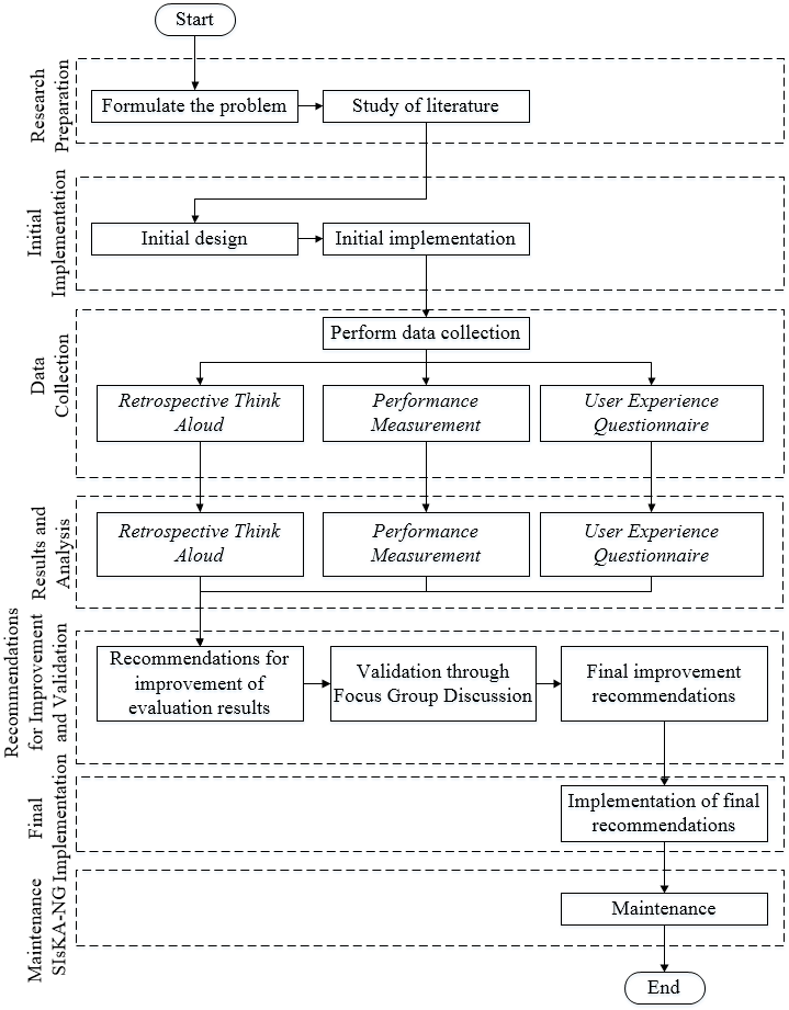 Figure 1: Research Method
The usability evaluation with the PM and the RTA was conducted afterwards, and their improvement recommendations were then validated by SIsKA-NG manager, namely the authors’ study program manager and the authors’ postgraduate program Information Technology (IT) manager. The process was continued to implement the recommendations on SIsKA-NG at the authors’ postgraduate program server. The maintenance was conducted after establishing the implementation.
The UEQ used 20 respondents [11][13] who carried out certain tasks according to the pages being evaluated [14]. Evaluation on the administrator pages used 25 tasks, the lecturer pages used 14 tasks, and the student pages used 21 tasks. Each respondent run each task 2 times to get a difference in the level of effectiveness and efficiency. The final stage of data collection was filling in the questionnaire (Figure 2) combined with the additional questions to clarify the answers of the respondents [15].
Table 1: The Updated Previous Recommendations of SIsKA
| No | Violated principle(s) | Recommendation(s) |
| 1 | Visibility of system status (feedback).
When the confirmation to delete the data appears, the “Delete” button is blue, while the “Back” button is red. |
1. Use standard color of buttons, such as red for “Delete” button and blue for “Back”, so the users do not misunderstand and make a mistake.
2. There should be a response that distinguishes visually when the object is given an action (selected, pressed, etc.). 3. Naming the menu and the page in accordance with its content. 4. Color must be clear on the button or functional system. |
| 2 | Use Control and Freedom.
The users are forced to change the password if the password is the same with the username. |
1. Instead of forcing the users to change the password, they should be given a warning. The users have the freedom to decide either to change or to leave their password.
2. There should be a feature to manage personal account data of each user, including sensitive information such as password. |
| 3 | Flexibility and Efficient of Use.
Search feature does not exist yet, there is only a search in the table, which is not appropriate. |
The search feature should be placed at the upper right corner of the page according to the standard system interface in general. |
| 4 | Recognation rather than Recall.
There is no error warning message when the users make a mistake. |
1. The system do not prevent the users from making a mistake. For an example, in making examination schedule. If the users have to add schedule first, the button to manage the participants should be disabled so that they are prevented to press the button.
2. The added schedule feature is done one by one, so that the users do not make a mistake, such as pressing the manage button of the participant first and then creating the examination schedule data. |
| 5 | Consistency and Standards.
The “Add” menu is inconsistent. |
1. The menu should be consistent, should add “Add” menu in lectures data page.
2. Consistency on the use of grammar in naming menus provided by the system. 3. Consistency on color selection on the system. |
| 6 | Aesthetic and Minimalist Design.
There is no clear instructions/description on any given page, so the users can only guess the content/ intent of the page. |
Each page is given a clear and informative description so that the users do not guess the intent of the page. For an example, the student home page still empty. It should be filled with the informative information, such as the registration flow of the proposal to the thesis examination; or the information related to the history of the stage passed by the student (see next Figure 4). |
| 7 | Error Prevention.
The system do not prevent the users from making a mistake. |
1. The system needs to prevent the users from making a mistake, such as providing a message to make sure whether they actually logout or not.
2. Provision of automatic data entry feature or the system provides clear data format, such as date, time, and telephone number. 3. Provision of warning feature about data or action that can cause error. |
| 8 | Help and Documentation.
There is no help menu. |
1. Creating a help menu to make it easier for the users to use the system, including: 1) News; 2) System Guidance; and 3) Frequently Asked Question (FAQ).
2. Creating a site map to make it easier for the users to navigate the system. |
| 9 | Match between system and real world | The use of grammar that can be understood directly by the users in accordance with their expectations. |
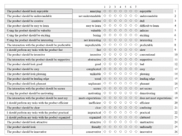 Figure 2: Twenty-Six Statement Items of UEQ
4. SIsKA-NG
Based on Table 1, the initial design of SIsKA-NG with its main functionalities is elaborated by using a use case diagram [16], as shown by Figure 3. The use case diagram shows the main functionalities related to the management of research, involving three stages of examination (proposal, pre-thesis, and thesis), and three kinds of user (administrator, lecturer, and student). Part of those examination stages was shown by Figure 4. Related to kinds of user, the administrator manage any data related to the student research, including research data, examination prerequisites, and examination schedule. The students can submit their research data and examination prerequisites, and later view examination schedule, as well as list of existing researchs. The lecturers have access to see the examination schedule related to their role as a supervisor or an examiner. All those described functionalities can be done by the users if they have logged in to SIsKA-NG.
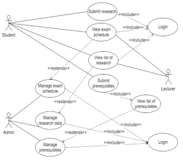 Figure 3 Use Case Diagram of SIsKA-NG
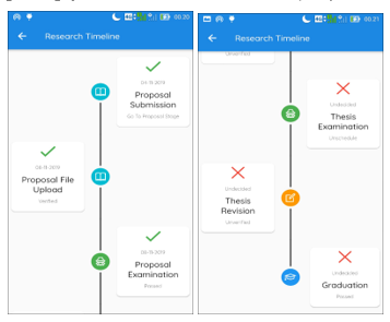 Figure 4 Part of the Student’s Examination Stages of SIsKA-NG on its mobile application: Proposal (Left); Thesis (Right)
Figure 5 shows an the Entity Relationship Diagram (ERD) of SIsKA-NG with the entities and their relationships that are described by using the Crow’s Foot model [17] from the previous recommendations [1], as shown by Table 1. There are 17 entities related to each other. These entities in the ERD is used for SIsKA-NG new database implementation.
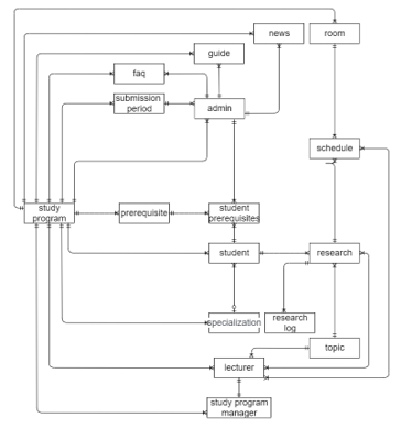 Figure 5 ERD of of SIsKA-NG
The ERD also shows relationship type of one-to-one and one-to-many. For example, one-to-one relationship connects the lecturer and the study program manager since only one lecturer can be a study program manager, meanwhile one-to-many relationship connects the specialization and the student since one specialization can be assigned to many students.
In addition to the functionality requirement design using use case diagram and ERD, an analysis was also carried out for non-functionality requirement related to the implementation. Table 2 shows the non-functionality requirement that are tailored to the authors’ postgraduate program server specification. Based on Table 2, a web framework CodeIgniter was used to improve the novelty aspect of SIsKA-NG technology. That framework supports PHP 5.6 and one of the latest web technologies [18][19].
Table 2 Non-Functionality Requirement of SIsKA-NG
| No | Requirement | Specification |
| 1 | Web Server | Apache: 2.4.x |
| 2 | DBMS | MySQL: 5.x |
| 3 | PHP | PHP: 5.6 |
The result of the initial implementation based on the previous recommendations (Table 1) produced SIsKA-NG with an improved interface. As an example, Figure 6 shows the administrator starting page.
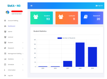 Figure 6: SIsKA-NG initial implementation of the Administrator Starting Page
5. Result and Discussion
5.1. The Performance Measurement
The PM was conducted through the effectiveness analysis and the efficiency analysis. The effectiveness of SIsKA-NG was obtained by counting the number of failures that occur when the respondent completes the task. The effectiveness analysis was conducted by reviewing the video of the work done by the respondent to see the factors that cause the respondent failed to complete the task. All factors that cause failure were then summarized so get a final list of causes of failure and recommendations for the improvement.
Table 3 shows the result of SIsKA-NG effectiveness analysis. On the administrator pages, there are four factors that cause failure, namely: 1) Unclear menus that need to be regrouped and renamed; 2) Less effective position of the student prerequisites sub menu; 3) Less effective position of the action button; and 4) Less effective display button. On the lecturer page, there are four factors that cause failure, namely: 1) Less effective position of the action button; 2) Less clear icon of the action button; 3) Less clear filter feature of each research stage and the examination schedule; and 4) The clarity of the grammar on the page. On the student page, there are four factors that cause failure, namely: 1) Less effective position of the action button; 2) Less clear icon of the action button; 3) The examination schedule that does not directly displays the detail schedule; and 4) The clarity of the grammar on the page. Table 4 shows the list of the recommendations based on the effectiveness analysis.
Table 3: The Result of SIsKA-NG Effectiveness Analysis
| Pages | 1st Test | 2nd Test | ||
| Errors | Percentage | Errors | Percentage | |
| Administrator | 23 | 4,60% | 5 | 1% |
| Lecturer | 20 | 7,14% | 8 | 2,86 |
| Student | 14 | 3,33% | 9 | 2,14% |
The efficiency of SIsKA-NG was obtained by comparing the time spent by the respondent on the first and the second trial. This efficiency calculation used a statistical comparison of the Mann Whitney U-test. Comparison of work time data from two experimental groups requires two hypotheses for each task, namely:
- H0 : There is no time difference in the completion of task [task number] between the first trial and the second trial.
- H1 : There is time difference in the completion of task [task number] between the first trial and the second trial.
Final computation of the efficiency data processing was done by comparing the p-value generated from the Mann Whitney U-test [6] of each task with a value of a equal to 0.05. If the p-value is greater than 0.05, the decision taken do not reject H0. Analysis of the factors causing the efficiency is also done if H1 is true. Analysis of the factors causing this level of efficiency is done by reviewing the video of the work done by the respondent to see the factors causing the difference in task completion time. All factors are then summarized to obtain a final list of causes of the time difference in efficiency and its recommendations for the improvement.
Based on the results of p-value comparison of each task with value a, then statistically there are 4 tasks that do not have a significant difference and 21 other tasks that have a significant difference from the completion time of each task on the administrator page. On the lecturer page, there are 10 tasks that do not have a significant difference and 4 other tasks that have a significant difference from the completion time of each task. On the student page, there are 10 tasks that do not have a significant difference and 11 other tasks that have a significant difference from the completion time of each task.
Tasks that show a significant difference in processing time are then analyzed in terms of causal factors by re-observing the video of respondent’s work. It was found that on the administrator page, many respondents have difficulty in finding the action buttons and menus grouping that are unclear, so that in the first trial more time was needed to search for menus or functions for task completion. On the lecturer and the student pages, significant time differences in some assignments were also found caused by inconsistent and unclear buttons positions, besided unclear grammar. Table 5 shows the list of the recommendations based on the efficiency analysis.
Table 4: The Recommendations based on the Effectiveness Analysis
| No | Pages | The Recommendations |
| 1 | Administrator | 1. Be clear on the group and the name of the menus related to their function.
2. The student prerequisites sub menu should be moved to the main menu. 3. The action button should be moved to the left position of the page. 4. The display button should be removed so the users only need to input the filter data. |
| 2 | Lecturer | 1. The action button should be moved to the left position of the page.
2. The icon of the action button should be easy to understand. 3. Be clear on filter feature at each research stage and exam schedule. 4. Be clear on the grammar on the page. |
| 3 | Student | 1. The action button should be moved to the left position of the page.
2. The icon of the action button should be easy to understand. 3. The examination schedule should directly displays the detail schedule. 4. Be clear on the grammar on the page. |
Table 5: The Recommendations based on the Efficiency Analysis
| No | Pages | The Recommendations |
| 1 | Administrator | 1. Be clear on the group and the name of the menus related to their function.
2. The action button should be moved to the left position of the page. 3. The save button should be moved to the bottom position of the page. 4. The display button should be removed so the users only need to input the filter data. 5. The entire examination schedule should be displayed and could be filtered afterwards. 6. Active Menu Tab should be colored for the visual clarity to the users. 7. Help text should be added for the usage clarity to the users. |
| 2 | Lecturer | 1. The save button should be moved to the bottom position of the page.
2. Filter feature should be added to the stages in all research submenus. 3. The display button should be removed so the users only need to input the filter data. |
| 3 | Student | 1. Be clear on the group and the name of the menus related to their function.
2. The action button should be moved to the left position of the page. 3. The save button should be moved to the bottom position of the page. 4. Summary of the previous research stage is automatically displayed when the users add research data. 5. The examination schedule should directly displays the detail schedule. 6. Active Menu Tab should be colored for the visual clarity to the users. |
5.2. The Retrospective Think Aloud
Table 6, Table 7, and Table 8 show the summary of difficulties, problems, suggestions, and/or criticisms on SIsKA-NG page of the administrator, the lecturer, and the student, respectively. Related to the position mentioned further, it refered to the position at SIsKA-NG page.
Table 6: Summary of the RTA on the Administrator Pages of SIsKA-NG
| No | Respondent Code | Summary |
| 1 | R01, R04, R05, R06, R08, R10, R12, R14, R15, R16, R17, R19, R20 | Features/aspects on the main menu and perspicuity:
1. Menus seem unclear and should be grouped based on their similar function. 2. Menus should stay visible so that when the users are at the bottom position, there is no need to scroll up to find them. 3. Information of each form’s field should be added to avoid user confusion. 4. Alternating background color of row should be used for the visual clarity of data row. 5. Tabs at the revision section of each research stage seem unclear and should be filled with distinguishing colors. 6. Error notifications will stay visible, with the users having the freedom to close them. |
| 2 | R01, R02, R03, R05, R06, R07, R08, R09, R11, R13, R14, R15, R17, R18, R19, R20 | Features/aspects of the system button:
1. The save button should be moved to the bottom position of the page. 2. The system functional button should be moved to the left position of the page. 3. The display button should be removed for automatic data display. |
| 3 | R01, R02 | Features/aspects on the information menu:
1. Content should be enriched. 2. The FAQs should be categorized specifically for the lecturer and the student. |
| 4 | R08, R09 | Features/aspects on the account setting:
1. Account feature should be placed at the upper-right position for the easy access. 2. Logged-in user display should be clickable to access the account management page. |
| 5 | R05 | Feature/aspect on the student prerequisites: its menu should be grouped according to each research stage. |
| 6 | R08 | Feature/aspect on the file upload: there should be a preview when uploading image data. |
| 7 | R11 | Feature/aspect on the system bug: data sorting fixation on the submission page. |
Table 7: Summary of the RTA on the Lecturer Page of SIsKA-NG
| No | Respondent Code | Summary |
| 1 | R01, R04, R05, R06, R07, R12, R13, R17, R18, R20 | Features/aspects on the data filter:
1. Filter feature should be added to all menus at the research stages. 2. Filter feature should be added according to the examination role. |
| 2 | R02, R05, R06, R08, R09, R10,
R12, R14, R15, R17, R18, R19, R20 |
Features/aspects of the system button:
1. The icon of the button should be easy to understand. 2. The action button should be moved to the left position of the page. 3. The display button should be removed on the schedule page. |
| 3 | R03 | Feature/aspect on the information menu: content should be enriched. |
| 4 | R03, R08 | Feature/aspect on the account setting: account feature should be placed at the upper-right position for the easy access. |
| 5 | R11, R14, R16 | Feature/aspect on the main menu: There should be a separation between menu groups for the visual clarity to the users. |
Table 8: Summary of the RTA on the Student Page of SIsKA-NG
| No | Respondent Code | Summary |
| 1 | R01, R03, R05, R06, R07, R08, R10, R11, R12, R14, R15, R16, R17, R19 | Features/aspects on the main menu and perspicuity:
1. Menus seem unclear and should be grouped based on their similar function. 2. Menus should stay visible so that when the users are at the bottom position, there is no need to scroll up to find them. 3. Information of each form’s field should be added to avoid user confusion. 4. Unnecessary fields should be removed to avoid user confusion. 5. Tabs at the revision section of each research stage seem unclear and should be filled with distinguishing color. 6. Error notifications will stay visible, with the users having the freedom to close them. 7. Each stage in the timeline should be given a distinguishing color for the visual clarity of the stages that have been passed (see Figure 4). |
| 2 | R01, R02, R03, R04, R05, R06, R07, R08, R09, R11, R13, R14, R15, R18, R19, R20 | Features/aspects of the system button:
1. The save button should be moved to the bottom position of the add or edit page. 2. The action button should be moved to the left position of the start page of each menu. |
| 3 | R02 | Feature/aspect on the information menu: content should be enriched. |
| 4 | R08, R09 | Features/aspects on the account setting:
1. Account feature should be placed at the upper-right position for the easy access. 2. Logged-in user display should be clickable to access the account management page. |
| 5 | R10, R13, R18 | Features/aspects on the research stage: summary from the previous stage is automatically seen when adding research data of the recent stage. |
| 6 | R07, R17 | Features/aspects on the student prerequisites:
1. The student only need to upload prerequisite files according to the prerequisite requirement. 2. Its menu should be grouped according to each research stage. |
| 7 | R04, R11, R12, R18, R20 | Feature/aspect on the examination schedule: detail schedule for the logged-in student should be displayed directly. |
5.3. The User Experience Questionnaire
After following up the PM and the RTA recommendations, SIsKA-NG was used for the UEQ. The questionnaire was filled out by 20 respondents using SIsKA-NG. The UEQ value of 26 statement items (see Figure 2) obtained from each respondent was processed by using the provided UEQ Data Analysis Tool [9][13]. At the data analysis stage, testing was carried out by comparing the value of each aspect with the product data set available in the UEQ Analysis Data Tool. Benchmark test can describe the relative quality of SisKA-NG compared to the other products. Benchmark test result are divided into five categories, namely Excellent, Good, Above Average, Below Average, and Bad. Data obtained from the UEQ was the result of SIsKA-NG user experience measured through six aspects, namely attractiveness, perspicuity, efficiency, dependability, stimulation, and novelty [11].
Figure 7 shows the result where Good category was obtained for perspicuity aspect. This category means that 25% of the products in the dataset are better than SIsKA-NG while 50% of the others are worse. Excellent category was obtained for aspect of attractiveness, efficiency, dependability, and stimulation. Those results are in the range of 10% best results. Excellent category was also obtained for novelty aspect but 10% of the products in the dataset are better than SIsKA-NG while 75% of the others are worse.
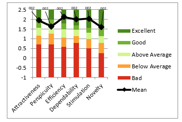 Figure 7: SIsKA-NG Benchmark Graph
Previous SIsKA with its six aspects each was assessed with the UEQ by score 1.59; 1.75; 1.64; 1.40; 1.56; and 1.10 [1]. The UEQ result of SIsKA-NG, as shown by Figure 7, was considered as a significant improvement compared to the previous UEQ result of SIsKA because of the better assessment on four aspects with level excellent, namely attractiveness, efficiency, dependability, and novelty. Same assessments are on two aspects, namely perspicuity (at level good eventhough SIsKA has higher score) and stimulation.
5.4. The Focus Group Discussion
Table 9 shows the additional recommendations that come from the Focus Group Discussion (FGD).
Table 9: The additional recommendations based on the FGD
| No | The Recommendations |
| 1 | Addition of CSV file import feature for user data. |
| 2 | Printing of the examination schedule should be more attractive and based on existing design. |
| 3 | Addition of verification feature by the research supervisor. |
| 4 | Integration of the student prerequisites with the research submission. |
The FGD discussed the result of the improvement recommendations obtained from the PM and the RTA evaluation. That FGD was conducted with the SIsKA-NG administrator, namely the authors’ study program administrator and the authors’ postgraduate program IT administrator. Those additional recommendations at Table 9 were considered as a reference for the further implementation.
5.5. The Implementation
Figure 8 shows an example of the new interface of SIsKA-NG, as one of the results of the final implementation based on the recommendations related to the menus grouping and the menus naming. That new interface is the result of the page improvement at Figure 6, which is the administrator starting page. Based on point 1 of the effectiveness recommendations of the administrator pages (Table 4), point 1 of the efficiency recommendations of the administrator pages (Table 5), and the RTA result, an improvement was made by grouping and by naming the menus related to their function.
 Figure 8 SIsKA-NG final implementation of the Administrator Starting Page
5.6. The Maintenance
SIsKA-NG, which has been hosted at the authors’ postgraduate program server, has been successfully used for the real case of student research data management. However, there are several things to be noted during the use, including:
- The framework code used was unstable at the authors’ postgraduate program server in the code of Asynchronous JavaScript And XML (AJAX) [20][21] for displaying the initial table (Figure 9). This error occurred because some Internet Servive Providers (ISPs) injected the advertising code that cause the AJAX code did not run perfectly. Based on in-depth testing, to avoid insertion of those advertisements SIsKA-NG need to use the Hypertext Transfer Protocol Secure (HTTPS) Internet communication protocol.
- The authors’ postgraduate program server need to be configured since the development Operating System (OS) was not the same as the production OS, neither do some software libraries needed (Figure 10).
- The file size that can be uploaded need to be adjusted because of recent 4MB limitation.
- Email notifications did not run at the server side, so additional email setting is required at the authors’ postgraduate program server.
- The time to run a feature of SIsKA-NG need to be optimized by evaluating the structure of SIsKA-NG code.
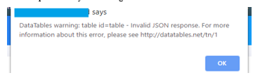 Figure 9: AJAX Error of SIsKA-NG
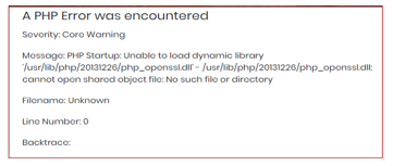 Figure 10: Software Library Error of SIsKA-NG
6. Conclusion and Future Work
This research has conducted significant improvement on the Academic Progress Information System that was called SIsKA-NG based on the usability evaluation. It gave better UEQ result of SIsKA-NG compared to the previous UEQ result of SIsKA since there are better excellent level assessment on four aspects of SIsKA-NG, namely attractiveness, efficiency, dependability, and novelty. Same assessments are on two aspects, namely perspicuity and stimulation. SIsKA-NG still need to be improved based on the aspect of perspicuity, additional recommendations from the conducted FGD, and procedural White Box testing for code evaluation.
Conflict of Interest
The authors declare that there is no conflict of interest regarding the publication of this article.
Acknowledgment
The authors would like to thank to Indonesian Ministry of Education and Culture that supported this work through research grant.
- A. I. I. Paramitha, G. R. Dantes and G. Indrawan, “The Evaluation of Web Based Academic Progress Information System Using Heuristic Evaluation and User Experience Questionnaire (UEQ),” in Third International Conference on Informatics and Computing (ICIC), 2018. https://doi.org/10.1109/IAC.2018.8780430.
- G. Indrawan, G. T. Heriawan, A. A. I. I. Paramitha, G. Wiryawan, G. B. Subawa, M. T. Sastradi, and K. A. Sucahyana, “SIsKA: Mobile Based Academic Progress Information System,” in International Conference on Innovative Research Across Disciplines (ICIRAD), 2017. https://doi.org/10.2991/icirad-17.2017.24.
- J. M. C. Bastien, “Usability testing: a review of some methodological and technical aspects of the method” Int. J. Med. Inform., 79(4), e18–e23, 2010. https://doi.org/10.1016/j.ijmedinf.2008.12.004
- S. Gupta, “A Comparative study of Usability Evaluation Methods” Int. J. Comput. Trends Technol., 22(3), 103–106, 2015. https://doi.org/10.14445/22312803/IJCTT-V22P121
- A. Widyanti and S. A. Q. Ainizzamani, “Usability evaluation of online transportation’ user interface” in International Conference on Information Technology Systems and Innovation (ICITSI), 2017. https://doi.org/10.1109/ICITSI.2017.8331762
- F. Z. Ghazizadeh and S. Vafadar, “A quantitative evaluation of usability in mobile applications: An empirical study” in International Symposium on Computer Science and Software Engineering Conference (CSSE), 2017. https://doi.org/10.1109/CSICSSE.2017.8320120
- S. Elling, L. Lentz, and M. de Jong, “Retrospective think-aloud method: Using eye movements as an extra cue for participants’ verbalizations” in Proceedings of the 2011 annual conference on Human factors in computing systems, 2011. https://doi.org/10.1145/1978942.1979116
- M. W. M. Jaspers, “A comparison of usability methods for testing interactive health technologies: Methodological aspects and empirical evidence” Int. J. Med. Inform., 78(5), 340–353, 2009. https://doi.org/10.1016/j.ijmedinf.2008.10.002
- H. Santoso, M. Schrepp, R. Y. Kartono Isal, A. Yudha Utomo, and B. Priyogi, “Measuring the User Experience” J. Educ. Online, 13(1), 58–79, 2016. https://doi.org/10.9743/JEO.2016.1.5
- B. Laugwitz, T. Held, and M. Schrepp, “Construction and Evaluation of a User Experience Questionnaire” in Holzinger A. (eds) HCI and Usability for Education and Work. USAB 2008. Lecture Notes in Computer Science, vol 5298. Springer, Berlin, Heidelberg, 2008. https://doi.org/10.1007/978-3-540-89350-9_6
- M. Schrepp, A. Hinderks, and J. Thomaschewski, “Construction of a Benchmark for the User Experience Questionnaire (UEQ)” Int. J. Interact. Multimed. Artif. Intell., 4(4), 40-44, 2017. https://doi.org/10.9781/ijimai.2017.445
- D. S. S. Sahid, P. I. Santosa, R. Ferdiana, and E. N. Lukito, “Evaluation and measurement of Learning Management System based on user experience” in The 6th International Annual Engineering Seminar (InAES), 2016. https://doi.org/10.1109/INAES.2016.7821910
- M. Schrepp, A. Hinderks, and J. Thomaschewski, “Applying the User Experience Questionnaire (UEQ) in Different Evaluation Scenarios” in In: Marcus A. (eds) Design, User Experience, and Usability. Theories, Methods, and Tools for Designing the User Experience. DUXU 2014. Lecture Notes in Computer Science, vol 8517. Springer, Cham, 2014. https://doi.org/10.1007/978-3-319-07668-3_37
- J. Nielsen, T. Clemmensen, and C. Yssing, “Getting access to what goes on in people’s heads?” in Proceedings of the second Nordic conference on Human-computer interaction, 2002. https://doi.org/10.1145/572020.572033
- A. Hinderks, M. Schrepp, F. J. Domínguez Mayo, M. J. Escalona, and J. Thomaschewski, “Developing a UX KPI based on the user experience questionnaire” Comput. Stand. Interfaces, 65, 38–44, 2019. https://doi.org/10.1016/j.csi.2019.01.007
- M. Seidl, M. Scholz, C. Huemer, and G. Kappel, “The Use Case Diagram” in UML @ Classroom. Undergraduate Topics in Computer Science. Springer, Cham, 2015. https://doi.org/10.1007/978-3-319-12742-2_3
- S. Hitchman, “The Details of Conceptual Modelling Notations are Important – A Comparison of Relationship Normative Language” Commun. Assoc. Inf. Syst., 9(1), 2002. https://doi.org/10.17705/1CAIS.00910
- X. Li, S. Karnan, and J. A. Chishti, “An empirical study of three PHP frameworks” in 2017 4th International Conference on Systems and Informatics (ICSAI), 2017. https://doi.org/10.1109/ICSAI.2017.8248546
- L. Lancor and S. Katha, “Analyzing PHP frameworks for use in a project-based software engineering course” in Proceeding of the 44th ACM technical symposium on Computer science education, 2013. https://doi.org/10.1145/2445196.2445350
- A. Mesbah, A. Van Deursen, and S. Lenselink, “Crawling AJAX-based web applications through dynamic analysis of user interface state changes” ACM Trans. Web, 2012. https://doi.org/10.1145/2109205.2109208
- M. Ying and J. Miller, “Refactoring legacy AJAX applications to improve the efficiency of the data exchange component” J. Syst. Softw., 86(1), 72–88, 2013. https://doi.org/10.1016/j.jss.2012.07.019