2-D and 3-D Visualization of Many-to-Many Relationships
2-D and 3-D Visualization of Many-to-Many Relationships
Volume 2, Issue 3, Page No 1527-1539, 2017
Author’s Name: SeungJin Lima)
View Affiliations
Computer Science, Merrimack College, 01845, U.S.A.
a)Author to whom correspondence should be addressed. E-mail: lims@merrimack.edu
Adv. Sci. Technol. Eng. Syst. J. 2(3), 1527-1539 (2017); ![]() DOI: 10.25046/aj0203191
DOI: 10.25046/aj0203191
Keywords: Visual data mining, Visualization, 3-D primitive, Many-to-many relationship

Export Citations
With the unprecedented wave of Big Data, the importance of information visualization is catching greater momentum. Understanding the underlying relationships between constituent objects is becoming a common task in every branch of science, and visualization of such relationships is a critical part of data analysis. While the techniques for the visualization of binary relationships are widespread, visualization techniques for ternary or higher relationships are lacking. In this paper, we propose a 3-D visualization primitive which is suitable for such relationships. The design goals of the primitive are discussed, and the effectiveness of the proposed visual primitive with respect to information communication is demonstrated in a 3-D visualization environment.
Received: 22 May 2017, Accepted: 24 July 2017, Published Online: 19 August 2017
1 Introduction
Understanding the relationships between the entities is an important matter in any type of data analysis project whether scientific or non-scientific. Visualization is generally viewed as complementary to traditional text-based analysis. Visualization also plays an indispensable role in data analysis. At times, visualization comes with an unexpected surprise such that it reveals auspicious patterns that may not be intuitive otherwise. In this paper, we address the design issues of 2-D and 3-D visualization techniques for many-to-many relationships. This paper is an extension of work originally presented in the proceedings of the 19th IEEE International Symposium of Multimedia (ISM 2016).
Augustus De Morgan insightfully stated, “When two objects, qualities, classes, or attributes, viewed together by the mind, are seen under some connexion, that connexion is called a relation” [1]. It is critical to understand the relationships between the objects in order to analyze the full drama played by the objects. For example, given the information that each of the two pairs of persons A and B, and A and C holds a friendly relationship in a social network, it may be important to know if the friendly relationship “clique” comprising A, B, and C together exists at a statistically significant level in psychology or cyber security. The authors of [2] identified two types of friendship from their study on Facebook. One type is the sympathy group which consist of approximately 15 close friends. The other type is the support clique of “friends on whom you would depend for emotional/social support in times of crisis.” The size of the second group is approximately 5.
Relationships may be characterized by attributes such as type (e.g., “co-authorship” [3] and “trust” in social networks [4], “presidential election”, etc.), weight (boolean or continuous), direction (directional or undirectional) and etc. The set of attributes for relationships is determined by the nature of the application domain. In our work, relationships are attributed only by the degree of participation of an object in its relationships to other objects, defined below, and the weight of the relationship.
Definition 1.1 (Degree of participation in relationship) Given a set of objects O = {o1,o2,…,on}, the relationship of an arbitrary type t between the members of O is many-to-many when each oi (1 ≤ i ≤ n) holds a relationship of the same type t with zero or more other objects in O simultaneously. Furthermore, we use the term k-relationship to denote a relationship whose degree of participation is k.
Among the various degrees of relationships in terms of participation, binary relationship is the most common in and the primary target of many data analysis projects. Examples of binary relationship include the gravitation between two masses in physics, symbiotic organisms in biology, term co-occurrence in information retrieval, co-citation [5] in bibliographic coupling studies, spatial co-location [6] in spatial data
mining, frequent 2-itemsets in association mining, and friend relationship between two persons in social networks.
At the same time, we recognize the rise of the relationships of a higher degree where three or more objects participate in the relationship simultaneously. Co-authorship [3] is such an example, because a paper can be published by more than two authors. The “support clique” of size 5 mentioned above is an example of relationships of a higher degree. As another example, the 34.7% of the papers are coauthored by three or more authors out of the 5.5 million journal articles, conference papers, and other publications on computer science listed at the DBLP Computer Science Bibliography website as of February in 2017. And the 0.5% of them are published by 10 or more co-authors as shown in Figure 1.
0% 10% 20% 30% 40% 50%
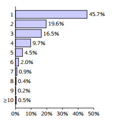 Figure 1: The fraction of publications listed in the DBLP Bibliography by number of coauthors.
Object relationships are commonly represented using a textual format in accordance with a data structure specifically designed for the data. A classic example is a tuple notation which is widely used in the relational database model. Relationships are also represented graphically. A graph G = (V ,E) where V is a set of vertices denoting objects and E is a set of edges representing relationships between the objects is a common example of this kind of representation, which has a dominant appearance in data/information visualization such as in social network analysis, web graph, and so forth.
When object relationships are analyzed over a large volume of data, overall descriptive patterns manifested in the underlying data is often the primary objective of the analysis. Individual or local patterns may or may not be of interest. Visualization helps us understand both overall and local patterns and offers a unique added value to data analysis of a large scale such as big data.
The visualization of binary relationships is conveniently and effectively done by drawing a line between the two related objects. In Figure 2, for example, the binary coauthorship relationship between Barkerma and Moursseau is apparent. We can also easily observe other binary relationships involving Barkerma, such as (Barkerma, Leeuw) and (Leeuw, Moursseau). A drawback of this visualization is that the readers are prone to mistakingly derive the ternary relationship (Barkerma, Leeuw, Moursseau) from (Barkerma, Leeuw), (Barkerma, Moursseau) and (Leeuw, Moursseau), unless noted otherwise.
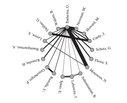 Figure 2: A visualization of G. Barkerma and collaborators in scientific publication [3].
The purpose of this paper is two-fold.
- We compare the merits of the selected 2-D visualization techniques and present the merits and challenges they impose for the purpose of data analysis when the degree of participation or the number of relationships grows large.
- We propose a geometric primitive which is suitable for visualizing ternary or higher-degree many-to-many relationships in 3-D. A set of design goals are also discussed. The effectiveness of the proposed primitive is demonstrated with various real-world datasets as well as artificial datasets.
The remainder of this paper is organized as follows: In Section 2, some selected related works are presented. We first discuss on the selected popular 2D visualization layouts in Section 3. We then present the proposed visualization primitive along with design goals and technical details in Section 4. A demonstration of the primitive is presented in Section 5. We conclude our presentation with what we plan to do in the future in Section 6.
2 Related Works
The topic of our work is generally related to scientific visualization in which a global summary of data is often the primary interest. On the other hand, local details are also important in visual data exploration and mining to which our work is closely related. A review on visual data exploration and mining can be found in [7]. Undirected relationships between entities are largely visualized as 2-D or 3-D matrices [8, 9] or undirected graphs [10, 3, 11, 12]. A number of different approaches exist. Determination of which approach is better than others is largely domain-specific as observed in [13]. We conveniently categorize most common approaches in the literature with respect to the layout of objects and visual cues representing relationships.
Difference in layout. The decision for the layout of objects is commonly influenced by the number of domains underlying the data objects or the number of attributes describing the data object. When the objects are from different domains, their membership to a different domain should be visually encoded so that the user may discern their membership easily. Intuitively, n orthogonal axes are used to make n domains distinguishable.
In case of bipartite relationships, for example, one approach is to arrange the objects in accordance to two axes that are visually perpendicular or parallel to each other. Bipartite graphs are examples of this kind. An alternative approach found in the literature is to arrange them anywhere in the visual space with two different object shapes to make them distinguishable. This approach can be thought of “zero” axis.
Though the objects belong to a single domain, we may still need multiple axes when these objects are associated with multiple attributes. A technique called parallel coordinates [15] is an example of this kind where objects are arranged vertically and each object is attributed by a number of parallel axes which are spaced out horizontally, each of which represents an attribute.
In our work, objects belong to a single domain. Two types of object layouts are commonly found in the literature and in practice.
- Single set of objects: Only one set of objects is rendered in the visualization. The objects are arranged along the circumference of a circle (Figure 3a), on a single linear axis (Figure 3b), or anywhere in the given visual space (Figure 3c). Notice that the three visualizations in Figure 3 are isomorphic. In other words, they carry the exact same set of relationships between the same set of objects though they may produce different visual impression. Graph is the basis of these visualization techniques.
- Two sets of objects: This layout can be thought of as an Euclidean space where one axis carries the full set of objects, and the second axis perpendicular to the first axis carries the same set of objects in the same ordering.
In Figure 4a, a set of 19 performance statistics of baseball players is arranged along both the horizontal and the vertical axes to show the correlation (a particular type of relationship) between them for the 1986 season. The statistics include season and career batting averages and so forth, calculated from “Hits” and “At bats”.
This layout is extended often to capture the correlation between two variables, as illustrated in the H-R diagram of stars showing star categories with respect to temperature and luminosity (Figure 4b). The layout is also extended to a 3-D space to amplify the visual effect of the significance of relationships as illustrated in Figure 5b.
Difference in the representation of relationships.
- Presence or absence of relationship: When the presence or absence of a relationship between two entities is what matters, connecting the two entities by an edge or a marker on a 2-D plot is sufficient. The three visualizations in Figure 3 and the one in Figure 4b are examples of this category. Unweighted graphs and scatter plot-like visualizations belong to this category.
- Significance of relationship: In contrast, Figures 2, 4a, and 5a show the significance of a relationship using another visual cue such as thickness of edges as in Figures 2 and 5a, color or density of color (Figure 4), or height of object in a 3-D space (Figure 5b).
As for the visualization techniques designed specifically for data mining, the authors of [9] chose to show cluster analysis results in a 3-D matrix such that the square grid of horizontal axes represent data objects and the vertical axis represents the similarity between the two corresponding objects. Visualization of geospatial point sets presented in [18] is inherently a similar 3-D matrix visualization since longitude and latitude values constitute X– and Y-axes. [10] uses multiple visual cues in a 2-D square matrix to enhance the visual feedback from a large dataset.
There also exist tools which employs a circle rather than a rectangle or square as the layout of the data objects. In [3], coauthorship is represented in a circular image such that the authors are arranged on a non-interactive 2-D canvas whose visual feedback may lose effectiveness as the data size grows large. As an extension of a circular grid, a concentric 2-D ring view of a coauthorship network is presented in [12] in which each ring represents the authors’ contribution in a particular year, which is useful to show temporal trends in the underlying information.
We notice that these visualization techniques discussed above are designed for binary relationships and we are not aware of a technique suitable for relationships whose degree of participation is higher than binary at the time of this writing.
Evaluation of the effectiveness of visualization techniques. Authors of [13] propose evaluation strategies for the effectiveness of visualization techniques. One approach is to solicit feedback from users in the form
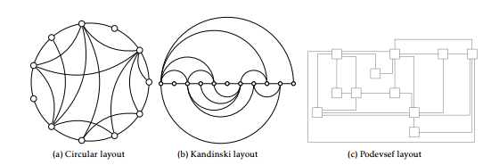 Figure 3: Various approaches to visualization of relationships using a single set of objects [14]. Objects are arranged along the circumference of the base circle (a) or along a single linear axis (b), or they can appear anywhere in the given visual area (c).
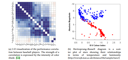 Figure 4: Matrix-like plots for visualization of relationships using two sets of entities.
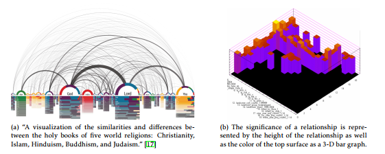 Figure 5: Line thickness, color and object height are commonly used visual cues for the magnitude of interval and ratio values.
of qualitative interviews and quantitative usage statis- approach is a more formal user study in which they tics collected from the access log of the tool. Another found that visualization-based instructions help the
workers complete the assembly task 35% faster with fewer errors than traditional instructions.
3 2-D Visualization of Many-toMany Relationships
In this section, we first compare the three 2-D strategies presented in [14]. The three approaches use a single set of objects. Our motivation is to see their suitability for the visualization of many-to-many relationships.
Data set. For an experiment of the visualization of relationships, we use a social network analysis data set that we generated from the book of Genesis in the Bible. The analysis was aimed at analyzing the interpersonal interactions in the book. There are 402 persons appearing in 1,064 interaction events in the book. The result of the analysis comprises 1,230 binary relationships and 225 maximal interactions. A maximal interaction in this study is defined as an interaction which is not contained in another interaction.
In this study, all the relationships belong to the same domain, namely interpersonal interactions. They have two attributes: degree of participation, ranging from 2 to 11, and significance of appearance, ranging between 0.0 and 1.0. The relationship in this data set is undirectional.
3.1 2-D Kandinski Layout
The objects are arranged on the single linear axis in the Kandinski layout illustrated in Figure 3b. The ordering of the objects is domain-specific. They can be arranged in the lexicographical order of the object labels. When the objects are associated with an ordinal quantity, such as rank or weight, they can be ordered according to the quantity. We can easily see that there are n-th factorial number of different arrangements of n objects and that a different ordering of objects will yield a different visual impression from the same set of relationships.
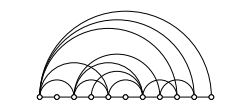 Figure 6: A variation of Kandinski shown in Fig. 3b where all the arcs are rendered only on the northern hemisphere of the axis.
The arrangement of arc between objects in the Kandinski figure is arguably arbitrary. Some arcs are arranged on the northern hemisphere while some others are on the southern hemisphere primarily for the purpose of the most comfortable visual effect. This approach may be prone to misinterpretation of the arcs. Viewers may mistakingly interpret the northern arcs may be superior to the ones on the south or vice versa.
Arcs can be rendered on a particular side of the axis for a specific purpose if relationships are associated with a bipolar attribute such as male or female and friendly or antagonistic.
As noted in Section 2, the three common layouts for a single set of objects shown in Figure 3 are isomorphic. In fact, the variation of Kandinski shown in Figure 6 is also isomorphic to the layout shown in Figure 3b. The benefit of this variation is to avoid the probability of misinterpretation of the arcs by the fact that the objects appear on a particular side of the axis.
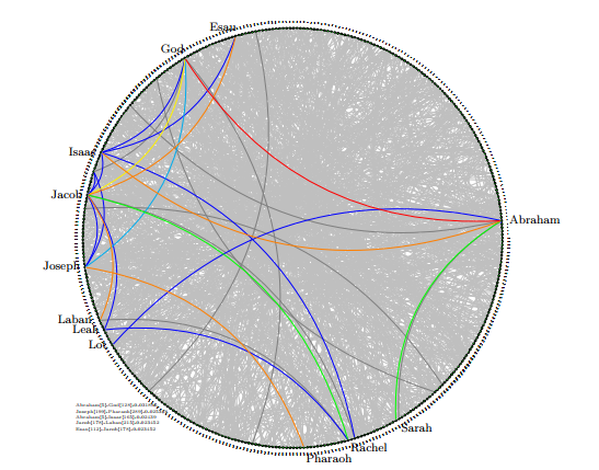
Based on this observation, we generated Figure 7 using the Kandinski layout for the 1,230 binary relationships from the 1,064 interaction events in the book of Genesis. The objects (persons) are arranged in the order of name. The statistical significance of an interaction is encoded using the red-orangeyellow-green-blue-gray color scheme with red being the most significant level. With this configuration, it is relatively clear that Abraham has higher interaction with God, Isaac, Sarah and Lot than other associates. God has distinctively higher interaction with Abraham than with anyone else, followed by Joseph. Most other relationships rendered in gray are equally insignificant in terms of occurrence frequency.
One drawback of Kandinski is that viewers may interpret incorrectly that a relationship of a larger arc may be more significant than the arcs of smaller radius. However, the significance of a relationship cannot be expressed by means of the radius or height of the arc. Hence, if the relationship is not boolean, a visual cue, such as thickness or color, must be carefully designed to represent different significance. Note that Figure 5a uses thickness for the significance of an arc. We opt out this option for color because thick arcs tend to mask thin arcs especially as the number of arcs grows large.
The figure is generated using the TikZ library from a script produced by a tool developed in-house.
3.2 2-D Podevsef Layout
We experiment the same interaction relationships using the Podevsef layout. In this layout, objects are laid out freely anywhere in the visual space. However, the common objective is to spread the objects in a “desirable” order to minimize the link distance and node collision. One practical implementation of this layout is found in the Sankey plugin
Figure 8 shows the interaction relationships as a Sankey diagram. The algorithm built in the library has chosen to place 5 objects as middle layer nodes between the node on the left and the nodes on the right. We can see the interactions between a pair of persons by the link between them and the significance of the interaction by the width of the ‘cable ribbon’-shaped
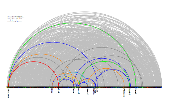 Figure 7: Interpersonal interactions among the 402 persons found in the book of Genesis, shown in Kandinski layout
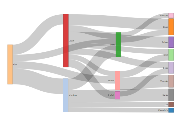 Figure 8: Interpersonal interactions among the 402 persons found in the book of Genesis, shown as a Sankey graph
link.
Note that Sankey graphs are generally used to visualize the flow of communication between the nodes, usually from left to right. Its application as a Podevsef layout should be used with care. Undirectional interactions are rendered on both sides of an internal node. Therefore, the cumulative total interactions of a person in the figure should be obtained by adding the width of every ribbon on both sides of a node. With this constraint, the Sankey visualization shows the dominating person-to-person interactions and the dominating persons in the interaction events.
We have observed that the Sankey cannot handle over 1,230 binary relationships of 406 objects effectively. The result was nearly unreadable, defeating the primary motivation of visualization, “a picture is worth a thousand words.” Because of this scalability issue, it is mainly used with a small number of selected objects.
3.3 2-D Circular Layout
One way to avoid the potential visual bias caused by the orientation of the edges observed in Kandinski and Podevsef layouts is to place all the objects on the equal ground without the orientation of left and right and all the edges on the same side of the visual space. This idea is implemented using the circular layout
(Fig. 3a).
In circular layout, the nodes are nominal, but not ordinal. There is no notion of left-end or right-end. There is no beginning nor end. Nodes may be placed in a random order or in the lexicographical order for the merit of object search visually. Edges are rendered within the disc.
In our approach, objects are arranged by alphabetical order of the object label. The significance of a relationship is represented by the color of the corresponding edge. The length of an edge is irrelevant. Using this configuration, we generated Figure 9 from the same interaction events found in the book of Genesis.
Circular layout exhibits the similar advantages and disadvantages of the Kandinski layout. However, a distinctive advantage of the circular layout over Kandinski is that it uses a twice larger area than Kandinski to present the same number of edges when both layouts use the diameter of the same length. Another advantage is that the circumference of a disc is 3.14 times longer than the diameter. Hence, the objects on a circular layout are 3.14 times more spaced out than the objects on the Kandinski axis. These differences generally make the circular layout more preferred.
We have presented thus far the visualization of binary relationships only using the three 2-D layouts that are commonly used. For the visualization of krelationships where k is 3 or larger, we first propose a geometric shape which is suitable for such a purpose since we are not aware of any one in the literature. Recall that the ternary relationship (A,B,C) is not a valid logical consequence of three binary relationships (A,B),(B,C), and (A,C). Suppose, for example, that {(A,B),(B,C),(A,C)} is a set of co-authorship relationships. It does not necessarily mean A,B, and C publish an article together. For this reason, we opt out the traditional approach which connects a pair of related objects by a line.
4 A Geometric Shape for Many-toMany Relationships
We now present a discussion on our strategy for the visualization of ternary or higher-degree relationships. The heart of the visualization of higher-degree relationships is to design a visualization primitive suitable for the purpose. The primitive should not only be capable of rendering k-relationships (k ≥ 3) accurately, but it must also guarantee to prevent the visualized relationship from being interpreted incorrectly for any degrees less than k. In our presentation of the geometric shape, we assume that objects are arranged along the circumference of a circle using the circular layout for its advantages discussed in the previous section.
4.1 k-Relationships as Hyperedges
In developing an effective visual metaphor for krelationships where k can be a reasonably large integer value, we investigated several geometric shapes as options. In particular, we have considered three approaches to the design of hyperedges.
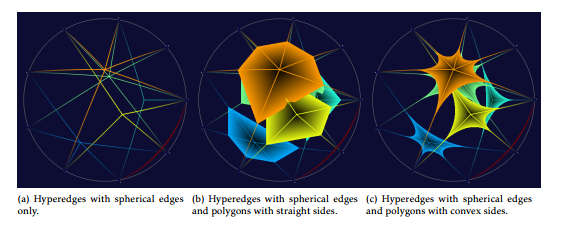
The first approach is to connect the constituent objects to the center point of the objects with k lines for k-relationships. An example of this approach is shown in Figure 10a. This approach is computationally efficient. Also, each hyperedge is thin and occupies less pixels on the screen than the other two approaches in the same figure. Hence, it offers more visual information on the screen than the others. However, it presents a challenge to identify the correct connecting center point of a relationship. When the number of relationships is large and the degrees of the relationships are diverse, the problem will become unbearable.
|
|
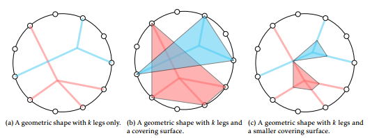
The next approach is to add a geometric surface to the hyperdge at the expense of incurring more computation and leaving less visual information space. In Figure 10b, we add to the edges a polygon which has k sides for k-relationships. The advantages of this approach is that higher-degree relationships can be visually recognized quicker and easier with the aid of the polygon surface and that it is relatively easy to implement. However, it has a considerable drawback: each hyperedge occupies a much larger area than the previous edge-only approach, leaving less amount of unoccupied pixels on the screen. Hypothetically, when the degree of a relationship is close to the maximum degree of participation, it is possible that the single hyperedge would block nearly the entire visualization space (although such high-degree relationships are rare in real-world datasets).
Between these two approaches, we take the second approach, with a modification, mainly because of its strength in distinguishing relationships and their degrees.
The improvement that we made to the second hyperedge approach is three-fold: we use smaller hyperedge covers as illustrated in Figure 10c, use concave sides for the polygon surface to further reduce the amount of pixels to use, and spherical edges are used so that the proposed hyperedges may be used in a 3-D visualization as well.
For an example of a hyperedge connecting 3 objects, we can employ a hyperbolic triangle that can be found in hyperbolic geometry. The characteristics of a hyperbolic triangles are well studied in a 2-D space. However, extending the theory of hyperbolic triangles to a higher-dimensional geometric shape for the purpose of implementation requires substantially more effort. The novelty of our work in implementing spherical edges and accompanying concave-sided polygon surfaces is to use Bezier curves as discussed below.
4.2 Geometry of hyperedges
As discussed earlier, the proposed hyperedge primitive has edges (we call them “legs”) and a cover that is well suited in a 3-D metaphor. A k-ary hyperedge has k legs plus a 3-D surface covering the midpoint of the legs to make it easier to identify the degree of the underlying relationship and to augment the 3-D look of the hyperedge. In designing and implementing such hyperedges, we ought to maximize the separation of hyperedges from each other for effective data analysis. We begin with the construction of legs.
Each k-relationship is first mapped to a k-ary hyperedge of k legs, each of which is a secondorder (quadratic) Bezier curve standing vertically. A quadratic Bezier curve requires three control points to define, i.e., two line segments between the first and second points and between the second and the third points. Given the three control points p0, p1 and p2, the quadratic Bezier curve is defined as a function of the parameter t ∈ [0,1]:
Definition 4.1 (Second-order Bezier Curve)
B(t) = (1−t)2 ·p0 +2t(1−t)·p1 +t2 ·p2 where t denotes a curve segment.
The polynomial expressed in second-order Bezier curves can be approximated by the following repeated steps:
- Start with a line segment L1 connecting p0 and p1 and another line segment L2 between p1 and p2.
- Place a marker M1 along L1 at distance t from p0 and another marker M2 along L2 at the same distance from p1.
- Draw a line L between M1 and M2, and place a marker at distance t from M1. Emit the marker as a point on the Bezier curve.
- Repeat the steps with respect to the next value of t.
Notice that the finer the line segments (controlled by the division of t), the smoother the resulting curve will be as illustrated in Figure 11. Since the calculation of the emitting point take a constant amount of time, the time complexity of drawing a secondorder Bezier curve is proportional to the number of the curve segments s, i.e., O(s).
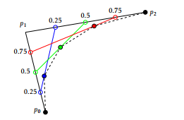 Figure 11: The effect of the number of curve segments on the Bezier curve generated from p0 and p2 with a control point p1 in between. With 4 line segments at the interval of 0.25, the Bezier curve is approximated by the three interpolated points (in blue, green and red) plus p0 and p2, resulting in the coarse dashed curve.
Construction of hyperedge. Adapting the quadratic Bezier curve, we construct hyperedges as follows: Let I be a k-relationship comprising k objects, i1, …, ik, which are located on the circumference of a circle in the circular layout, and let pm be the center point of the k objects on the x–z plane. Then, we can construct the hyperedge for the k-relationship as follows: First, take i1 as p0 of the corresponding quadratic Bezier curve. We can compute the location of p2 such that p2 is the opposite point of p0 on the circle about pm. Furthermore, set the y-axis value (i.e., the height) of pm to the statistical significance value of I. Now we can create a quadratic Bezier curve using the three control points p0, pm and p2. Take the half of the curve on the p0 side as the component curve for i1. Repeat the steps to construct the other k−1 component curves from the other k−1 objects of I. The resulting hyperedge is generated by joining the k component curves at their peak point (located at the same x−y coordinate with pm). Figure 12 shows how six half-length Bezier curves join at the crest in a 3-D space. The resulting hyperedge is parabolic-shaped, and its height is scaled by the statistical significance of the corresponding krelationship automatically. The hyperedge is further decorated with a concave-sided polygon cover over the peak point for visual clarity.
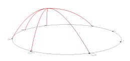 Figure 12: An hyperedge of 6 legs, each of which is a half-length second-order Bezier curve.
Figure 13a shows examples of hyperedge implementations for 3-, 4-, 5-, 6- and 7-relationships. Hyperedges for 3-relationships are constructed from three Bezier curve components with a cover at the joining point of the component curves as shown in the figure. The figure also illustrates that relationships of higher degree can also be constructed seamlessly using the same algorithm. Notice also in Figure 13c that each side of the polygon cover of a hyperedge is also a Bezier curve, the exact shape of which is determined by the locations of the control points.
The length of the portion of a leg which is not covered by the corresponding cover is about 50% of the leg length (measured from the bottom to the peak) by default. If the coverage ratio is larger, it tends to be easier to inspect the corresponding relationship visually, and visual ambiguity is reduced. However, it can easily mask other hyperedges at the same time. This ratio can be dynamically adjusted for maximum visual effect in our implementation. We found that the coverage ratio of 20% yields good visual feedback, while not dominantly masking other hyperedges. Once the location of each vertex of the hyperedge cover is determined on a leg, every pair of adjacent vertices (on two neighboring legs) and the peak point of the hyperedge are used as the three control points to generate the final hyperedge cover between the two legs.
Time complexity of hyperedge. As discussed earlier in this section, the time complexity of the construction of a second-order Bezier curve is O(s), where s denotes the number of curve segments. Hence, the time complexity of the construction of a hyperedge with k legs without the cover is O(ks). Each hyperedge with k legs has k−1 cover segments between a pair of legs. Each cover segment costs additional O(s) operation when we use the same level of smoothness for each Bezier curve. Hence, adding the cover to the hyperedge will cost additional O(ks), and the total time complexity of a hyperedge with k legs and a cover is O(ks). From this analysis, we conclude that the overall complexity of the visualization of n relationships is O(ksn).
Notice that the average value of k is relatively small in the real-world data when relationships obey the anti-monotone principle. In our implementation, n is the dominating factor for the scalability of the proposed approach. On the other hand, the capability of rendering a large number of relationships may bring an adversary effect, especially when the relationships are not evenly spaced out; that is, individual objects become less discernible. This issue is a system development issue and beyond the scope of this paper.
4.3 Visual cues
Visualization of relationships of arbitrary degrees would be challenging mainly due to the fact that the degrees of relationships can vary widely and the number of relationships, at least in theory, that are dealt with in data warehouses or in big data can be very large. Also, users may respond to the visual stimuli coming from a large number of visual primitives differently. For example, one user may be sensitive to variations in color but not in length, and vice versa. For these reasons, in designing a visual metaphor for relationships, we need to utilize visual cues to reinforce the meaning of each relationship in the context and to minimize any user-level distortion of the visual information.
For 3-D visualization of relationships, using multiple visual cues is generally more effective than using a single visual cue as long as they are used with consistency since viewers’ responses to a particular visual cue may vary. In the proposed visualization primitive for k-relationships, multiple visual cues are used to maximize the discriminative power of the metaphors: shape, color, illumination, height, and thickness. These visual cues are demonstrated in the figures throughout this paper.
Relative location Since the peak point of each component Bezier curve of a hyperedge is a function of its associated control points, hyperedges tend to be spatially clustered when hyperedges are rendered on the same screen. For example, the four 6- and 7relationships in Figure 13c form a clump. This tendency will increase toward the center of the screen as the degree of relationships increases (in other words, the distribution of the objects becomes more even on the base circle).
Color The hue of the legs representing a krelationship r is determined by the statistical significance of the relationship using the following formula:
max−weight(r)
hue(r) = max
where max is the maximum significance in the dataset, and weight(r) is the statistical significance of the corresponding relationship r. With this color scheme, the most significant legs are rendered in red and the least significant ones in blue, with yellow and green edges in between.
Illumination Shading is a natural phenomenon to real 3-D objects under illumination. We add a pseudoshading effect to hyperedges to augment their 3-D look by applying varying illumination rather than uniform illumination.
The leg illumination is defined as a function of t∈
[0,1]
(t −0.5)2
illumination(t) = − 0.52 +1
where t denotes a curve segment.
The above formula guarantees a leg to be the brightest at the vertex point (i.e., peak point) and gradually darker toward both end points, as illustrated in Figure 13.
|
|
Thickness The thickness of a leg is also proportional to the statistical significance of the corresponding relationship in our approach.
5 Implementation and Demonstration in Action
Implementation of the proposed visualization primitive. The proposed primitive is implemented in two different 3-D graphics programming environments, one in Java using the Java 3d library and the other in C using the C OpenGL library. Both libraries provide comparable 3-D graphics programming features. In our development, it took much longer time and effort to arrive at the current design from the idea of hyperbolic geometry than actual implementation.
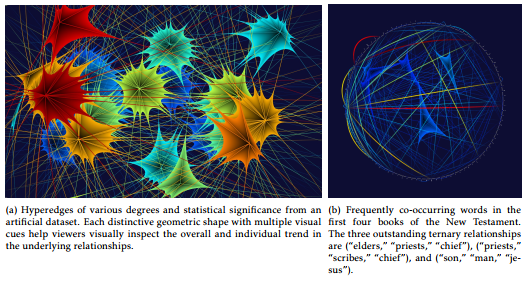
Hyperedges in action. Figure 14a shows that highly significant relationships are in red and tall (over other hyperedges), whereas less significant ones are in blue and short. Note that the figure is generated from an artificial dataset to demonstrate the capability of the proposed visual primitive of various visual cues employed in our approach.
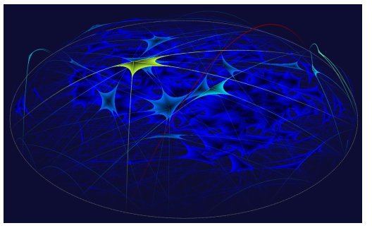 Figure 15: Interpersonal interactions found in the book of Genesis. The visualization shows that most interactions of more than 2 persons occur at a relatively low frequency. The binary interaction (God, Noah) shown in red is the most significant. The interactions between Noah and his three sons shown in yellow is one of the few outstanding interactions involving more than 2 persons. Figure 15: Interpersonal interactions found in the book of Genesis. The visualization shows that most interactions of more than 2 persons occur at a relatively low frequency. The binary interaction (God, Noah) shown in red is the most significant. The interactions between Noah and his three sons shown in yellow is one of the few outstanding interactions involving more than 2 persons. |
Figures 14b and 15 are generated using real-world datasets. Figure 14b shows frequently co-occurring words in the first four books of the New Testament. Overall, the visualization tells us that there are only a few word sets in which 3 or more words occur together at a statistically significant level. This is a natural phenomenon because frequently occurring words obey the principle of anti-monotone. In fact, among the 165 sets of co-occurring words with a minimum support of 0.35%, only (“elders,” “priests,” “chief”), (“priests,” “scribes,” “chief”), and (“son,” “man,” “jesus”) occurs more frequently than the threshold.
Figure 15 shows 402 persons along the circumference of the disc and the maximal interactions discovered from the book of Genesis. As these maximal interactions also obey the principle of anti-monotone, only a handful of relationships of higher degrees stand out in the visualization. The most significant relationship is the binary interaction between God and Noah (the red and tall arc). The most significant 4relationship in yellow in the figure is between Noah and his three sons.
6 Conclusion
A 3-D visual metaphor for many-to-many relationships is presented in this paper. The proposed visualization primitive accurately conveys the degree of participation of a relationship with its statistical significance using multiple visual cues. Each relationship of ternary or higher degree of participation is modeled as a novel hyperedge having as many legs as the degree of the relationship and a cover at the junction point of the legs. The metaphor is implemented as visual primitives of high-quality graphical objects and shows a good separation of different degrees of participation.
The effectiveness of our model with respect to information communication is generally demonstrated through a handful of experiments in this paper. At the same time, we forewarn the reader that efficiency in terms of CPU cycles could be a concern in comparison to 2-D multivariate visualization techniques since we render information as high-quality 3-D objects. In the future, we plan to evaluate the effectiveness of the proposed visual primitive using quantitative usage statistics and a user study to assess how well our visualizations improve information processing, communication, and decision making as suggested in [13].
Conflict of Interest The authors declare no conflict of interest.
- Augustus De Morgan. On the syllogism, no. iii, and on logic in general. In Transactions of the Cambridge Philosophical Society, chapter 10, pages 173–230. Cambridge University Press, Cambridge, 1864.
- A. Sutcliffe, R. Dunbar, J. Binder, and H. Arrow. Relationships and the social brain: integrating psychological and evolutionary perspective. British J. of Psychology, 103(2):149–168, 2012. doi: 10.1111/j.2044-8295.2011.02061.x.
- M. E. J. Newman. Coauthorship networks and patterns of scientific collaboration. Proc. of the National Academy of Sciences of USA, 101(1):5200–5205, April 6 2004.
- Wanita Sherchan, Surya Nepal, and Cecile Paris. A survey of trust in social networks. ACM Comput. Surv., 45(4):47:1–47:33, August 2013. doi: 10.1145/2501654.2501661.
- M. Kessler. Bibliographic coupling between scientific papers. American Documentation, 14(1):10–25, 1962.
- Zhongshan Lin and SeungJin Lim. Optimal candidate generation in spatial co-location mining. In Proc. of the 24th Annual ACM Symposium on Applied Computing, pages 1441–1445, Mar 2009. doi: 10.1145/1529282.1529604.
- Maria Cristina Ferreira de Oliveira and Haim Levkowitz. From visual data exploration to visual data mining: a survey. IEEE TVCG, 9(3):378–394, Jul-Sep 2003. doi: 10.1109/TVCG. 2003.1207445.
- Y. Matsuo and M. Ishizuka. Keyword extraction from a single document using word co-occurrence statistical information. Int’l J. on AI Tools, 13:157–169, 2004. doi: 10.1142/ S0218213004001466.
- Eduardo Tejada and Rosane Minghim. Improved visual clustering of large multi-dimensional data sets. In Proc. of the 9th Int’l Conf. on Info. Vis., pages 818–825, July 2005. doi: 10.1109/IV.2005.61.
- James Abello and Jeffrey Korn. MGV: A system for visualizing massive multidigraphs. IEEE TVCG, 8(1):21–38, Jan-Mar 2002. doi: 10.1109/2945.981849.
- Joshua O’Madadhain, Danyel Fisher, Padhraic Smyth, Scott White, and Yan-Biao Boey. Analysis and visualization of network data using JUNG. J. of Statistical Software, VV, 2005.
- Tze-Haw Huang and Mao Lin Huang. Analysis and visualization of co-authorship networks for understanding academic collaboration and knowledge domain of individual researchers. In Proc. of the 3rd CGIV, pages 18–23, 2006.
- Maneesh Agrawala, Wilmot Li, and Floraine Berthouzoz. Design principles for visual communication. Commun. ACM, 54(4):60–69, April 2011. doi: 10.1145/1924421.1924439.
- Michael A. Bekos, Michael Kaufmann, Stephen G. Kobourov, and Antonios Symvonis. Smooth Orthogonal Layouts. 17(5):575–595, 2013.
- Julian Heinrich and Daniel Weiskopf. State of the art of parallel coordinates. In M. Sbert and L. Szirmay-Kalos, editors, Eurographics 2013 – State of the Art Reports. The Eurographics Association, 2013. doi: 10.2312/conf/EG2013/stars/095-116.
- Michael Friendly. Corrgrams: Exploratory displays for correlation matrices. The American Statistician, 56(4):316–324, Nov 2002.
- Philipp Steinweber and Andreas Koller. Similar diversity. in Visual Complexity: mapping patterns of information. 2011.
- Daniel A. Keim, Christian Panse, Mike Sips, and Stephen C. North. Visual data mining in large geospatial point sets. IEEE CG&A, 24(5):36–44, Sep-Oct 2004. doi: 10.1109/MCG.2004.41